|
1.
|
|
2.
|
In the Tables panel at top left, click the green triangle next to Full Factorial Model.
|
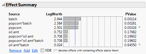
In the Effect Summary report, notice that the popcorn*batch interaction has a small p-value (0.00261). From this, you conclude that there is a significant interaction between popcorn and batch.
|
3.
|
This saves a column that contains the prediction formula to the data table. The new column is Pred Formula yield.
|
4.
|
|
5.
|
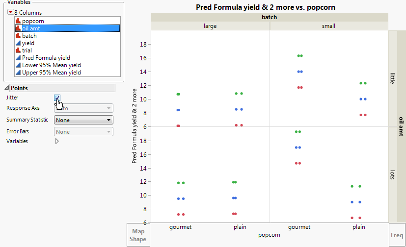
Select Graph > Graph Builder.
|
|
6.
|
|
7.
|
|
8.
|
|
9.
|
|
10.
|
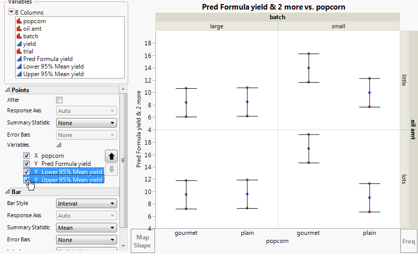
Format the graph to see interval bars for Lower 95% Mean yield and Upper 95% Mean yield, and to see points for Pred Formula yield.
 and drag it to the plot.
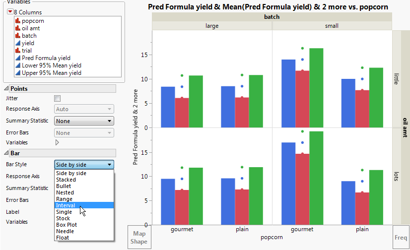
|
12.
|
In the Bar options panel, select Interval from the Bar Style menu. See Confidence Limits and Means Plotted as Side-by-Side Bars.
|
The interval bar style currently spans from Lower 95% Mean yield to Pred Formula yield, but you want it to span up to Upper 95% Mean yield. Remove the bar element for Pred Formula yield.
|
13.
|
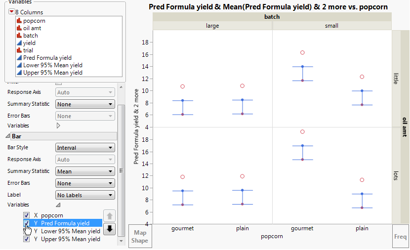
In the Bar options under Variables, deselect Y Pred Formula yield. See Interval Bar Style Applied to Three-Y-Axis Variables.
|
|
14.
|
In the Points options under Variables, deselect Y Lower 95% Mean yield and Y Upper 95% Mean yield. See Interval Span for Confidence Boundaries.
|
|
15.
|
|
16.
|
(Optional) Click Done.
|
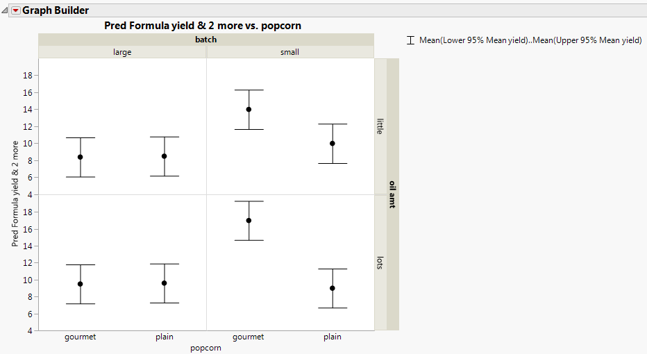
From Predicted Means and Confidence Intervals, you can see the following relationships: