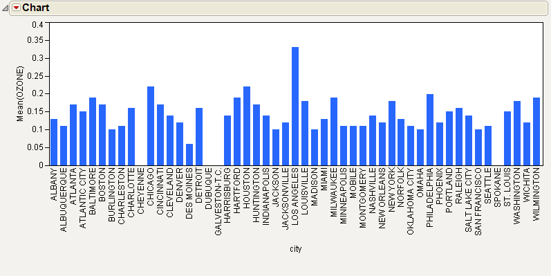
Treemaps can be useful in cases where histograms or bar charts are ineffective. This example uses the Cities.jmp sample data table, which contains meteorological and demographic statistics for 52 cities. Compare the bar chart to the treemap.
|
1.
|
|
2.
|
Select Graph > Chart.
|
|
3.
|
|
4.
|
Select Mean.
|
|
5.
|
|
6.
|
Click OK.
|
|
1.
|
Return to the Cities.jmp sample data table.
|
|
2.
|
Select Graph > Treemap.
|
|
3.
|
|
4.
|
|
5.
|
|
6.
|
Click OK.
|

|
•
|
Tip: A photo can be displayed in the label when you place your cursor over a square. For example, in the Cities.jmp sample data table, you could add an Expression column that contains a photo of each city and add a label to the column. See Expression Role in The Column Info Window for details.