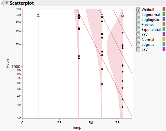
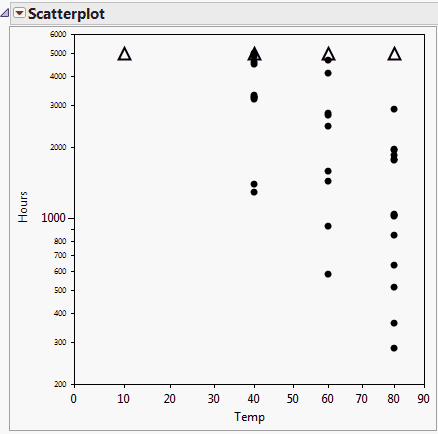
The Scatterplot of the lifetime event versus the explanatory variable is shown at the top of the report window. For the Devalt.jmp sample data, the Scatterplot shows Hours versus Temp. Scatterplot Representation for Failure and Censored Observations indicates how each type of failure is represented on the Scatterplot in the report window. To increase the size of the markers on the graph, right-click the graph, select Marker Size and then select one of the marker sizes listed.
Select to show the density curves. If the Location or the Location and Scale model is fit, or if Nested Model Tests is selected in the launch window, then the density curves for all of the given explanatory variable levels are shown. After the curves have been created, the Show Density Curves option toggles the curves on and off the plot.
Specify the quantile lines that you want, three at a time. You can add more quantiles by continually selecting Add Quantile Lines. Default quantile values are 0.1, 0.5, and 0.9. Invalid quantile values, such as missing values, are ignored. If desired, you can enter just one quantile value, leaving the other entries blank.
Scatterplot of Hours versus Temp shows the initial scatterplot; Scatterplot with Density Curve and Quantile Line Options shows the resulting scatterplot with the Show Density Curves and Add Quantile Lines options selected displaying the curves and the lines for the various Temp levels for the Weibull distribution. You can also view density curves across all the levels of Temp for the other distributions. These distributions can be selected one at a time or can be viewed simultaneously by checking the boxes to the left of the desired distribution name(s).