The scatterplot is the simplest of all the multiple-variable graphs. Use scatterplots to determine the relationship between two continuous variables and to discover whether two continuous variables are correlated. Correlation indicates how closely two variables are related. When you have two variables that are highly correlated, one might influence the other. Or, both might be influenced by other variables in a similar way.
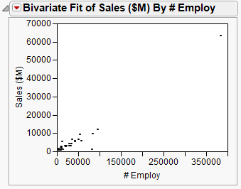
This example uses the Companies.jmp data table, which contains sales figures and the number of employees of a group of companies.
|
1.
|
|
2.
|
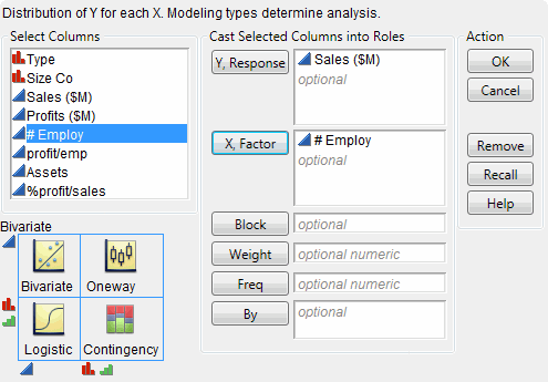
Select Analyze > Fit Y by X.
|
|
3.
|
|
4.
|
|
5.
|
Click OK.
|
|
2.
|
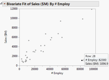
Select Rows > Hide and Exclude. The data point is hidden and no longer included in calculations.
|
|
3.
|
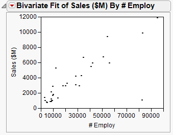
To re-create the plot without the outlier, select Redo > Redo Analysis from the red triangle menu for Bivariate. You can close the original report window.
|