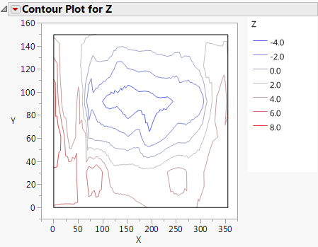
Follow the instructions in Example of a Contour Plot to produce the plot shown in The Contour Plot Report.
The legend for the plot shows individual markers and colors for the Y variable. Replace variables in the plot by dragging and dropping a variable, in one of two ways: swap existing variables by dragging and dropping a variable from one axis to the other axis; or, click on a variable in the Columns panel of the associated data table and drag it onto an axis.