This example uses the Failure3.jmp sample data table. The data monitors production samples before and after a furnace cleaning for three days for a capacitor manufacturing process. The data table has a column called date with values OCT 1, OCT 2, and OCT 3.
|
1.
|
|
2.
|
|
3.
|
|
4.
|
|
5.
|
|
6.
|
Click OK.
|
Two-way Comparative Pareto Plot displays the Pareto plot with a two-way layout of plots that show each level of both X variables. The upper left cell is called the key cell. Its bars are arranged in descending order. The bars in the other cells are in the same order as the key cell.
|
7.
|
Click Contamination and Metallization in the key cell and the bars for the corresponding categories highlight in all other cells.
|
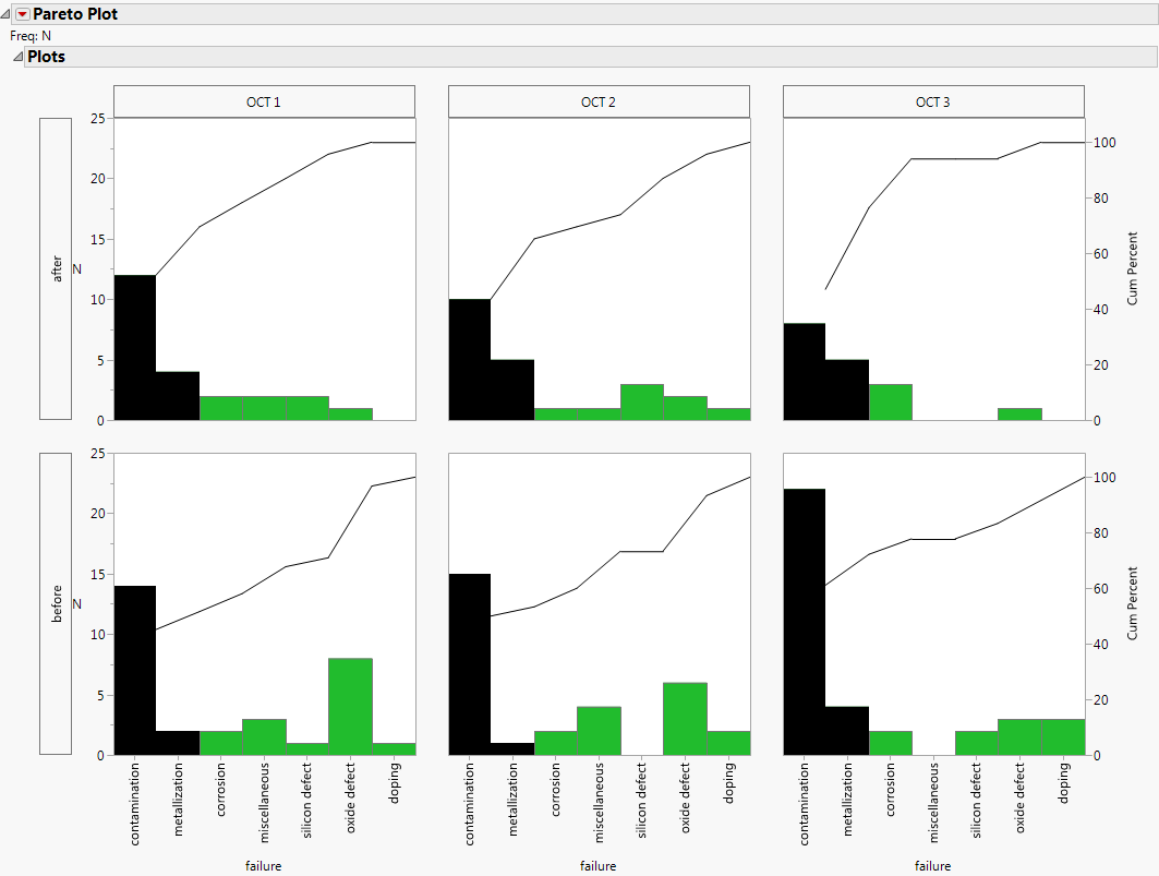
The Pareto plot shown in Two-way Comparative Pareto Plot illustrates highlighting the vital few. In each cell of the two-way comparative plot, the bars representing the two most frequently occurring problems are selected. Contamination and Metallization are the two vital categories in all cells. After furnace cleaning, Contamination is less of a problem.