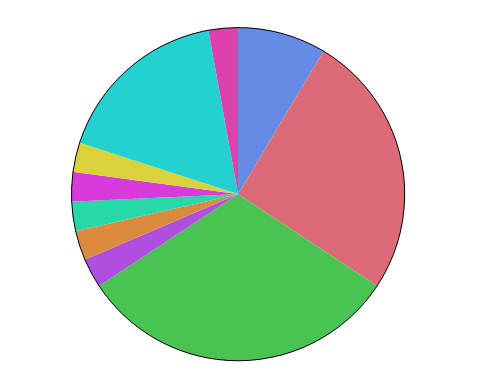
The Pie element  plots summary statistics for groups of observations, representing their values as the size of the slices or rings on a pie chart.
Figure 2.36 Pie Options
Tip: If you have multiple graphs, you can color or size each graph by different variables. Drag a second variable to the Color or Size zone, and drop it in a corner. In the Variables option, select the specific color or size variable to apply to each graph.
 |
|
 |
|
|
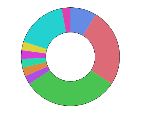
The central angles for all slices are equal. The size of each slice is determined by the Summary Statistic. Also known as an exploded pie chart, a coxcomb chart can help you see smaller areas.
 |