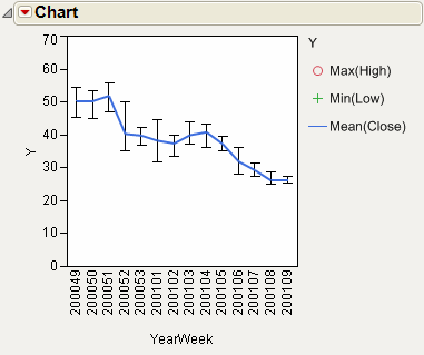
The Stock Prices.jmp sample data table contains data for the dates and values of a stock over time. The variable YearWeek is a computed column representing the year and week in a single variable. Use a range chart to show the high, low, and average close values for each stock. For those weeks where data exists for multiple days, the average of the values is plotted.
|
1.
|
|
2.
|
Select Graph > Legacy > Chart.
|
|
3.
|
|
4.
|
|
5.
|
Select Max from the menu of statistics.
|
|
6.
|
|
7.
|
Select Min from the menu of statistics.
|
|
8.
|
|
9.
|
Select Mean from the menu of statistics.
|
|
10.
|
Click OK.
|
|
11.
|
Select Range Chart from the red triangle menu for Chart.
|
|
12.
|
In the legend, right-click Mean(Close) and select Connect Points.
|
Figure 14.19 Example of a Combined Range and Line Chart
