This example is in three parts. In most cases, you would start with Create the Baseline Control Chart, where you let JMP calculate the control limits for you. Then, to apply these control limits to new data, you would either Specify Control Limits or Specify Multiple Sets of Control Limits (for phase data).
|
1.
|
|
2.
|
Select Analyze > Quality and Process > Control Chart Builder.
|
|
3.
|
|
4.
|
Figure 3.8 XBar and R Chart of Line Length by Print Run
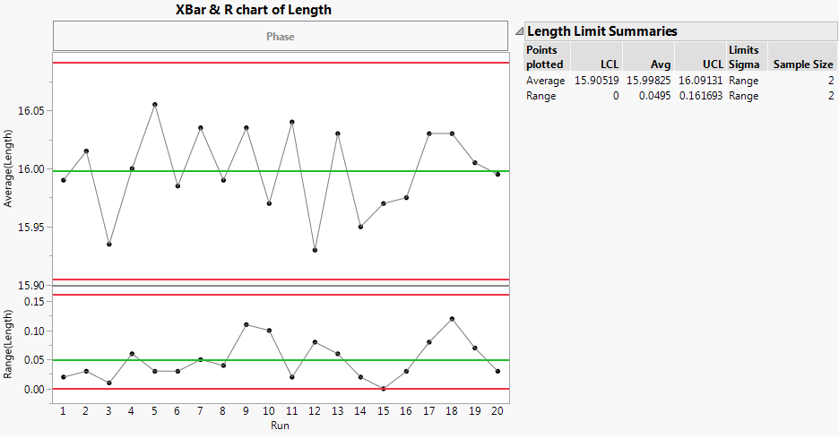
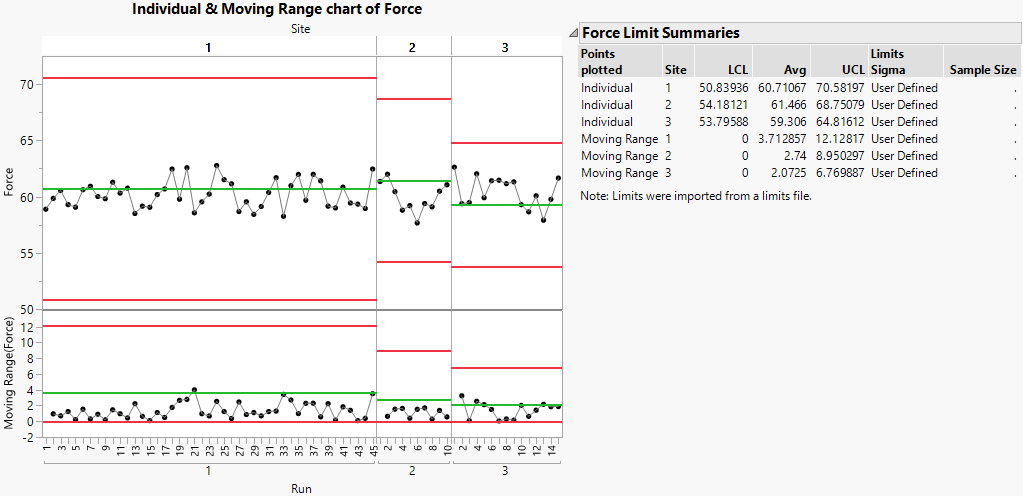
The XBar and R-charts have three lines drawn horizontally across them. These are the calculated LCL (lower control limit), Avg (average) and UCL (upper control limit).
|
5.
|
If we had determined that our process was not in control, we would do further research to figure out how we could alter our process so that it is in control. For this example, since the process is already in control or stable, we can skip that step. Now, you can use these control limits with new data. Proceed to Specify Control Limits, or Specify Multiple Sets of Control Limits (to see an example with phase data).
|
1.
|
|
2.
|
Select Analyze > Quality and Process > Control Chart Builder.
|
|
3.
|
|
4.
|
|
5.
|
|
7.
|
Click OK.
|
|
8.
|
|
–
|
|
10.
|
Click OK.
|
|
1.
|
|
2.
|
|
3.
|
|
4.
|
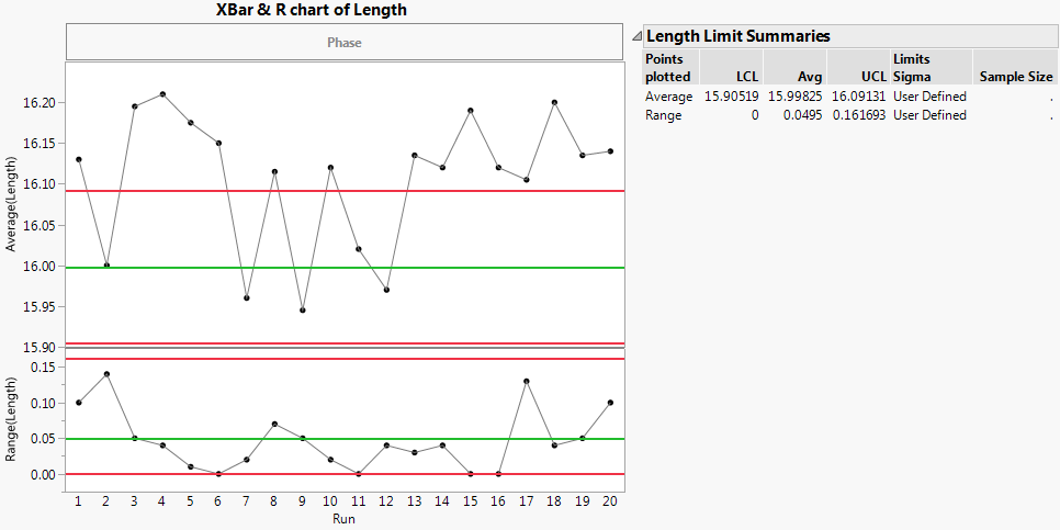
XBar is selected, so enter these fixed limits for the Average (XBar) chart:
|
|
5.
|
|
–
|
|
6.
|
Click OK.
|
You have entered control limits for XBar and R-charts for the Length column. Now you can create a control chart.
|
7.
|
Select Analyze > Quality and Process > Control Chart Builder.
|
|
8.
|
|
9.
|
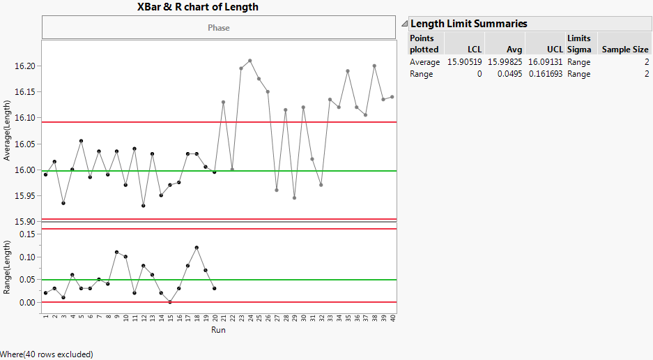
To use the Get Limits method, you need a data table that defines your historical limits. For detailed information about how to create a limits table, see Saving and Retrieving Limits in Shewhart Control Charts.
|
1.
|
|
2.
|
Select Analyze > Quality and Process > Control Chart Builder.
|
|
3.
|
|
4.
|
|
5.
|
Click the Control Chart Builder red triangle and select Get Limits. Navigate and open the limits data table for this example, called Length Limits.jmp. By default, the file is located here:
|
|
–
|
On Windows: C:\Program Files\SAS\JMP\<version>\Samples\Data
|
|
–
|
On Macintosh: \Library\Application Support\JMP\<version>\Samples\Data
|
|
1.
|
|
2.
|
Select Analyze > Quality and Process > Control Chart Builder.
|
|
3.
|
|
4.
|
|
1.
|
|
2.
|
Select Analyze > Quality and Process > Control Chart Builder.
|
|
3.
|
|
4.
|
|
5.
|
Figure 3.11 Baseline Control Chart for Existing Data

|
1.
|
From the report in Figure 3.11, click the red triangle next to Control Chart Builder and select Save Limits > in New Table.
|
|
3.
|
|
4.
|
Select Analyze > Quality and Process > Control Chart Builder.
|
|
5.
|
|
6.
|
|
7.
|
|
8.
|
Click the red triangle next to Control Chart Builder and select Get Limits. Open the limits table you saved in step 2.
|