This example uses the Car Poll.jmp sample data table, which contains survey data for car owners and car makes. You are interested in classifying the car owners into three clusters and producing a plot to visualize the probabilities of cluster membership. A ternary plot provides a good visualization when you have three clusters.
|
1.
|
|
2.
|
Select Analyze > Clustering > Latent Class Analysis.
|
|
3.
|
|
4.
|
Click OK.
|
|
5.
|
|
6.
|
Click the red triangle next to Latent Class Model for 3 Clusters and select Save Mixture Probabilities.
|
|
7.
|
In the Car Poll data table window, select the LCA Cluster Probabilities column group from the column list.
|
|
8.
|
Select Graph > Ternary Plot.
|
|
9.
|
Click X, Plotting.
|
|
10.
|
Click OK.
|
Figure 13.6 Ternary Plot of Cluster Membership Probabilities
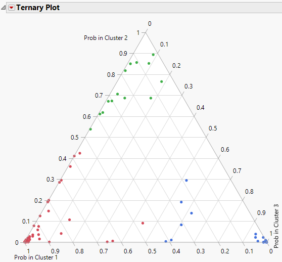
Figure 13.6 shows the ternary plot of cluster probabilities for each observation. Most of the cluster membership probabilities fall near the vertices, which indicates that they have high values for one cluster and lower values for the other two. However, there are some points in the middle of the plot, indicating that these observations do not have high probabilities of cluster membership for any of the clusters. These observations might warrant closer inspection or they might indicate that more clusters are needed to better represent the data.