If you have two or more Y variables on the same axis, you can reflect the scaling of a second set of variables by creating a second Y axis. This can be useful when two variables measure the same underlying quantities, but have different scales. In general, it is unwise to use a second Y axis in any other situation. For more information, see Stephen Few’s paper on Dual-Scaled Axes in Graphs.
The CrimeData.jmp sample data table contains data on various types of crime for the 50 US states yearly, from 1973 to 2010. The Total column sums the number of incidents, and the Total Rate column gives a population-adjusted rate. You want to show these two variables on a single chart.
|
1.
|
|
2.
|
Select Graph > Graph Builder.
|
|
3.
|
|
4.
|
Select Year and drag it to the X zone.
|
Figure 2.14 Total Rate and Total Merged
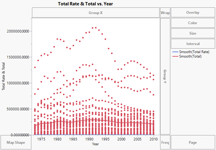
The Total Rate values are all between 0 and 1, and so are barely visible. Calculate yearly means and then use a second Y axis to make these values visible.
|
5.
|
|
7.
|
Figure 2.15 Second Y Axis Added
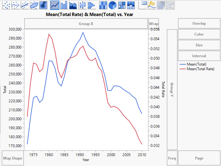
An axis for Total Rate is added on the right, and the axes rescale to show both sets of values. You can now see relationships between the two measures. For example, both measures began to decrease in 1991.
|
8.
|
(Optional) Click Done.
|