|
1.
|
|
2.
|
Right-click on row 1 and select Hide and Exclude.
|
|
3.
|
Select Graph > Graph Builder.
|
|
4.
|
|
5.
|
|
6.
|
|
9.
|
In the Points options under Variables, de-select Color Weight (lbs).
|
|
10.
|
(Optional) Click Done.
|
Figure 3.4 Contour Plot with a Color Variable
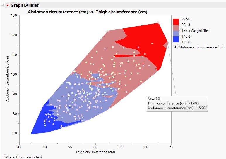
The contour colors correspond to the weight, as shown in the Weight (lbs) legend. The graph shows that thigh and abdomen circumference are related; as one increases, so does the other. The colored contours indicate how weight fits in the relationship. Individuals with large measurements of abdomen and thigh circumference are also generally the heaviest. Notice that one individual (row 32) does not quite fit the pattern.