A line segment is plotted for each level of the row effect. Response values predicted by the model are joined by line segments. Non-parallel line segments give visual evidence of possible interactions. However, the p-value for such a suggested interaction should be checked before concluding that it exists. Figure 2.50 gives an interaction plot matrix for the Reactor.jmp sample data table.
|
1.
|
|
2.
|
Select Analyze > Fit Model.
|
|
3.
|
|
4.
|
Make sure that the Degree box has a 2 in it.
|
|
5.
|
|
6.
|
Click Run.
|
|
7.
|
From the red triangle menu next to Response Y, select Factor Profiling > Interaction Plots.
|
Figure 2.50 Interaction Plots
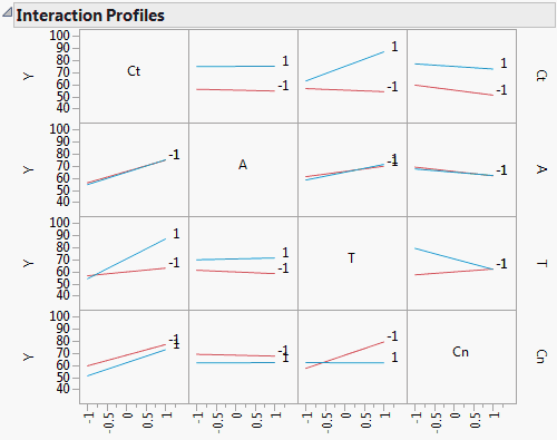
The plot corresponding to the T*Cn interaction is the third plot in the bottom row of plots or equivalently, the third plot in the last column of plots. Either plot shows that the effect of Cn on Y is fairly constant at the low level of T, whether Cn is set at a high or low level. However, at the high level of T, the effect of Cn on Y differs based on its level. Cn at –1 leads to a higher predicted Y than Cn at 1. Note that this interaction is significant with a p-value < 0.0001.