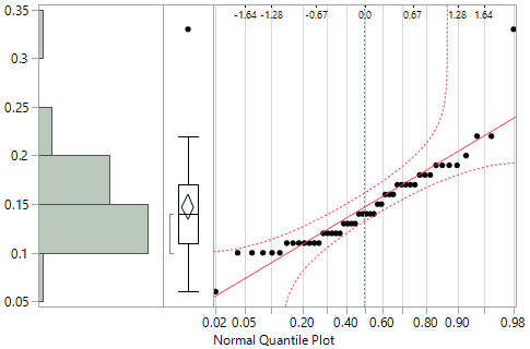
Use the Normal Quantile Plot option to visualize the extent to which the variable is normally distributed. If a variable is normally distributed, the normal quantile plot approximates a diagonal straight line. This type of plot is also called a quantile-quantile plot, or Q-Q plot.
The normal quantile plot also shows Lilliefors confidence bounds (Conover 1980) and probability and normal quantile scales.
Figure 2.7 Normal Quantile Plot
|
•
|
The y-axis shows the column values.
|
|
•
|
The upper x-axis shows the normal quantile scale.
|
|
•
|
The lower x-axis shows the empirical cumulative probability for each value.
|