Figure 3.11 Outlier Analysis Report
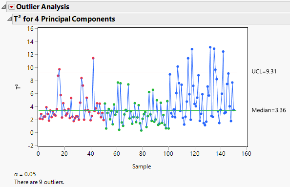
By default, the Outlier Analysis report displays the T2 for <A> Principal Components plot. The plot shows the T2 value for each observation and horizontal lines at the Median and Upper Control Limit (UCL). For details on how the T2 values, median, and UCL are calculated, see Calculations for Outlier Analysis.
The α level used to calculate the UCL is displayed below the plot. The number of outliers detected is also shown. This number is the number of observations with T2 values that are greater than the UCL.
T2 Plot
Shows or hides a heat map of the T2 contribution values for all observations expressed as a proportion of the individual row’s T2. The proportions for an individual row are obtained by computing the square of the contribution and dividing by the sum of the squares of all contributions for that individual row.
(Available only if one or more points is selected in the T2 plot.) Shows a report with a T2 contribution plot for each selected sample. A T2 contribution plot shows the contribution of each variable to the sample’s T2 statistic. For details on how the contributions are calculated, see Calculations for Outlier Analysis. Use contribution plots to investigate outliers. The variables with the largest positive or negative contributions are those that contribute most to a sample having a large T2 value. To remove the contribution plots, select Remove Plot from the contribution plot report red triangle menu.
Enables you to specify the number of principal components used in the T2 and T2 contribution statistics. When you change the number of components, the T2 plot, heap map, and normalized DModX plot automatically update.
Set α level
Enables you to specify the α level.
Saves the T2 Contributions to new columns in the data table. There is one column for each principal component.