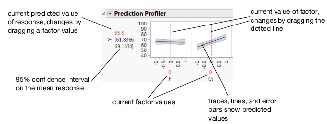
The Prediction Profiler displays profile traces (see Figure 1.2) for each X variable. A profile trace is the predicted response as one variable is changed while the others are held constant at the current values. The Prediction Profiler recomputes the profiles and predicted responses (in real time) as you vary the value of an X variable.
|
•
|
The vertical dotted line for each X variable shows its current value or current setting. If the variable is nominal, the X axis identifies categories.
|
For each X variable, the value above the factor name is its current value. Change the current value by clicking in the graph or by dragging the dotted line where you want the new current value to be.
|
•
|
The horizontal dotted line shows the current predicted value of each Y variable for the current values of the X variables.
|
|
•
|
The black lines within the plots show how the predicted value changes when you change the current value of an individual X variable. In fitting platforms, the 95% confidence interval for the predicted values is shown by solid blue curves surrounding the prediction trace (for continuous variables) or the height of an error bar (for categorical variables). For continuous variables, the confidence interval region is shaded.
|
Figure 1.2 Illustration of Traces