 Results Explorer
Figure 11.11 Partial RSS Explorer Report
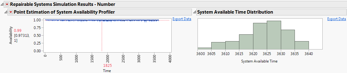
By default, the report contains two types of graphs. The first type of graph, shown on the left side of Figure 11.11, is a point estimate graph. The point estimate graph displays aggregated simulation results on the vertical axis plotted against simulation iteration time on the horizontal axis. The range of the horizontal axis is the duration that you specify in the simulation settings. The estimated probability of the system being available at a given time is shown in red next to the vertical axis. Below the point estimate is a 95% confidence interval for the point estimate.
The second type of graph, shown on the right side of Figure 11.11, is a histogram of the system available time from the simulation iterations. The bins in the histograms are representative of one of the following:
Tip: Select the Export Data option beside a graph to create a data table with the data that the graph uses.