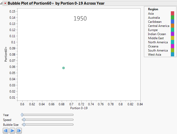
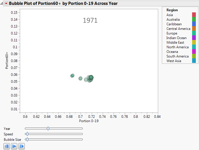
For dynamic bubble plots, you might specify only a Time variable and no ID variable. The resulting bubble plot contains a single moving bubble that tracks the series as the Time value changes.
|
1.
|
|
2.
|
Select Graph > Bubble Plot.
|
|
3.
|
|
4.
|
|
5.
|
|
6.
|
|
7.
|
Click OK.
|
|
9.
|
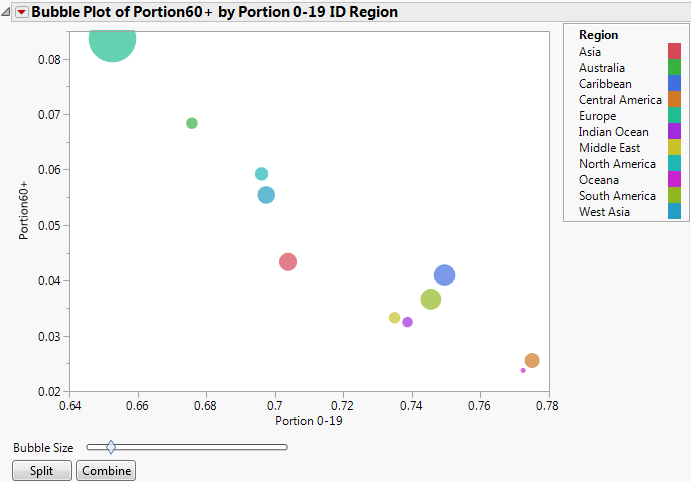
For static bubble plots, you might specify one or two ID variables and no Time variable. The resulting bubble plot contains a bubble at each ID value. Note that although this bubble plot is static, you can perform splitting on bubbles.
|
1.
|
|
2.
|
Select Graph > Bubble Plot.
|
|
3.
|
|
4.
|
|
5.
|
|
6.
|
|
7.
|
Click OK.
|
|
9.
|
Click Split.
|
This example uses the SATByYear.jmp sample data table, which contains SAT verbal and math test scores for a selection of the US population in 2004.
|
1.
|
|
2.
|
Select Graph > Bubble Plot.
|
|
3.
|
|
4.
|
|
5.
|
|
6.
|
|
7.
|
Click OK.
|
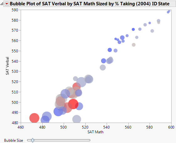
From The Static Bubble Plot Report Window, you draw the following conclusions:
|
1.
|
From the red triangle menu, select Show Roles.
|
|
2.
|
Click on the ID link.
|
|
3.
|
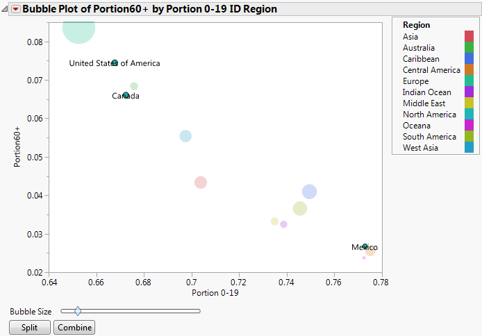
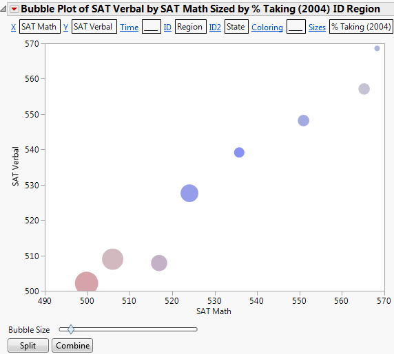
Region is now the primary ID variable.
|
4.
|
Click on the ID2 link.
|
|
5.
|
State is now the secondary ID variable.
|
7.
|
Click Split.
|
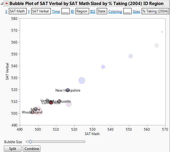
Now the bubbles are split by the secondary ID variable, which is State. You now see each state within the Southwest region.
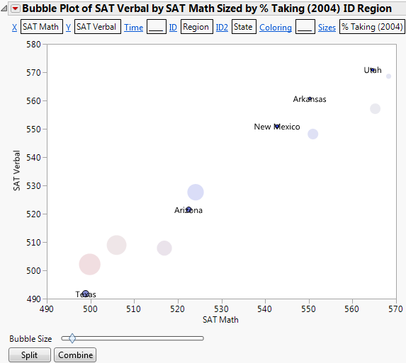
From Example of Southwest Region Split by State, you see that there is significant variation between the scores from the Southwest states.
|
8.
|
Click Combine to combine the southwest states again.
|
|
10.
|
Click Split.
|
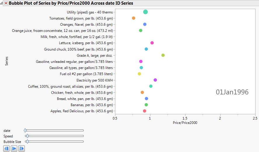
This example uses the blsPriceData.jmp sample data table, which shows the price of commodities over several years. Because the value of the US dollar changes over time, a column named Price/Price2000 shows the ratio of a commodity’s price at any given time to the price in the year 2000.
|
1.
|
|
2.
|
Select Graph > Bubble Plot.
|
|
3.
|
|
4.
|
|
5.
|
|
6.
|
Click OK.
|
|
9.
|
Click OK.
|