|
1.
|
|
2.
|
Select Analyze > Fit Y by X.
|
|
3.
|
|
4.
|
|
5.
|
Click OK.
|
|
6.
|
From the red triangle menu, select Analysis of Means Methods > ANOM.
|
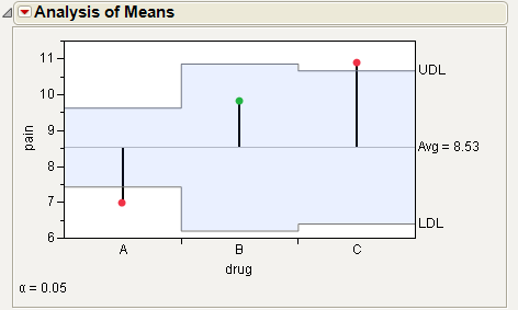
For the example in Example of Analysis of Means Chart, the means for drug A and C are statistically different from the overall mean. The drug A mean is lower and the drug C mean is higher. Note the decision limits for the drug types are not the same, due to different sample sizes.
This example uses the Spring Data.jmp sample data table. Four different brands of springs were tested to see what weight is required to extend a spring 0.10 inches. Six springs of each brand were tested. The data was checked for normality, since the ANOMV test is not robust to non-normality. Examine the brands to determine whether the variability is significantly different between brands.
|
1.
|
|
2.
|
Select Analyze > Fit Y by X.
|
|
3.
|
|
4.
|
|
5.
|
Click OK.
|
|
6.
|
From the red triangle menu, select Analysis of Means Methods > ANOM for Variances.
|
|
7.
|
From the red triangle menu next to Analysis of Means for Variances, select Show Summary Report.
|
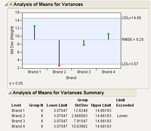
From Example of Analysis of Means for Variances Chart, notice that the standard deviation for Brand 2 exceeds the lower decision limit. Therefore, Brand 2 has significantly lower variance than the other brands.
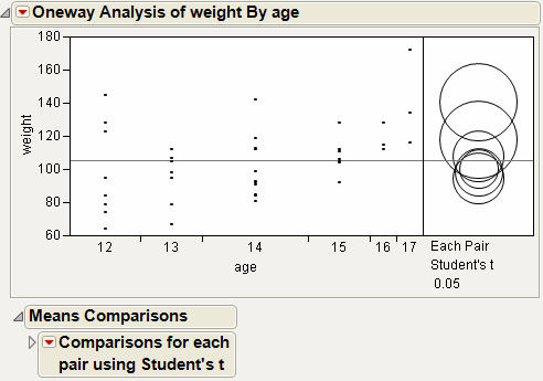
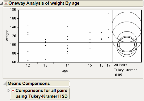
This example uses the Big Class.jmp sample data table. It shows a one-way layout of weight by age, and shows the group comparison using comparison circles that illustrate all possible t-tests.
|
1.
|
|
2.
|
Select Analyze > Fit Y by X.
|
|
3.
|
|
4.
|
|
5.
|
Click OK.
|
|
6.
|
From the red triangle menu, select Compare Means > Each Pair, Student’s t.
|
The means comparison method can be thought of as seeing if the actual difference in the means is greater than the difference that would be significant. This difference is called the LSD (least significant difference). The LSD term is used for Student’s t intervals and in context with intervals for other tests. In the comparison circles graph, the distance between the circles’ centers represent the actual difference. The LSD is what the distance would be if the circles intersected at right angles.
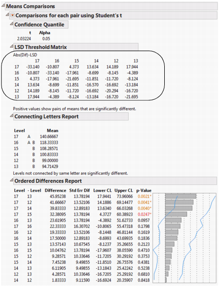
In Example of Means Comparisons Report for Each Pair, Student’s t, the LSD threshold table shows the difference between the absolute difference in the means and the LSD (least significant difference). If the values are positive, the difference in the two means is larger than the LSD, and the two groups are significantly different.
|
1.
|
|
2.
|
Select Analyze > Fit Y by X.
|
|
3.
|
|
4.
|
|
5.
|
Click OK.
|
|
6.
|
From the red triangle menu, select Compare Means > All Pairs, Tukey HSD.
|
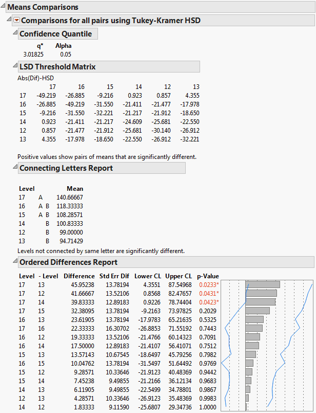
In Example of Means Comparisons Report for All Pairs, Tukey HSD, the Tukey-Kramer HSD Threshold matrix shows the actual absolute difference in the means minus the HSD, which is the difference that would be significant. Pairs with a positive value are significantly different. The q* (appearing above the HSD Threshold Matrix table) is the quantile that is used to scale the HSDs. It has a computational role comparable to a Student’s t.
|
1.
|
|
2.
|
Select Analyze > Fit Y by X.
|
|
3.
|
|
4.
|
|
5.
|
Click OK.
|
|
6.
|
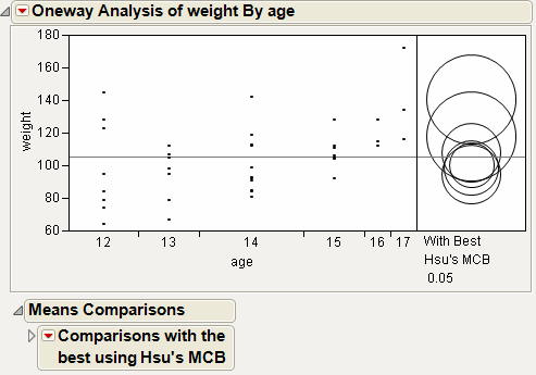
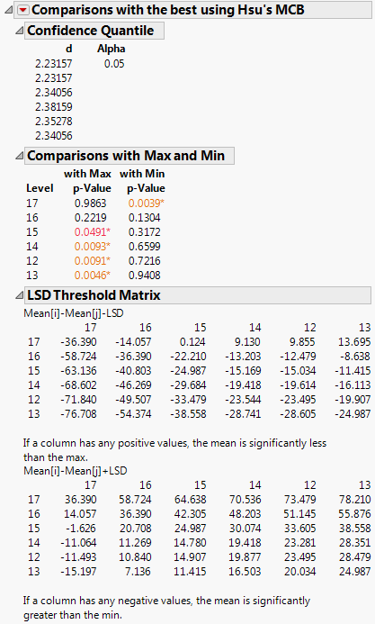
From the red triangle menu, select Compare Means > With Best, Hsu MCB.
|
|
1.
|
|
2.
|
Select Analyze > Fit Y by X.
|
|
3.
|
|
4.
|
|
5.
|
Click OK.
|
|
6.
|
From the red triangle menu, select Compare Means > With Control, Dunnett’s.
|
Alternatively, click on a row to highlight it in the scatterplot before selecting the Compare Means > With Control, Dunnett’s option. The test uses the selected row as the control group.
|
8.
|
Click OK.
|
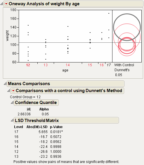
Using the comparison circles in Example of With Control, Dunnett’s Comparison Circles, you can conclude that level 17 is the only level that is significantly different from the control level of 12.
|
1.
|
|
2.
|
Select Analyze > Fit Y by X.
|
|
3.
|
|
4.
|
|
5.
|
Click OK.
|
|
6.
|
From the red triangle menu, select each one of the Compare Means options.
|
Although the four methods all test differences between group means, different results can occur. Comparison Circles for Four Multiple Comparison Tests shows the comparison circles for all four tests, with the age 17 group as the control group.

From Comparison Circles for Four Multiple Comparison Tests, notice that for the Student’s t and Hsu methods, age group 15 (the third circle from the top) is significantly different from the control group and appears gray. But, for the Tukey and Dunnett method, age group 15 is not significantly different, and appears red.
|
1.
|
|
2.
|
Select Analyze > Fit Y by X.
|
|
3.
|
|
4.
|
|
5.
|
Click OK.
|
|
6.
|
From the red triangle menu, select Unequal Variances.
|
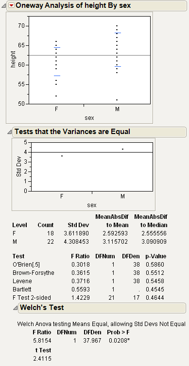
This example uses the Big Class.jmp sample data table. Examine if the difference in height between males and females is less than 6 inches.
|
1.
|
|
2.
|
Select Analyze > Fit Y by X.
|
|
3.
|
|
4.
|
|
5.
|
Click OK.
|
|
6.
|
From the red triangle menu, select Equivalence Test.
|
|
8.
|
Click OK.
|
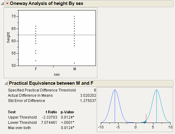
From Example of an Equivalence Test, notice the following:
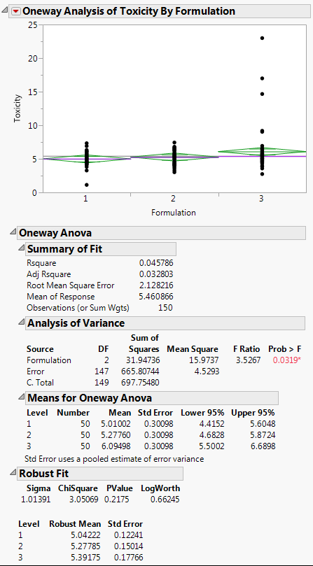
The data in the Drug Toxicity.jmp sample data table shows the toxicity levels for three different formulations of a drug.
|
1.
|
|
2.
|
Select Analyze > Fit Y by X.
|
|
3.
|
|
4.
|
|
5.
|
Click OK.
|
|
6.
|
From the red triangle menu, select Means/Anova.
|
|
7.
|
From the red triangle menu, select Robust > Robust Fit.
|
|
1.
|
|
2.
|
Select Analyze > Fit Y by X.
|
|
3.
|
|
4.
|
|
5.
|
Click OK.
|
|
6.
|
|
10.
|
Select the Solve for Power check box.
|
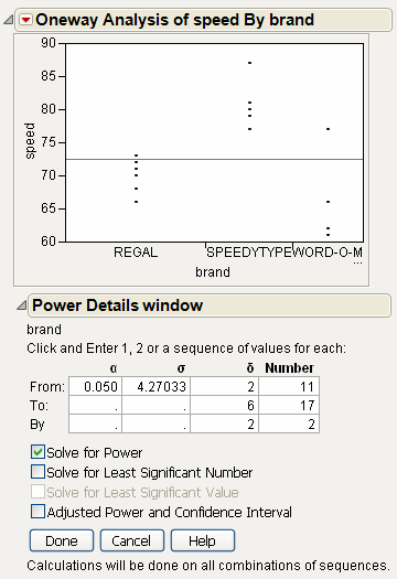
|
11.
|
Click Done.
|
|
12.
|
|
13.
|
|
1.
|
|
2.
|
Select Analyze > Fit Y by X.
|
|
3.
|
|
4.
|
|
5.
|
Click OK.
|
|
6.
|
From the red triangle menu, select Normal Quantile Plot > Plot Actual by Quantile.
|
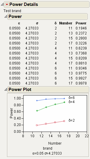
From Example of a Normal Quantile Plot, notice the following:
|
1.
|
|
2.
|
Select Analyze > Fit Y by X.
|
|
3.
|
|
4.
|
|
5.
|
Click OK.
|
|
6.
|
From the red triangle menu, select CDF Plot.
|

The levels of the X variables in the initial Oneway analysis appear in the CDF plot as different curves. The horizontal axis of the CDF plot uses the y value in the initial Oneway analysis.
|
1.
|
|
2.
|
Select Analyze > Fit Y by X.
|
|
3.
|
|
4.
|
|
5.
|
Click OK.
|
|
6.
|
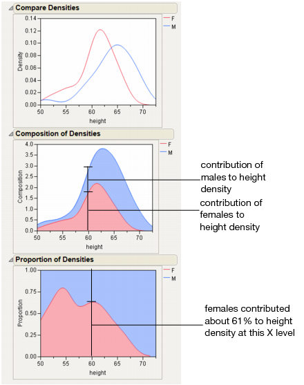
From the red triangle menu, select Densities > Compare Densities, Densities > Composition of Densities, and Densities > Proportion of Densities.
|
This example uses the Matching.jmp sample data table, which contains data on six animals and the miles that they travel during different seasons.
|
1.
|
|
2.
|
|
3.
|
|
4.
|
|
5.
|
Click OK.
|
|
6.
|
From the red triangle menu, select Matching Column.
|
|
7.
|
Select subject as the matching column.
|
|
8.
|
Click OK.
|
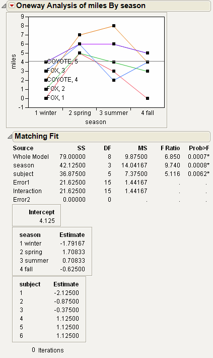
The plot graphs the miles traveled by season, with subject as the matching variable. The labels next to the first measurement for each subject on the graph are determined by the species and subject variables.
The Matching Fit report shows the season and subject effects with F tests. These are equivalent to the tests that you get with the Fit Model platform if you run two models, one with the interaction term and one without. If there are only two levels, then the F test is equivalent to the paired t-test.