|
1.
|
|
2.
|
Select Graph > Graph Builder.
|
|
3.
|
|
4.
|

|
5.
|
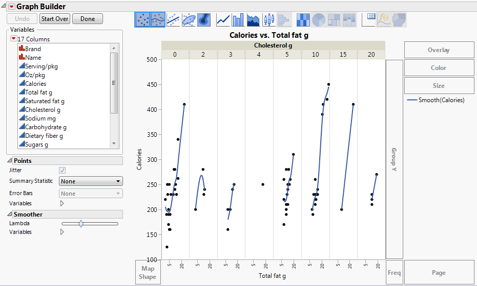
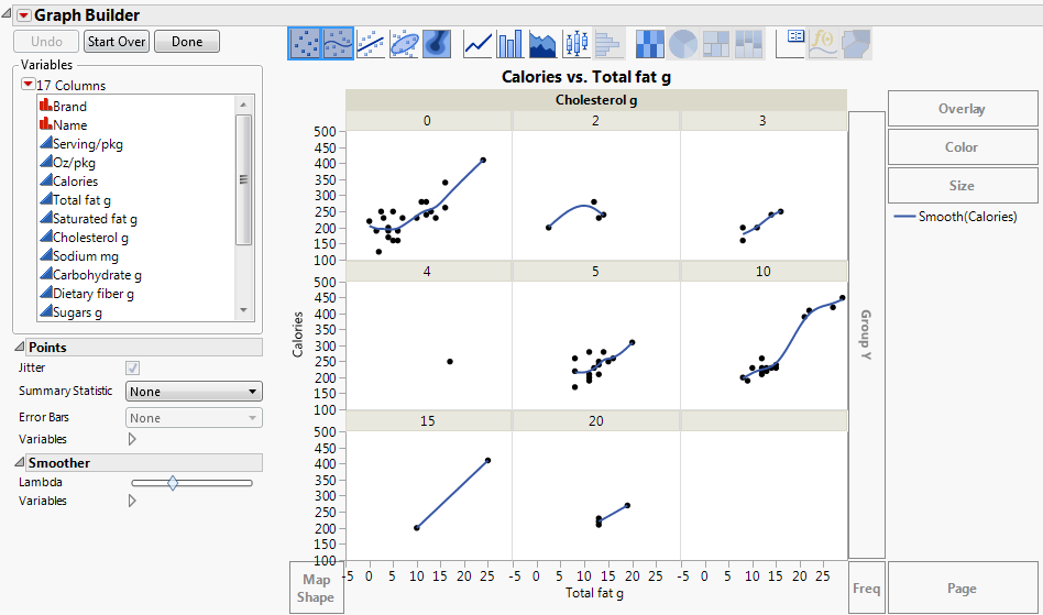
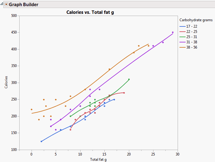
Eight levels of the variable make the graph difficult to read. Try putting Cholesterol g into the Wrap zone instead.
|
6.
|
|
7.
|
Remove Cholesterol g by right-clicking on the Cholesterol g label in the Group X zone and selecting Remove.
|
|
8.
|
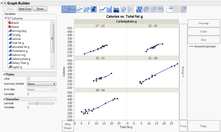
Carbohydrate g is a continuous variable with many values, so Graph Builder uses the percentiles to create five ranges of carbohydrate g levels. About the same number of points are displayed in each group. You can see that the relationship between calories and fat is relatively strong for each level of carbohydrate. It appears that carbohydrates adds additional predictive ability.
|
9.
|
|
10.
|
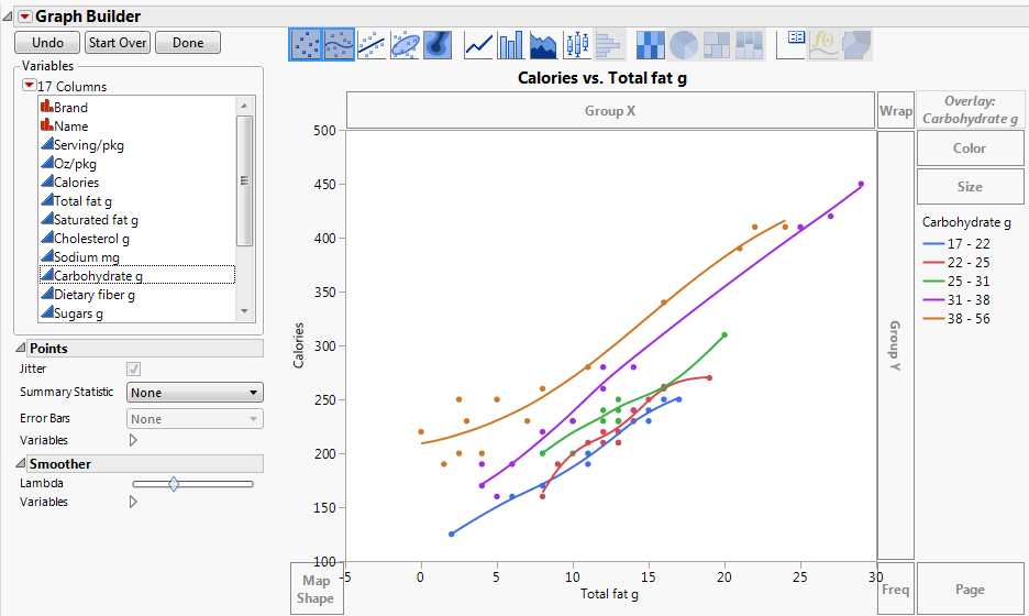
Right-click on the legend title (Carbohydrate g) and select Legend Settings.
|
|
11.
|
Rename the Title to Carbohydrate grams.
|
|
12.
|
Click OK.
|
Launch Graph Builder by selecting Graph > Graph Builder.
|
•
|
|
•
|
|
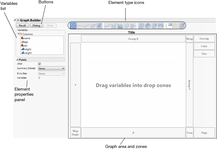
Drop variables here to create map shapes. See Create Map Shapes. If you have a variable in the Map Shape zone, the X and Y zones disappear.
|
|||
|
|||
|
•
|
The X, Y, and Map Shape zones are positional, and influence the types of graph elements that are available.
|
|
•
|
The Group X, Group Y, Wrap, and Overlay zones partition the data into subsets and lay out multiple graphs by either dividing the graph space or by overlaying the graphs.
|
|
•
|
|
|
The Points element shows data values.
|
|
|
The Smoother element shows a smooth curve through the data. The smoother is a cubic spline with a default lambda of 0.05 and standardized X values. You can change the value of lambda using the slider.
|
|
|
The Line of Fit element shows a linear regression with confidence intervals. The confidence intervals are fixed at 5% confidence, with an alpha of 0.05.
|
|
|
The Ellipse element shows a bivariate normal density ellipse.
|
|
|
The Contour element shows regions of density or value contours. If you specify only one continuous variable for X or Y, a violin plot appears instead of a contour plot.
|
|
|
The Line element shows a response summarized by categories.
|
|
|
The Bar element shows a response summarized by categories.
|
|
|
The Area element shows a response summarized by categories.
|
|
|
The Box Plot element shows a compact view of a variable’s distribution, with quartiles and outliers.
|
|
|
The Histogram element shows a variable’s distribution using binning. If you specify the same variable for X and Y, then the Y role is ignored and a single histogram appears.
Tip: To overlay histograms transparently, assign a Y variable and an Overlay variable. Then, click the Histogram element icon.
|
|
|
|
|
|
The Pie element shows portions of a whole.
|
|
|
The Treemap element shows a response summarized by categories.
|
|
|
|
|
|
The Caption Box element shows a summary statistic value for the data.
|
|
|
The Formula element shows a function defined by a column formula.
|
|
|
The Map Shapes element creates a map on the graph.
|
When applicable, properties for each element appear and can be adjusted in the Graph Builder window. For more information, see Right-Click Menu for a Graph.
|
•
|
Undo reverses the last change made to the window.
|
|
•
|
Recall populates the Graph Builder window with the last graph that you created. The Recall button becomes the Undo button once you perform an action.
|
|
•
|
Start Over returns the window to the default condition, removing all data and graph elements from the window, and all variables from the drop zones.
|
|
•
|
Dialog opens the Graph Builder launch window. After you click it, the Dialog button becomes the Start Over button.
|
|
•
|
Done hides the buttons and Select Columns box and removes all drop zone outlines. In this presentation-friendly format, you can copy the graph to other programs. To copy the graph, select Edit > Copy. To restore the window to the interactive mode, click Show Control Panel on the Graph Builder red triangle menu.
|