Suppose that you have downloaded Esri shapefiles from the Internet and you want to use them as your map files in JMP. The shapefiles are named Parishes.shp and Parishes.dbf. These files contain coordinates and information about the parishes (or counties) of Louisiana.
Note: Pathnames in this section refer to the “JMP” folder. On Windows, in JMP Pro, the “JMP” folder is named “JMPPro”. In JMP Shrinkwrap, the “JMP” folder is named “JMPSW”.
Save the .shp file with the appropriate name and in the correct directory, as follows:
|
1.
|
In JMP, open the Parishes.shp file from the following default location:
|
|
‒
|
On Windows: C:\Program Files\SAS\JMP\<Version Number>\Samples\Import Data
|
|
‒
|
On Mac: /Library/Application Support/JMP/<Version Number>/Samples/Import Data
|
|
2.
|
|
‒
|
On Windows: C:\Users\<user name>\AppData\Roaming\SAS\JMP\Maps
|
|
‒
|
On Mac: /Users/<user name>/Library/Application Support/JMP/Maps
|
|
3.
|
Close the Parishes-XY.jmp file.
|
Perform the initial setup and save the .dbf file, as follows:
|
1.
|
Open the Parishes.dbf file from the following default location:
|
|
‒
|
On Windows: C:\Program Files\SAS\JMP\<Version Number>\Samples\Import Data
|
|
‒
|
On Mac: /Library/Application Support/JMP/<Version Number>/Samples/Import Data
|
|
2.
|
|
3.
|
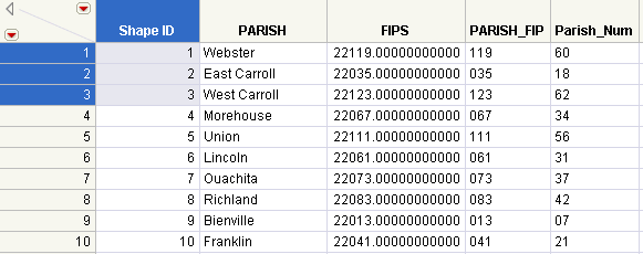
In the first three rows of the Shape ID column, type 1, 2, and 3 (Note - You can also use Cols > New Column > Initialize Data > Sequence Data).
|
|
4.
|
Select all three cells, right-click, and select Fill > Continue sequence to end of table.
|
|
5.
|
|
6.
|
Select Column Properties > Map Role.
|
|
7.
|
Select Shape Name Definition.
|
|
8.
|
Click OK.
|
|
9.
|
Save the Parishes file with the following name and extension: Parishes-Name.jmp. Save the file here:
|
|
‒
|
On Windows: C:\Users\<user name>\AppData\Roaming\SAS\JMP\Maps
|
|
‒
|
On Mac: /Users/<user name>/Library/Application Support/JMP/Maps
|
|
10.
|
Close the Parishes-Name.jmp file.
|
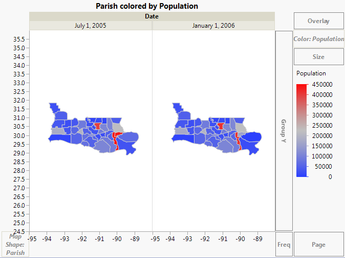
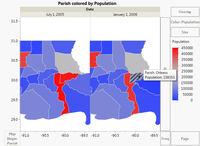
Once the map files have been set up, you can use them. The Katrina.jmp data table contains data on Hurricane Katrina’s impact by parish. You want to visually see how the population of the parishes changed after Hurricane Katrina. Proceed as follows:
|
1.
|
|
2.
|
|
3.
|
Select Shape Name Use.
|
|
4.
|
Click the Map name data table button
|
|
5.
|
In Parishes-Name.jmp, the PARISH column has the Shape Name Definition Map Role property assigned. The column consists of map shape data for each parish.
|
6.
|
Select Graph > Graph Builder.
|
|
7.
|
The map appears automatically, since you defined the Parish column using the custom map files.
|
8.
|
|
9.
|
|
10.
|
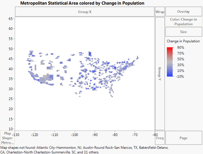
Suppose that you already have your custom map files and they are named appropriately. Your map files are US-MSA-Name.jmp and US-MSA-XY.jmp. They are saved in the sample data folder.
The PopulationByMSA.jmp data table contains population data from the years 2000 and 2010 for the metropolitan statistical areas (MSAs) of the United States. This example shows how the data table has been set up to create a map.
|
1.
|
|
2.
|
|
3.
|
Select Column Properties > Map Role.
|
|
4.
|
Select Shape Name Use.
|
|
5.
|
|
6.
|
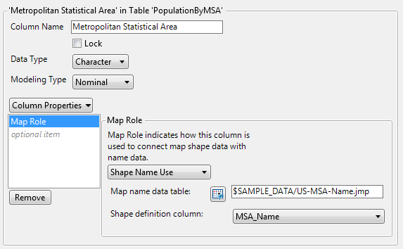
MSA_Name is the specific column within the US-MSA-Name.jmp data table that contains the unique names for each metropolitan statistical area. Notice that the MSA_Name column has the Shape Name Definition Map Role property assigned, as part of correctly defining the map files.
Note: Remember, the Shape ID column in the -Name data table maps to the Shape ID column in the -XY data table. This means that indicating where the -Name data table resides links it to the -XY data table, so that JMP has everything that it needs to create the map.
|
7.
|
Click OK.
|
Once the Map Role column property has been set up, you can perform your analysis. You want to visually see how the population has changed in the metropolitan statistical areas of the United States between the years 2000 and 2010.
|
1.
|
Select Graph > Graph Builder.
|
|
2.
|
Since you have defined the Map Role column property on this column, the map appears.
|
3.
|
|
4.
|
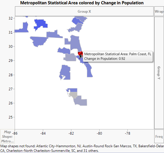
Select the Magnifier tool to zoom in on the state of Florida.
|
|
5.
|
Select the Arrow tool and click on the red area.
|
|
6.
|
Select the Magnifier tool and hold down the ALT key while clicking on the map to zoom out.
|
|
7.
|
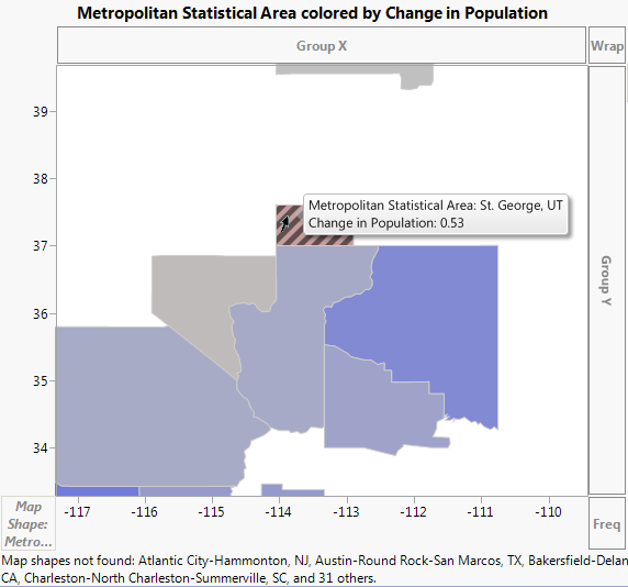
Select the Magnifier tool and zoom in on the state of Utah.
|
|
8.
|
Select the Arrow tool and click on the area that is slightly red.
|
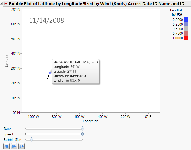
This example uses the Hurricanes.jmp sample data table, which contains data on hurricanes that have affected the east coast of the United States. Adding a background map helps you see the areas the hurricanes affected. A script has been developed for this example and is part of the data table.
|
1.
|
|
2.
|
Run the Bubble Plot script (Bubble Plot > Run Script).
|
Bubble Plot of Hurricanes.jmp
|
5.
|
Right-click the graph and select Background Map. The Set Background Map window appears (Example of Background Map Options).
|
|
6.
|
Bubble Plot of Hurricanes.jmp with Background Map
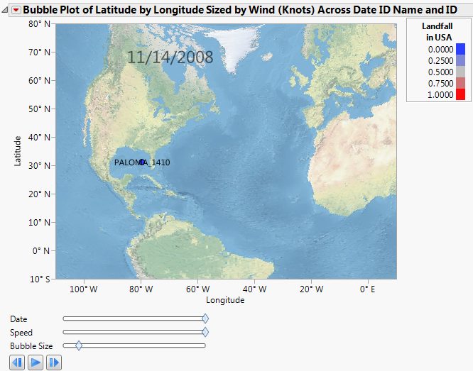
Now the coordinates make geographic sense. Click Run to view the animation of the hurricane data moving over the background map. Experiment with different options and view the displays. Adjust the axes or use the zoom tool to change what part of the world you are viewing. The map adjusts as the view does. You can also right-click the graph and select Size/Scale->Size to Isometric to get the aspect ratio of your graph to be proportional.
The next example uses the Katrina Data.jmp sample data table, which contains data on hurricane Katrina such as latitude, longitude, date, wind speed, pressure, and status. Adding a background map helps you see the path the hurricane took and impact on land based on size and strength. A script has been developed for this example and is part of the data table.
|
1.
|
|
2.
|
|
3.
|
|
4.
|
|
5.
|
|
6.
|
|
7.
|
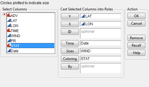
Bubble Plot Setup of Katrina Data.jmp
|
8.
|
Click OK.
|
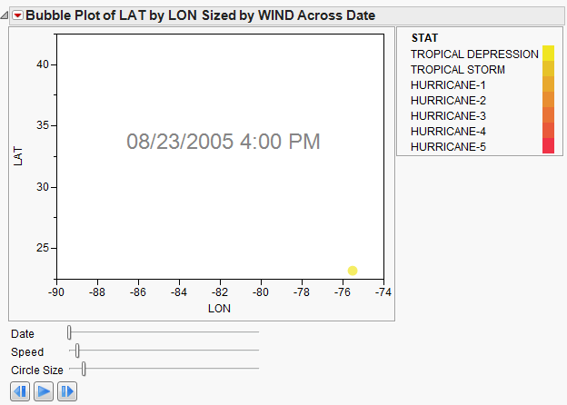
Bubble Plot of Katrina Data.jmp
|
9.
|
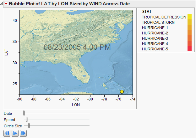
Right-click the graph and select Background Map. The Set Background Map window appears.
|
|
10.
|
Bubble Plot of Katrina Data.jmp with Background Map
|
11.
|
Right-click the X axis (LON) and select Axis Settings. The X Axis Specification window appears.
|
|
12.
|
|
13.
|
|
14.
|
Click OK.
|
|
15.
|
|
16.
|
Bubble Plot of Katrina Data.jmp with Background Map
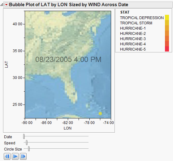
Click Run to view the animation of the hurricane data moving over the background map. You can manipulate the speed and the bubble size. Experiment with different options and view the displays. Adjust the axes or use the zoom tool to change what part of the area you are viewing. Add boundaries to the states. The map adjusts as the view does.
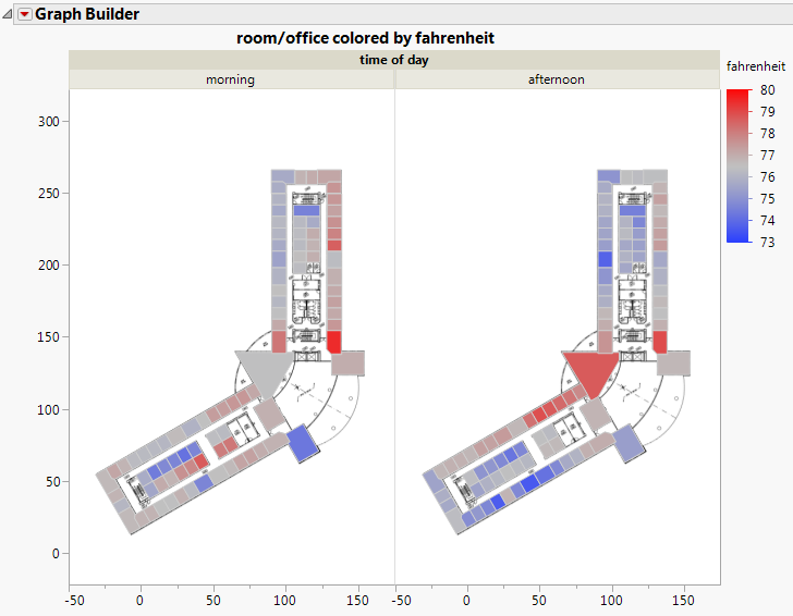
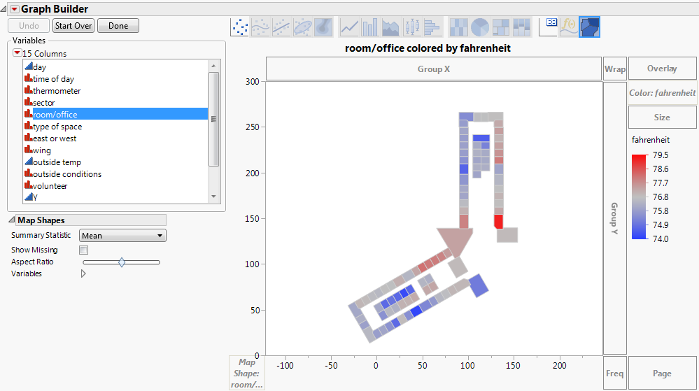
This example demonstrates the creation of a custom background map for an office temperature study and how JMP was used to visualize the results. Data was collected concerning office temperatures for a floor within a building. A map was created for the floor using the Custom Map Creator add-in from the JMP File Exchange (https://community.jmp.com/docs/DOC-6218). Using Graph Builder, the office temperature results were then analyzed visually.
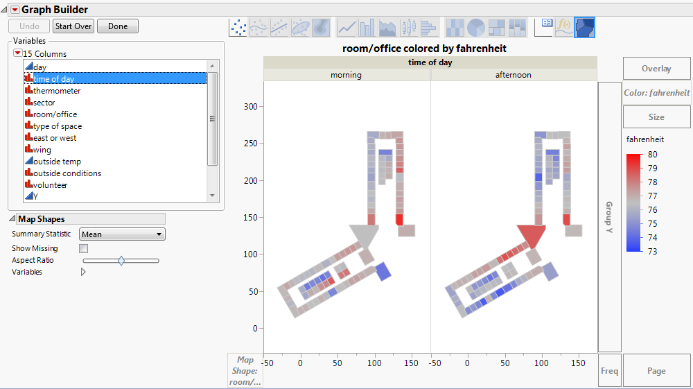
The map shown below is the floor, grouped by time of day. The color reflects the Fahrenheit value. Exploring data visually in this way can give hints as to what factors are affecting office temperature. Looking at this map, it appears the offices on the east side of the building are warmer in the mornings than they are in the afternoons. On the western side of the building, the opposite appears to be true. From this visualization, we might expect that both of these variables are affecting office temperatures, or perhaps that the interaction between these terms is significant. Such visuals help guide decision-making during the analysis.
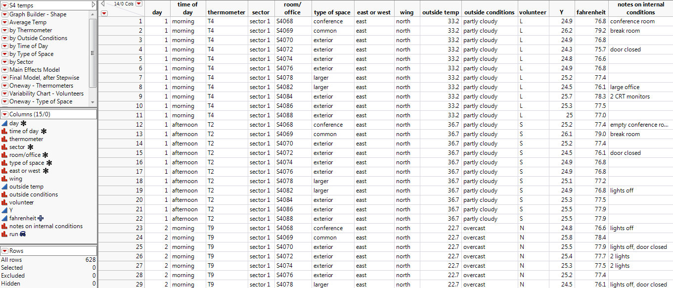
First, data was collected and input into a data table (S4 Temps.jmp). Note the Room/Office column. It contains the unique names for each office and was assigned the Map Role to correctly define the map files.
Then, a map of the floor was created using the Custom Map Creator add-in, which you can download from the JMP File Exchange at https://community.jmp.com/docs/DOC-6218. The add-in creates two tables to define the shapes; an XY table and a Name table. The instructions below describe how it was built.
|
1.
|
Launch the add-in through the menu items Add-Ins > Map Shapes > Custom Map Creator. Two tables open in the background followed by the Custom Map Creator Window.
|
|
4.
|
|
5.
|
Click Next.
|
|
8.
|
As soon as you finish defining the boundaries of the shape, click Next Shape. Continue adding shapes until you have completed the floor plan. Note that you do not need to connect the final boundary point; the add-in automatically does that for you when you click Next Shape.
|
|
9.
|
The line size and color can be changed. In addition, checking Fill Shapes fills each shape with a random color.
|
|
10.
|
Click Finish.
|
The custom map files were created and named appropriately. The map files are S4-Name.jmp and S4-XY.jmp and have been saved in the JMP Samples\Data folder.
Note: Pathnames in this section refer to the “JMP” folder. On Windows, in JMP Pro, the “JMP” folder is named “JMPPro”. In JMP Shrinkwrap, the “JMP” folder is named “JMPSW”.
The S4 Temps.jmp data table contains office data over a three-day period. Set up the Map Role column property in the data table, as follows:
|
1.
|
|
2.
|
|
3.
|
Select Column Properties > Map Role.
|
|
4.
|
Select Shape Name Use.
|
|
5.
|
Click the icon next to Map name data table and browse to the S4-Name.jmp file (located in the JMP Samples/Data folder).
|
|
6.
|
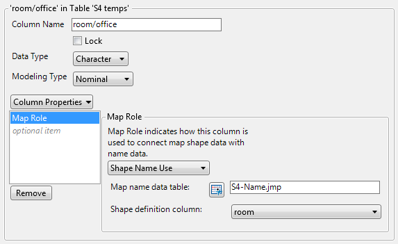
Room is the specific column within the S4-Name.jmp data table that contains the unique names for each office. Notice that the room column has the Shape Name Definition Map Role property assigned, as part of correctly defining the map files.
Note: Remember, the Shape ID column in the -Name data table maps to the Shape ID column in the -XY data table. This means that indicating where the -Name data table resides links it to the -XY data table, so that JMP has everything that it needs to create the map.
|
7.
|
Click OK.
|
Once the Map Role column property has been set up, you can perform your analysis. You want to visually see the differences in office temperatures throughout the floor.
|
1.
|
Select Graph > Graph Builder.
|
|
2.
|
Since you have defined the Map Role column property on this column, the map appears.
|
3.
|
|
4.
|
Drag and drop Time of Day onto Group X zone.
|
Note that only the offices that were part of the study and were created using the Custom Map Creator add-in are displayed. To add the entire floor plan image, the original floor plan graphic was dragged and dropped onto the Graph Builder window to create Room/Office Map with Original Floor Plan.
To view Room/Office Map with Original Floor Plan, select Help > Sample Data Library and open S4 Temps.jmp and run the by Time of Day script.