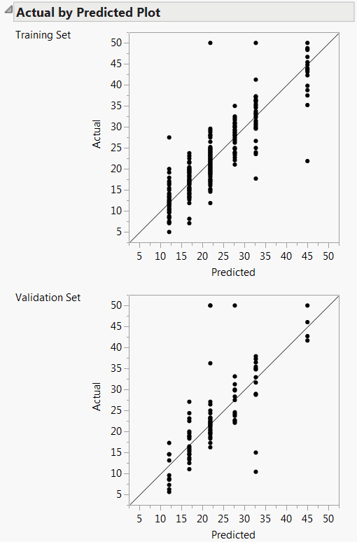
For continuous responses, the Actual by Predicted plot shows how well the model fits the data. Each leaf is predicted with its mean, so the x-coordinates are these means. The actual values form a scatter of points around each leaf mean. A diagonal line represents the locus of where predicted and actual values are the same. For a perfect fit, all the points would be on this diagonal. When validation is used, plots are shown for both the training and the validation sets. See Actual by Predicted Plots for Boston Housing Data.
When you fit a Decision Tree, observations in a leaf have the same predicted value. If there are n leaves, then the Actual by Predicted plot shows at most n distinct predicted values. This gives the plot the appearance of having points arranged on vertical lines. Each of these lines corresponds to a predicted value for some leaf.
The ROC curve is for categorical responses. The classical definition of ROC curve involves the count of True Positives by False Positives as you accumulate the frequencies across a rank ordering. The True Positive y-axis is labeled “Sensitivity” and the False Positive X-axis is labeled “1-Specificity”. If you slide across the rank ordered predictor and classify everything to the left as positive and to the right as negative, this traces the trade-off across the predictor's values.
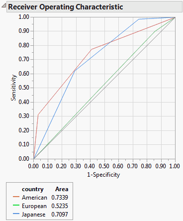
ROC curves are nothing more than a curve of the sorting efficiency of the model. The model rank-orders the fitted probabilities for a given Y-value. Starting at the lower left corner, the curve is drawn up when the row comes from that category and to the right when the Y is another category.
In the following picture, the Y axis shows the number of Ys where Y=1, and the X axis shows the number of Ys where Y=0.
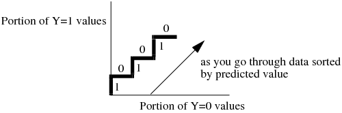
Because partitions contain clumps of rows with the same (that is tied) predicted rates, the curve actually goes slanted, rather than purely up or down.
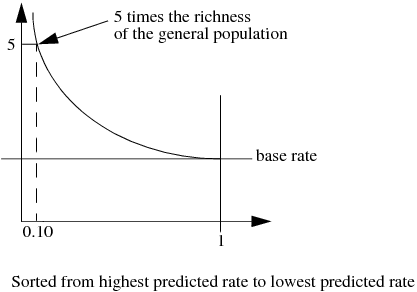
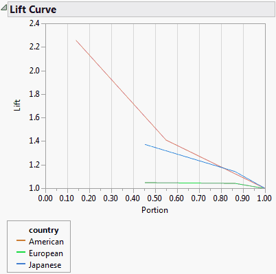
A lift curve shows the same information as an ROC curve, but in a way to dramatize the richness of the ordering at the beginning. The Y-axis shows the ratio of how rich that portion of the population is in the chosen response level compared to the rate of that response level as a whole. For example, the top-rated 10% of fitted probabilities might have a 25% richness of the chosen response compared with 5% richness over the whole population. Then the lift curve goes through the X-coordinate of 0.10 at a Y-coordinate of 25% / 5%, or 5. All lift curves reach (1,1) at the right, as the population as a whole has the general response rate.