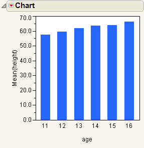
Follow the instructions in Example of the Chart Platform to produce the report shown in The Initial Chart Report Window.
Charts can be bar charts, pie charts, line charts, needle charts, point charts, and range charts. The Initial Chart Report Window shows a standard bar chart.
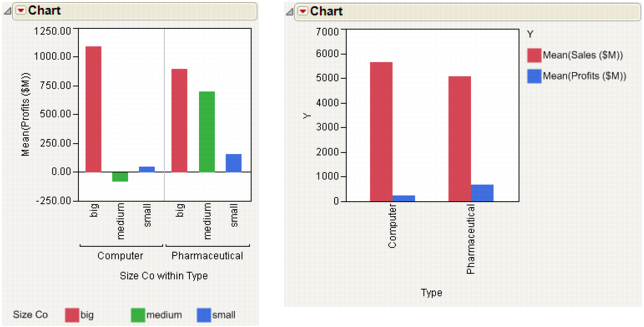
By default, the Chart platform orders the bars using one of the common orders supported by JMP (months, days of the week, and so on). However, if the grouping column has a Row Order Levels column property, the levels are ordered in that order. If the grouping column has a Value Ordering column property, it uses that order. If both Row Order Levels and Value Ordering properties are defined, the Value Ordering property has precedence. With neither property in effect, bars are drawn in alphanumeric order.
|
2.
|
From the red triangle menu for Chart, select Level Options > Colors.
|
|
2.
|
From the red triangle menu for Chart, select Level Options > Colors.
|
Note: If you assigned both a category variable and a grouping variable in your chart, all of the bars are colored even if you selected only one bar.
|
2.
|
Right-click and select Colors.
|
|
2.
|
Select Cols > Column Info.
|
|
3.
|
Assign colors using Value Colors in the Column Properties menu. For details about the Value Colors property, see the Using JMP book.
|