Using the Process Capability red triangle menu, you can add individual detail reports, normalized box plots, and summary reports. The red triangle menu also has options for identifying out-of-spec values in your data table, creating a summary data table, changing the display order of analyzed columns, and saving out spec limits. These options are described in Process Capability Platform Options.
You can change the default report at File > Preferences > Platforms > Process Capability. Follow the instructions in Example of the Process Capability Platform to produce the report shown in Default Results for Semiconductor Capability.jmp.
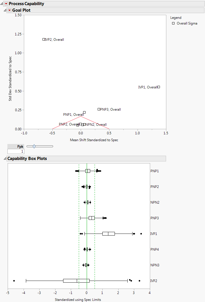
The Goal Plot shows, for each variable, the spec-normalized mean shift on the x-axis, and the spec-normalized standard deviation on the y-axis. It is useful for getting a quick, summary view of how the variables are conforming to specification limits. By default, the Goal Plot shows only those points for each column that are calculated using the overall sigma. Hold your cursor over each point to view the variable name and the sigma type used to calculate the point. See Goal Plot for details about the calculation of the coordinates for the Goal Plot.
The points on the Goal Plot are also linked to the rows of the Goal Plot Summary Table, where each row corresponds to a column. You can select a point in the Goal Plot, right-click, and apply row states. These row states are applied to the rows of the Goal Plot Summary Table. Row states that you apply in the Goal Plot Summary Table are reflected in the Goal Plot. To see this table, select Make Goal Plot Summary Table from the Process Capability red triangle menu. See Make Goal Plot Summary Table.
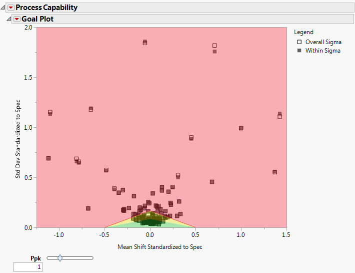
When you select Shade Levels from the Goal Plot red triangle menu, shaded areas appear within the goal plot triangle. See Goal Plot. The shaded areas are described as follows, with p representing the value shown in the Ppk edit box:
|
•
|
|
•
|
Points in the green area have 2p < Ppk.
|
JMP gives the Goal Plot in terms of Ppk values by default. You can change this preference at File > Preferences > Platforms > Process Capability. When the AIAG (Ppk) Labeling preference is unchecked, all of the Ppk labeling is changed to Cpk labeling, including the label of the slider under the goal plot.
The Goal Plot red triangle menu has the following options:
Goal Plot shows the Goal Plot for the entire data set for the Semiconductor Capability.jmp sample data table after selecting Shade Levels and Show Within Sigma Points from the Goal Plot red triangle menu.
Processes with only an upper specification limit are represented by blue and should be compared to the blue (right) side of the goal triangle. Processes with only a lower specification limit are represented by red and should be compared to the red (left) side of the goal triangle. For details about how the coordinates of points are calculated, see Goal Plot.
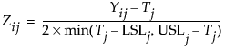
The Capability Box Plots show a box plot for each variable selected in the analysis. The values for each column are centered by their target value and scaled by the difference between the specification limits. If the target is not centered between the specification limits, the values are scaled by twice the minimum difference between the target and specification limits. For each process column Yj (see Notation for Goal Plots and Capability Box Plots for a description of the notation):
For a process with a one-sided specification, see One-Sided or Missing Specification Limits. For the situation where no target is specified, see Capability Box Plots for Processes with Missing Targets.
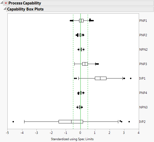
Capability Box Plot shows the Capability Box Plots for the Semiconductor Capability.jmp sample data table as described in Example of the Process Capability Platform. The Capability Box Plots displays dotted green lines drawn at ±0.5. For a process with a target that is centered between its specification limits, the dotted green lines represent the standardized specification limits.
This plot is useful for comparing variables with respect to their specification limits. For example, in Capability Box Plot, the majority of points for IVP1 are above its USL, and the majority of its points for IVP2 are less than its target. PNP2 seems to be on target with all data points in the specification limits.
Suppose that only the lower specification limit is specified and that the process target is specified. The capability box plot is based on the following values for the transformed observations (see Notation for Goal Plots and Capability Box Plots for a description of the notation):