Example of Adding Selection Filters to a Dashboard
In a dashboard that contains several reports, you can select data in a report and then view only that data in other reports contained in the same window. This example shows how to add selection filters to the primary report when you edit a dashboard.
Open Reports and Create a Dashboard
1. Select Help > Sample Data Library and open Hollywood Movies.jmp.
2. To create the reports, run the table scripts named “Distribution: Profitability by Lead Studio and Genre”, “Graph Builder: World and Domestic Gross by Genre”, and “Bubble Plot: Theaters Open Week by Domestic Gross”.
3. From any window, select File > New > Dashboard.
Templates for common layouts appear.
4. Select the 2x1 Dashboard template.
A box with room for two reports appears on the workspace.
5. In the Reports list, double-click the Graph Builder and Distribution report thumbnails to put them on the dashboard.
Add and Use Selection Filters
1. Right-click the center of the left report (Graph Builder) and select Use As Selection Filter.
2. To add another report as a second selection filter, click the Bubble Plot thumbnail and drag it into the blue line around the Graph Builder graph.
Figure 11.13 Dragging the Bubble Plot into the Graph Builder Graph
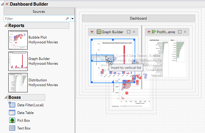
A filter icon appears on both thumbnails.
3. Click the Dashboard Builder red triangle and select Preview Mode.
4. Select one of the bars for the Fantasy genre in the left report.
Figure 11.14 Filtering Data
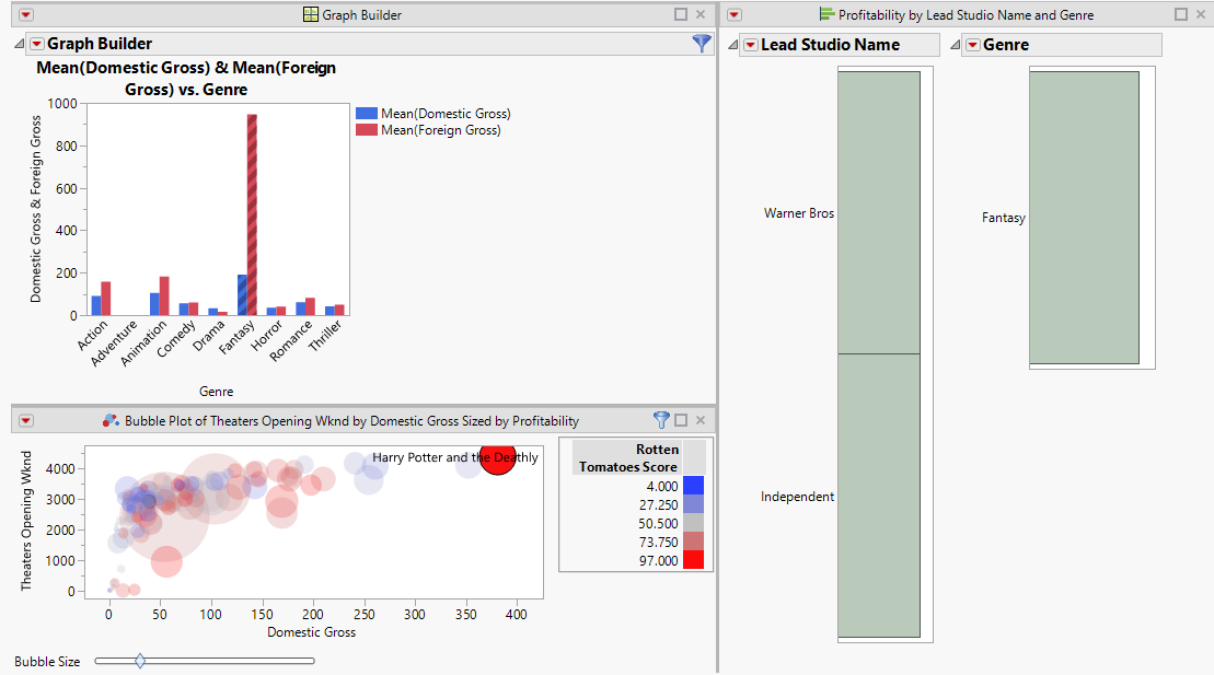
In the right report, you can see that Warner Bros and Independent studios produced the most fantasy movies. In the bottom report, you can see that Harry Potter was the most profitable fantasy movie.