Example of ROC Curves
To demonstrate ROC curves, proceed as follows:
1. Select Help > Sample Data Library and open Penicillin.jmp.
2. Select Analyze > Fit Y by X.
3. Select Response and click Y, Response.
4. Select ln(dose) and click X, Factor.
Notice that JMP automatically fills in Count for Freq. Count was previously assigned the role of Freq.
5. Click OK.
6. Click the red triangle next to Logistic Fit of Response By ln(dose) and select ROC Curve.
7. Select Cured as the positive, and click OK.
Note: This example shows a ROC Curve for a nominal response. For more information about ordinal ROC curves, see ROC Curve in Predictive and Specialized Modeling.
The results for the response by ln(dose) example are shown here. The ROC curve plots the probabilities described above, for predicting response. Note that in the ROC Table, the row with the highest Sens-(1-Spec) is marked with an asterisk.
Figure 8.9 Examples of ROC Curve and Table
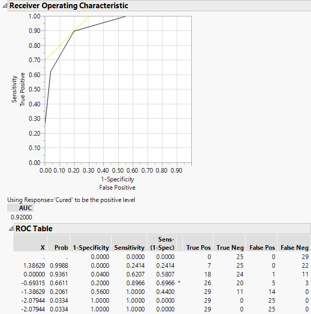
Since the ROC curve is well above a diagonal line, you conclude that the model has good predictive ability.