G chart Example
A G chart is an effective way to understand whether rare events are occurring more frequently than expected and warrant an intervention. See Rare Event Control Charts.
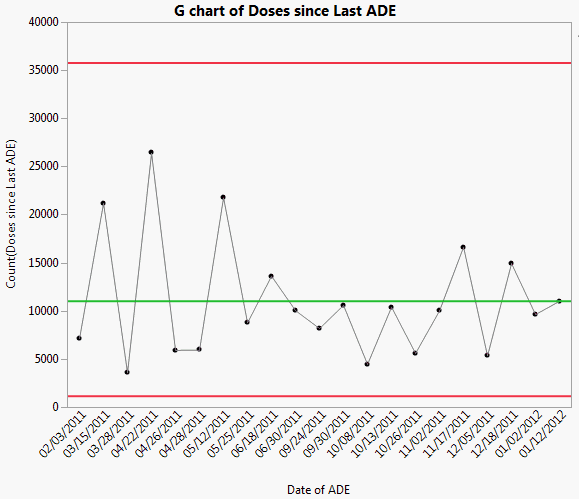
The Adverse Reactions.jmp sample data table contains simulated data about adverse drug events (ADEs) reported by a group of hospital patients. An ADE is any type of injury or reaction the patient suffered after taking the drug. The date of the reaction and the number of days since the last reaction were recorded.
1. Select Help > Sample Data Library and open Quality Control/Adverse Reactions.jmp.
2. Select Analyze > Quality and Process > Control Chart Builder.
3. Drag Doses since Last ADE to the Y role.
4. Drag Date of ADE to the Subgroup role.
An Individual & Moving Range chart of Doses since Last ADE appears.
5. In the drop-down list, select Rare Event instead of Shewhart Variables.
A G chart of Doses since Last ADE appears showing the number of doses given since the last event.
Figure 3.23 G chart of Doses since Last ADE