T chart Example
T charts are used to measure the time that has elapsed since the last event. See Rare Event Control Charts.
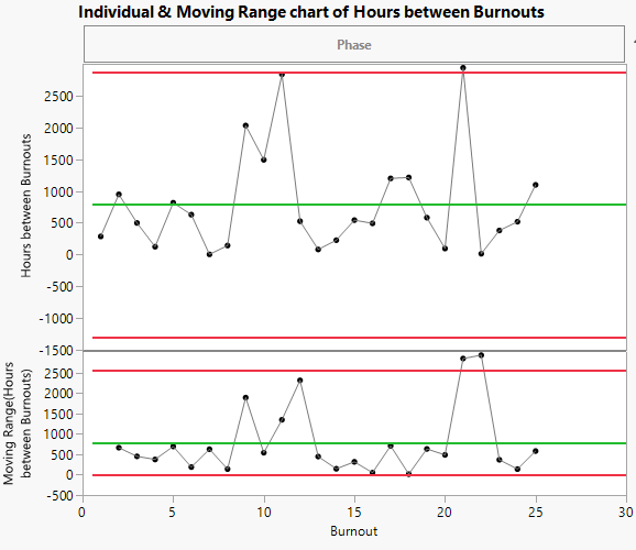
The Fan Burnout.jmp sample data table contains simulated data for a fan manufacturing process. The first column identifies each fan that burned out. The second column identifies the number of hours between each burnout.
1. Select Help > Sample Data Library and open Quality Control/Fan Burnout.jmp.
2. Select Analyze > Quality and Process > Control Chart Builder.
3. Drag Hours between Burnouts to the Y role.
4. Drag Burnout to the Subgroup role.
Figure 3.24 Individual and Moving Range Chart of Hours Between Burnouts
5. In the drop-down list, select Rare Event instead of Shewhart Variables.
A G chart of Hours between Burnouts appears.
6. Under Limits, change the Sigma from Negative Binomial to Weibull.
Figure 3.25 T chart of Hours Between Burnouts
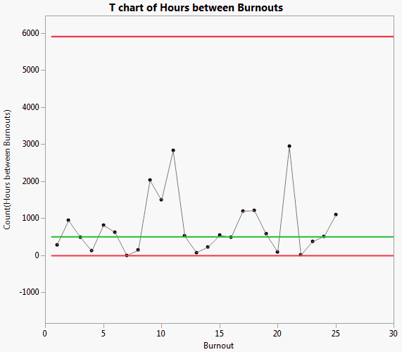
In the T chart, all points appear to be within the control limits. It’s clear that the Individual & Moving Range chart was inappropriate for the analysis, as the limits were too narrow.