Additional Example of the Cell Plot Platform
This example uses the SAT.jmp sample data table, which contains SAT test scores (divided into verbal and mathematics portions) for all 50 United States.
1. Select Help > Sample Data Library and open SAT.jmp.
2. Select Graph > Cell Plot.
3. Select all of the Verbal scores for all of the years, and click Y, Response.
4. Select all of the Math scores for all of the years, and click Y, Response.
5. Select State and click Label.
6. Click OK.
The report window appears.
7. Right-click the plot under 2004 Verbal (the top left cell) and select Sort Ascending.
This sorts the cell plot by the verbal scores for 2004.
Figure 8.6 Cell Plot for SAT Scores
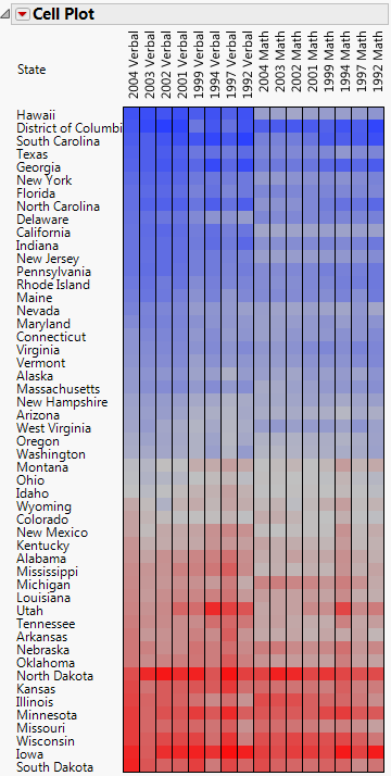
You notice the following:
• Hawaii has the lowest verbal scores for 2004, and South Dakota has the highest verbal scores for 2004.
• There is a contrast between Hawaii’s math and verbal scores. Hawaii has average math scores (represented by gray color values) but low verbal scores (represented by blue color values). Hawaii appears to be an outlier, since it has a strikingly different pattern for its math scores and its verbal scores.
• There is very little contrast between North Dakota’s math and verbal scores. North Dakota’s math and verbal scores are generally high (represented by red color values).
For a description of color themes, see Pop-Up Menu for Cell Plots.