Example of a Forecast Plot
|
Data |
This example uses maximum monthly temperature data from the US city of Raleigh, NC that were recorded from 1980 to 1990. |
|
Techniques |
This example uses a time series line of fit. |
|
Goal |
The goal of this example is to forecast the maximum monthly temperature for the following year. |
1. Select Help > Sample Data Library and open Time Series/RaleighTemps.jmp.
2. Select Graph > Graph Builder.
3. Select Month/Year and drag it to the X zone.
4. Select Temperature and drag it to the Y zone.
5. Click the Line of Fit element icon ![]() .
.
6. In the Line of Fit properties panel, do these actions:
– From the Fit list, select Time Series.
– In the box next to Seasonal Period, type 12.
– In the box next to Forecast Periods, type 12.
This forecasts 12 months out. Since the data ends at 1990, it forecasts through 1991.
7. Right-click the X axis and select Axis Settings.
– Under Tick/Bin Increment, change the Increment to 1.
– Under Tick/Bin Increment, change the Label Row Nesting to 2.
– Under Axis Label Rows, on the Label Row 1 tab, select Labels for the minor tick marks.
– Click OK.
8. (Optional) To save the predicted forecast values and the lower and upper points of the forecast interval as new columns in the data table, click the Line of Fit red triangle and select Save Formula.
9. Click Done.
Figure 4.27 Forecast Plot of Maximum Monthly Temperature
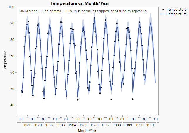
The graph shows the data points used to estimate the time series function that extends through the forecast period. Note the following about this graph:
• The solid blue line represents the forecast model. The shaded blue area is the 95% confidence interval around the predicted values.
• The forecast period covers 1991, which is 12 months past the last data point. The forecast period is the right most portion of the plot that has no data points.
• The peak forecast high for 1991 is in July with an estimated value of 90oF. This estimate has a confidence interval of about 83oF to 96oF represented by the limits of the blue region above and below the estimate.
• The text at the top indicates the type of model that was fit, the parameter values for that model, and information about missing values. To remove this text from your graph, deselect the Forecast Model option in the Line of Fit properties panel.