Example of a Variability Chart
Suppose that you have data containing part measurements. Three operators, Cindy, George, and Tom, each took measurements of 10 parts. They measured each part three times, making a total of 90 observations. You want to identify the variation between operators.
1. Select Help > Sample Data Library and open Variability Data/2 Factors Crossed.jmp.
2. Select Analyze > Quality and Process > Variability / Attribute Gauge Chart.
3. For Chart Type, select Variability.
4. Select Measurement and click Y, Response.
5. Select Operator and click X, Grouping.
6. Select part# and click Part, Sample ID.
7. Click OK.
8. Click the Variability Gauge red triangle and select Show Group Means and Connect Cell Means.
Figure 5.2 Example of a Variability Chart
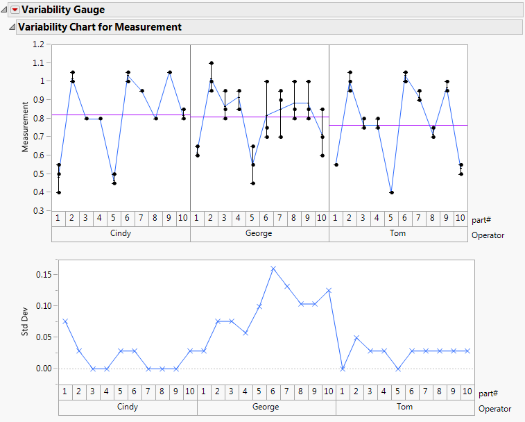
Looking at the Std Dev chart, you can see that Cindy and George have more variation in their measurements than Tom, who appears to be measuring parts the most consistently. George seems to have the most variation in his measurements, so he might be measuring parts the most inconsistently.