Example of a Bullet Bar Chart
|
Data |
This example uses fabricated sales data for four products. |
|
Techniques |
This example uses a bullet chart. |
|
Goal |
The goal of this example is to display actual units sold compared to a minimum and target number of units. |
1. Select Help > Sample Data Library and open Bullet Measures.jmp.
2. Select Graph > Graph Builder.
3. Select Actual, Target, and Minimum and drag them to the X zone.
4. Select Product and drag it to the Y zone.
5. Click the Bar element icon ![]() .
.
6. In the Bar properties panel, perform these actions:
– From the Bar Style list, select Bullet.
– Open Variables, and then highlight Minimum and click the Up arrow once.
7. Click the Graph Builder red triangle and select Legend Position > Bottom.
8. Right-click on a color in the legend and change the Fill Color as follows:
– No change to Actual
– Change Minimum to dark gray
– Change Target to light gray
9. Right-click in the Y axis > Order By > Target, ascending.
10. Change the titles of the X axis and graph as follows:
a. Click the graph title and enter Sales Data vs. Products.
b. Click the X-axis title and enter Units.
11. Click Done.
Figure 4.26 Bullet Chart of Actual, Target, and Minimum Units Sold
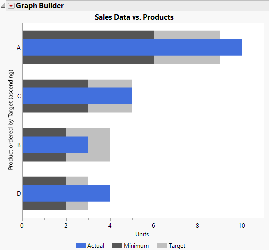
The products are ordered by the target number of units as shown by the light gray bars. Products A and D have actual sales that are above their targets; the blue bars extend beyond the light gray target bars. Sales for Product C are on target. Sales for Product B are below target but above the minimum number of units.