Presummarize Chart Example
The following example uses the Coating.jmp data table.
1. Select Help > Sample Data Library and open Quality Control/Coating.jmp.
2. Select Analyze > Quality and Process > Legacy Control Charts > Presummarize.
3. Select Weight and click Process.
4. Select Sample and click Sample Label.
5. Select both Individual on Group Means and Moving Range on Group Means. The Sample Grouped by Sample Label button is automatically selected when you choose a Sample Label variable.
When using Presummarize charts, you can select either On Group Means options or On Group Std Devs options or both. Each option creates two charts (an Individual Measurement, also known as an X chart, and a Moving Range chart) if both IR chart types are selected.
The On Group Means options compute each sample mean and then plot the means and create an Individual Measurement and a Moving Range chart on the means.
The On Group Std Devs options compute each sample standard deviation and plot the standard deviations as individual points. Individual Measurement and Moving Range charts for the standard deviations then appear.
6. Click OK.
Figure 12.26 Example of Charting Presummarized Data
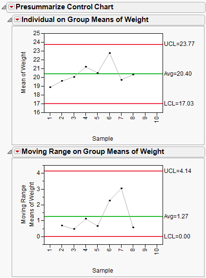
Although the points for XBar and S charts are the same as the Individual on Group Means and Individual on Group Std Devs charts, the limits are different because they are computed as Individual charts.
Another way to generate the presummarized charts, with the Coating.jmp data table:
1. Choose Tables > Summary.
2. Select Sample and click Group.
3. Select Weight, and then click Statistics > Mean and Statistics > Std Dev.
4. Click OK.
5. Select Analyze > Quality and Process > Legacy Control Charts > IR.
6. Select Mean(Weight) and Std Dev(Weight) and click Process.
7. Click OK.
The resulting charts match the presummarized charts.