Scatterplots
The scatterplot is the simplest of all the multiple-variable graphs. Use scatterplots to determine the relationship between two continuous variables and to discover whether two continuous variables are correlated. Correlation indicates how closely two variables are related. When you have two variables that are highly correlated, one might influence the other. Or, both might be influenced by other variables in a similar way.
Figure 4.9 Example of a Scatterplot
Scenario
This example uses the Companies.jmp data table, which contains sales figures and the number of employees of a group of companies.
A financial analyst wants to explore the following questions:
• What is the relationship between sales and the number of employees?
• Does the amount of sales increase with the number of employees?
• Can you predict average sales from the number of employees?
To answer these questions, use a scatterplot of Sales ($M) versus # Employ.
Create the Scatterplot
1. Select Help > Sample Data Library and open Companies.jmp.
2. Select Analyze > Fit Y by X.
3. Select Sales ($M) and Y, Response.
4. Select # Employ and X, Factor.
Figure 4.10 Fit Y by X Window
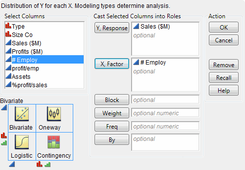
5. Click OK.
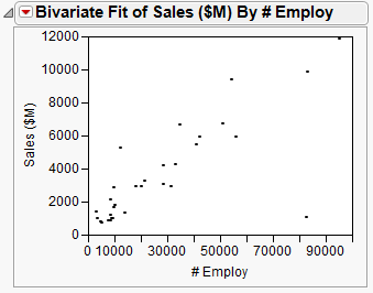
Figure 4.11 Scatterplot of Sales ($M) versus # Employ
Interpret the Scatterplot
One company has a large number of employees and high sales, represented by the single point at the top right of the plot. The distance between this data point and all the rest makes it difficult to visualize the relationship between the rest of the companies. Remove the point from the plot and re-create the plot by following these steps:
1. Click the point to select it.
2. Select Rows > Hide and Exclude. The data point is hidden and no longer included in calculations.
Note: The difference between hiding and excluding is important. Hiding a point removes it from any graphs but statistical calculations continue to use the point. Excluding a point removes it from any statistical calculations but does not remove it from graphs. When you both hide and exclude a point, you remove it from all calculations and from all graphs.
3. To re-create the plot without the outlier, click the Bivariate red triangle and select Redo > Redo Analysis. You can close the original report window.
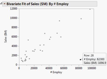
Figure 4.12 Scatterplot with the Outlier Removed
The updated scatterplot provides these answers:
• There is a relationship between the sales and the number of employees.
The data points have a discernible pattern. They are not scattered randomly throughout the graph. You could draw a diagonal line that would be near most of the data points.
• Sales do increase with the number of employees, and the relationship is linear.
If you drew that diagonal line, it would slope from bottom left to top right. This slope shows that as the number of employees increases (left to right on the bottom axis), sales also increases (bottom to top on the left axis). A straight line would be near most of the data points, indicating a linear relationship. If you would have to curve your line to be near the data points, there would still be a relationship (because of the pattern of the points). However, that relationship would not be linear.
• You can predict average sales from the number of employees.
The scatterplot shows that sales generally increase as the number of employees does. You could predict the sales for a company if you knew only the number of employees of that company. Your prediction would be on that imaginary line. It would not be exact, but it would approximate the real sales.
Interact with the Scatterplot
As with other JMP graphics, the scatterplot is interactive. Place your cursor over the point in the bottom right corner with the mouse to reveal the row number and the x and y values.
Figure 4.13 Place Your Cursor Over a Point
Click a point to highlight the corresponding row in the data table. Select multiple points by doing one of the following:
• Click and drag with the cursor around the points. This selects points in a rectangular area.
• Select the lasso tool, and then click and drag around multiple points. The lasso tool selects an irregularly shaped area.