ROC Curve
The ROC Curve option is available only for categorical responses. Receiver Operating Characteristic (ROC) curves display the efficiency of a model’s fitted probabilities in sorting the response levels. An introduction to ROC curves is found in ROC Curves in Basic Analysis.
The predicted response for each observation in a partition model is a value between 0 and 1. To use the predicted response to classify observations as positive or negative, a cut point is used. For example, if the cut point is 0.5, an observation with a predicted response at or above 0.5 would be classified as positive, and an observation below 0.5 as negative. There are trade offs in classification as the cut point is varied.
To generate a ROC curve, each predicted response level is considered as a possible cut point and the following values are computed for each possible cut point:
• The sensitivity is the proportion of true positives or the percent of positive observations with a predicted response greater than the cut point.
• The specificity is the proportion of true negatives or the proportion of negative observations with a predicted response less than the cut point.
The ROC curve plots sensitivity against 1 - specificity. A partition model with n splits has n+1 predicted values. The ROC curve for the partition model has n+1 line segments.
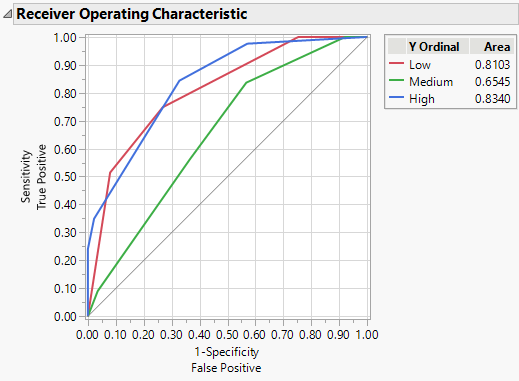
If your response has more than two levels, the Partition report contains a separate ROC curve for each response level versus the other levels. Each curve is the representation of a level as the positive response level. If there are only two levels, one curve is the reflection of the other.
Figure 4.17 ROC Curves for a Three Level Response
If the model perfectly rank-orders the response values, then the sorted data contains all of the positive values first, followed by all of the other values. In this situation, the curve moves all the way to the top before it moves at all to the right. If the model does not predict well, the curve follows the diagonal line from the bottom left to top right of the plot.
In practice, the ROC curve lies above the diagonal. The area under the curve is the indicator of the goodness of fit for the model. A value of 1 indicates a perfect fit and a value near 0.5 indicates that the model cannot discriminate among groups.
When your response has more than two levels, the ROC curve plot enables you to see which response categories have the largest area under the curve.
