Individual Measurement and Moving Range Charts Example
The Pickles.jmp data in the Quality Control sample data folder contains the acid content for vats of pickles. Because the pickles are sensitive to acidity and produced in large vats, high acidity ruins an entire pickle vat. The acidity in four vats is measured each day at 1, 2, and 3 PM. The data table records day, time, and acidity measurements.
1. Select Help > Sample Data Library and open Quality Control/Pickles.jmp.
2. Select Analyze > Quality and Process > Control Chart Builder.
3. Drag Acid to the Y role.
4. Click the Control Chart Builder red triangle and select Show Limit Labels.
This option labels the control limits and averages in both charts.
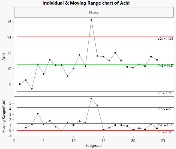
Figure 3.15 Individual Measurement and Moving Range Charts for Acid
The individual measurement and moving range charts monitor the acidity in each vat produced (subgroup of size 1). Vat 13 has an acidity above the upper control limit of 14.05.
You can also view a Median Moving Range chart. Continue with the following steps to change the charts to use median moving ranges.
5. In the Limits[1] outline, change the Sigma setting to Median Moving Range.
6. In the Limits[2] outline, change the Sigma setting to Median Moving Range.
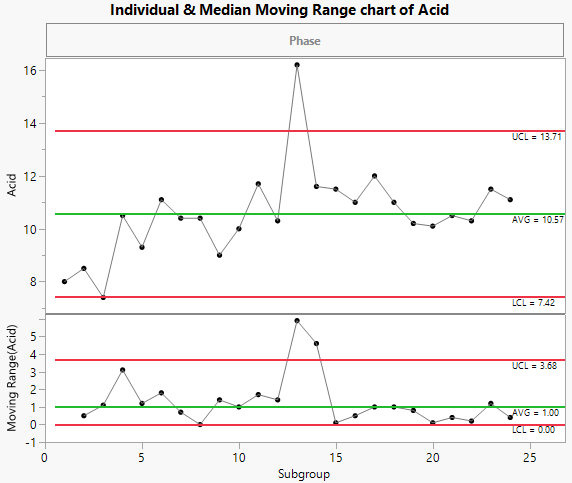
Figure 3.16 Individual Measurement and Median Moving Range Charts for Acid
The limits in the individual measurement and median moving range charts use the median moving range as the sigma, rather than the average moving range. This results in slightly narrower control limits for Acid.

