Color Map on Correlations
In the Evaluate Design report, the Color Map on Correlations plot shows the absolute value of the correlation between any two effects that appear in either the Model or the Alias Terms section. The cells of the color map are identified above the map. There is a cell for each effect in the Model section and a cell for each effect in the Alias Terms section. Smaller values are desired.
By default, the absolute magnitudes of the correlations are represented by a white to gray to black intensity color theme. In general terms, the color map for a good design shows a lot of white off the diagonal, indicating orthogonality or small correlations between distinct terms. Large absolute correlations among effects inflate the standard errors of estimates.
To see the absolute value of the correlation between two effects, hover over the corresponding cell. To change the color scale, click the Color Map on Correlations red triangle and select Use Blue to Red color theme for color map. For a custom color scale, right-click in the plot and select Color Theme. To save a table of the correlations, right-click to the right of the plot below the legend and select Table of Correlations.
Color Map Example
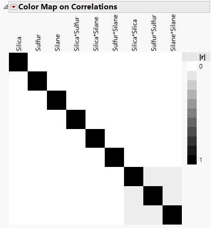
Figure 16.24 shows the Color Map on Correlations for the Bounce Data.jmp sample data table, found in the Design Experiment folder. The black coloring indicates absolute correlations of one. Note that there are black cells on the diagonal, showing correlations of model terms with themselves.
All other cells are either white or gray. The gray squares correspond to correlations between quadratic terms. To see this, hover over each of the gray squares. The absolute correlations of quadratic terms with each other are small, 0.0714.
From the perspective of correlation, this is a good design. When effects are highly correlated, it is more difficult to determine which is responsible for an effect on the response.
Figure 16.24 Color Map on Correlations
Tip: To save a table of the correlations, right-click to the right of the plot below the legend and select Table of Correlations.
