Compare Multiple Variables Using a Variability Chart
In some graphs, you specify only a single X variable. Use a variability chart to specify multiple X variables and see differences in means and variability across all of your variables at once.
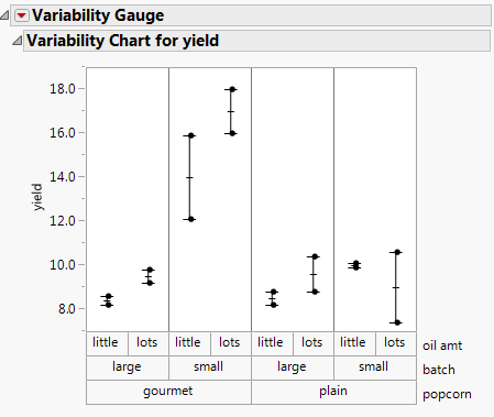
Figure 4.36 Example of a Variability Chart
Scenario
This example uses the Popcorn.jmp data table with data from a popcorn maker. The yield (the volume of popcorn for a given measure of kernels) was measured for each combination of popcorn style, batch size, and amount of oil used.
The popcorn maker wants to explore the following question:
• Which combination of factors results in the highest popcorn yield?
To answer this question, use a variability chart of the yield versus the style, batch size, and oil amount.
Create the Variability Chart
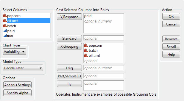
1. Select Help > Sample Data Folder and open Popcorn.jmp.
2. Select Analyze > Quality and Process > Variability/Attribute Gauge Chart.
3. Select yield and click Y, Response.
4. Select popcorn and click X, Grouping.
5. Select batch and click X, Grouping.
6. Select oil amt and click X, Grouping.
Note: The order in which you assign the variables to the X, Grouping role is important, because the order in this window determines their nesting order in the variability chart.
Figure 4.37 Variability Chart Window
7. Click OK.
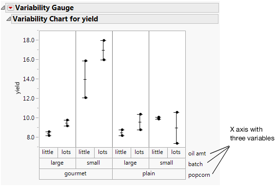
The top chart is the variability chart, showing the yield broken down by each combination of the three variables. The bottom chart shows the standard deviation for each combination of the three variables. Since the bottom chart does not show the yield, hide it.
8. Click the Variability Gauge red triangle and deselect Std Dev Chart.
Figure 4.38 Results Window
Interpret the Variability Chart
The variability chart for yield indicates that small, gourmet batches produce the highest yield.
To be more specific, the popcorn maker might ask this additional question: Is the yield high because those batches are small, or because those batches are gourmet?
The variability chart shows the following:
• The yield from small, plain batches is low.
• The yield from large, gourmet batches is low.
Given this information, the popcorn maker can conclude that only the combination of small and gourmet at the same time results in batches with high yield. It would have been impossible to reach this conclusion with a chart that only allowed a single variable.


