Example of Marker Simulation
Learn how to simulate genetic crosses from your genetic data.
1. Select Help > Sample Data Folder > Life Sciences and open Genotypes Pedigree.jmp and Genotypes Pedigree Anno.jmp.
2. Click on the Genotypes Pedigree.jmp table.
3. Select the first twenty rows in the table.
Note: This example analyzes the first twenty rows only.
4. Select Rows > Row Selection > Invert Row Selection.
5. Select Rows > Exclude/Unexclude to exclude all but the first twenty rows from the analysis.
6. Select Analyze > Genetics > Marker Simulation.
7. Select Markers (60/0) and click Marker.
8. Select Pred Formula Trait1, Pred Formula Trait2, Pred Formula Trait3, Pred Formula Trait4, and Probability (Disease Status=1) and click Predictor Formula.
9. Select Sex and click Cross.
10. Enter 2 for Ploidy.
11. Enter 5 for the Number of Individuals per Cross.
12. Enter 2 for the Number of Generations.
13. Check the Use Annotation Table, Use Only markers Found in the Predictor Formula, and Estimate Diversity check boxes.
14. Under Advanced Options, enter 123 for Set Random Seed.
15. Check the Unthreaded check box.
16. Click OK.
17. In the Choose Annotation Table window, select the Genotypes Pedigree Anno.jmp annotation data table.
18. In the Annotation Specifications window, select Marker and click Marker Variables.
19. Select Gene and click Annotation Group.
20. Select Linkage Position and click Annotation Position.
21. Click OK.
The Marker Simulation report is generated.
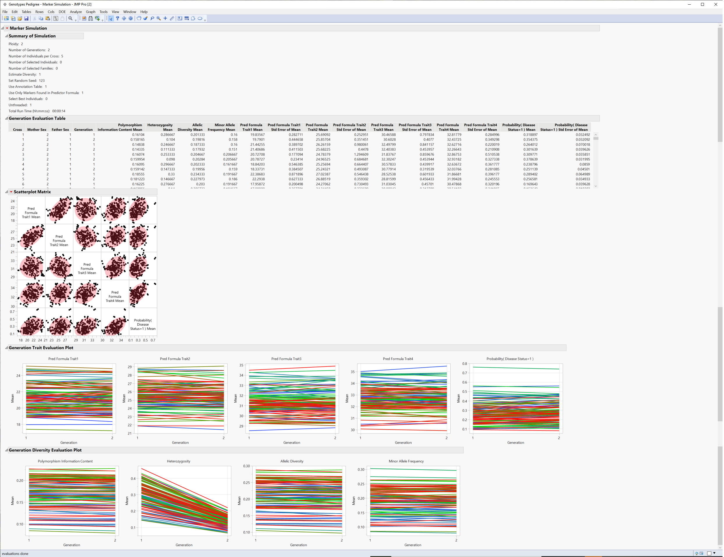
22. Click  and select Show Evaluation Plot and Show Diversity Plot to generate the report shown in Figure 4.1.
Figure 4.1 Results of the Simulated Crosses
The Summary of Simulation table summarizes the selections made on the platform and the time it took for the simulation to run.
The Generation Evaluation Table provides genotypic and allelic statistics for each cross across generations along with predicted trait statistics.
The Scatterplot matrix shows a pairwise comparison of the traits for each cross.
The Evaluation Plot shows the change in the mean trait value across the generations for each cross.
The Diversity Plot shows how polymorphism, heterozygosity, and allelic diversity and frequency change across generations.
