Example of the Categorical Platform
Use the Categorical platform to summarize results from different types of survey questions:
• A single response question
• Three aligned ranking questions
• A multiple response question
• A single response question segmented by a secondary question
You set up four analyses (one for each type of question) in the Categorical launch window. Alternatively, you can use one launch tab at a time.
1. Select Help > Sample Data Folder and open Color Preference Survey.jmp.
2. Select Analyze > Consumer Research > Categorical.
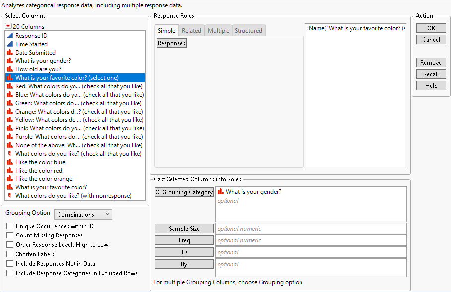
3. Select What is your favorite color? (select one) and click Responses.
4. Select What is your gender? and click X, Grouping Category.
Note: If you want to run the single analysis of favorite color by gender, click OK now.
Figure 3.2 Completed Simple Tab in the Categorical Launch Window
5. Select the Related tab.
6. Select I like the color blue. through I like the color orange. and click Aligned Responses.
This enters three questions with rating scales to be analyzed together. The gender grouping category applies to this analysis.
7. Select the Multiple tab.
8. Select Red: What colors do you like? (check all that you like) through None of the above: What colors do you like? (check all that you like) and click Multiple Response.
This enters the multiple response question “What colors do you like?” where each response is in an individual column for analysis. The gender grouping category applies to this analysis.
9. Select the Structured tab.
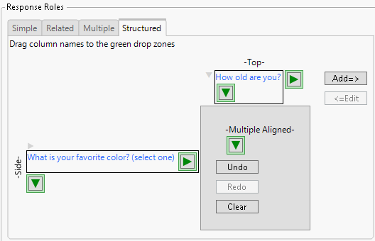
10. Drag What is your favorite color? (select one) to the Side green arrow and drag How old are you? to the Top green arrow.
Figure 3.3 Structured Tab in Categorical Launch Window
11. Click Add.
The What is your gender? column specified in the X. Grouping Category role does not apply to the structured analysis.
Tip: Click on the green arrows in the structured tab for a column list, where you can click to add a column. You can nest multiple columns by using the down arrow on the top or the right arrow on the side.
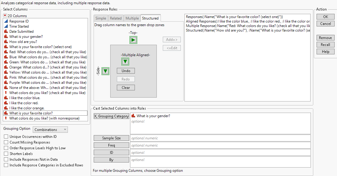
Figure 3.4 Completed Launch Window for Full Example
12. Click OK.
The results for each analysis are stacked vertically in a single report window.
Simple Tab Report
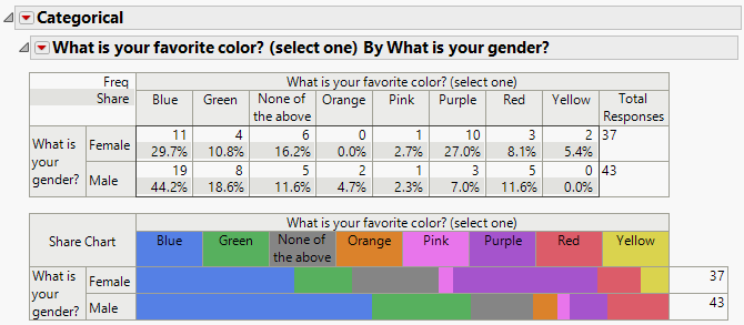
The first section shows the results for the simple response survey question, “What is your favorite color?”, grouped by gender. Each respondent was asked to select one color from the list: Red, Blue, Green, Orange, Yellow, Pink, Purple, or None of the above.
Figure 3.5 Simple Response: Favorite Color by Gender
The analysis shows that blue is the favorite color for both genders. For males, the frequency of the 43 male respondents selecting blue is 19. This corresponds to a share of 44.2% or 19/43. For females, 11 of 37 female respondents (frequency) or 29.7% (share) selected blue.
Tip: You can define the colors in the charts using the Value Colors column property. See Value Colors in Using JMP.
Related Tab Report
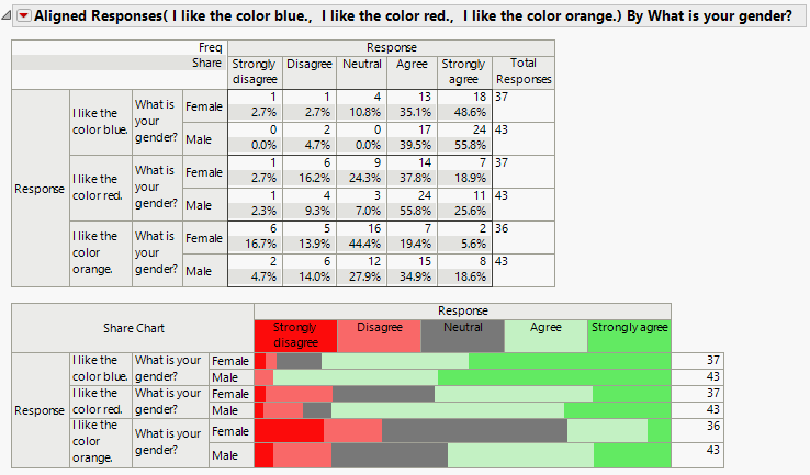
The second section of the report shows the results for three related questions that asked respondents to rank how much they liked a color. The responses to these questions are aligned, because the questions used the same rating scale of Strongly agree to Strongly disagree.
Figure 3.6 Aligned Response: Ranking Colors by Gender
The analysis shows that blue is the color with the highest rankings for both males and females. Orange has a high number of neutral results for both genders as compared to red and blue. The value colors column property is used to define the colors used in the share chart.
Note: If you analyze aligned questions individually using the Simple tab, you obtain three individual reports containing the same information as the related report. Using the Related tab aligns the reports so that the results are easier to compare to one another.
Multiple Tab Report
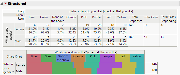
The third section in the report shows the results from a multiple choice survey question grouped by gender. The question was “What colors do you like? (check all that you like)”. Each possible response was collected in an individual column. If the subject selected a response, there is a value in the corresponding column. Otherwise, the column is empty.
Figure 3.7 Multiple Response: Colors Liked by Gender
From the results, we observe that blue and green are highly liked by both genders. Females like pink and purple at higher rates than males.
In a multiple response question, more than one answer is allowed. A case represents a single responder, and Total Cases is the total number of responders. In our data, we have 37 female cases and 43 male cases. The total number of cases responding are the number of cases who selected one or more responses (which in our data, was everyone).
The Total Responses column lists the total number of selections made. For females, there were 146 colors selected by the 37 females. For males, there were 180 colors selected by the 43 male responders. The tabulation includes the number of responders selecting each color, the share or the percent of the total responses, and the rate or the percent of the total cases.
Structured Tab Report
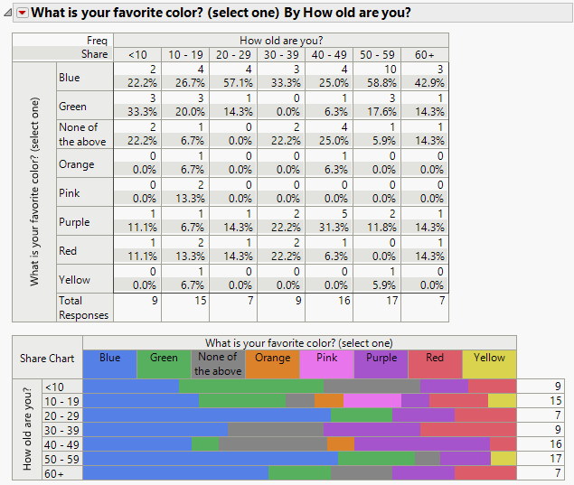
The final section shows the table generated from the structured tab where you set the favorite color question as the response of interest grouped by the age group. In the structured format, the levels of the primary response of interest form the rows of the table and the levels of the grouping variable form the columns.
Figure 3.8 Structured: Favorite Color by Age
The 10 to 19 age group has two responders with pink as their favorite color. No other age groups have responders with pink as their favorite color. You can see from the bottom row of the table that the number of responders in each age group is small. You could gather more data to draw conclusions about the favorite colors across age groups.
