Nest Axes for Character Variables
In Graph Builder, if you merge categorical variables, an individual axis is constructed for each variable. The outermost axis corresponds to the first variable that is selected, the next to the second, and so on.
To nest the axes instead, drag the variables to the zone individually:
1. Drag the variable for the innermost axis to the zone.
2. Drag the variable for the next axis to the outside of the preceding variable and drop the variable when a trapezoid shape appears.
The following example illustrates nested axes:
After changes are made to improve a measurement process, a measurement systems analysis study is conducted to study repeatability and reproducibility with Part, Operator, and Instrument as factors. Each of three operators measures each of eight parts with four instruments. Of particular interest is the consistency of the instruments. The measured quantity is called new Y.
1. Select Help > Sample Data Folder, select the Variability Data folder, and open 3 Factors Crossed.jmp.
2. Select Graph > Graph Builder.
3. Select new Y and drag it to the Y zone.
4. Select Part and drag it to the X zone.
The plot shows variation in the values that are measured for each of the eight parts. There are systematic differences among the parts, which is to be expected. For example, measurements for parts 7 and 8 are lower than those for parts 1 through 6.
5. Drag Operator to the Color zone.
The new Y values are colored by Operator, shown in the legend at the right side of the graph. It appears that Janet might be measuring higher values than the other two operators on most parts. But the Operator effect is not easy to visualize, so you create a separate Operator axis.
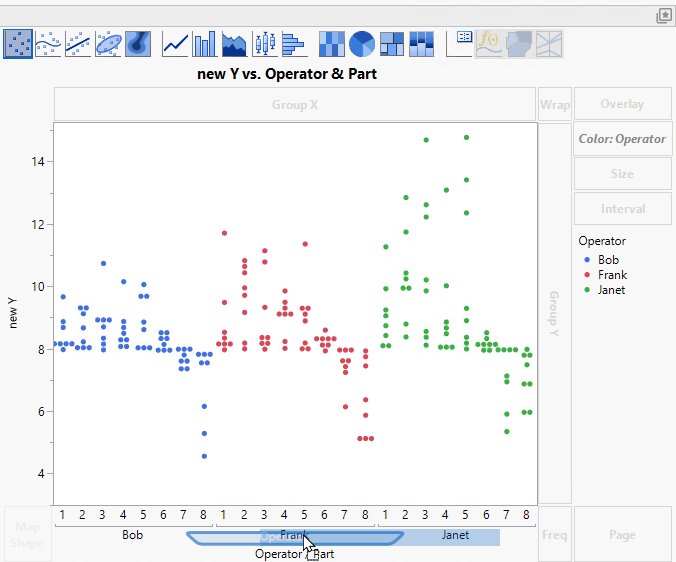
6. Select Operator and drag it beneath Part in the X zone.
The label Operator/Part appears, which indicates that Part is associated with the topmost axis, and Operator is associated with the lower axis.
Figure 3.16 Drag Operator to Add a Second Axis
Now it is easier to see that Janet tends to obtain higher measurements for the same parts than do Bob and Frank. But what about the effect of Instrument?
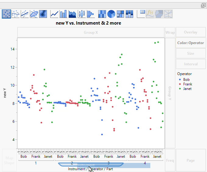
7. Select Instrument and drag it beneath Operator/Part in the X zone.
The label Instrument/Operator/Part appears, which indicates that a third axis for Instrument has been added beneath the Operator axis.
Figure 3.17 Drag Instrument to Add a Third Axis
It is clear that Instrument 2 leads to much more consistent measurements than the other three instruments. For Instrument 2, there is comparatively little variation between or within operators.
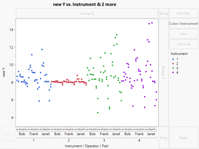
8. Select Instrument and drag it to the Color zone.
Figure 3.18 Three Nested Axes
Now the new Y values are colored by Instrument, and it is easy to see Instrument differences.
By nesting the axes for the three factors in the study, you can get a visual understanding of the variation because of the factors.


