Create Multiple Y Axes
In Graph Builder, you can display multiple variables on the same graph by assigning them to different Y axes, which enables you to compare variables with different units or scales. This option is useful in line charts to make it easier to compare trends across data sets that would otherwise be difficult to visualize together.
Example of Creating Multiple Y Axes
The Fermentation Process.jmp sample data table contains information that is related to a fermentation process, such as time, pH levels, and temperature. You want to show multiple variables in Y axes on a single chart.
1. Select Help > Sample Data Folder/Functional Data and open Fermentation Process.jmp.
2. Select Graph > Graph Builder.
3. Select the Graph Builder red triangle and select Parallel Y Axes.
4. Click the Line element ![]() .
.
5. Select Time and drag it to the X zone.
6. Select Temp and drag it to the Y zone.
7. Select Molasses Feed and drag it to the Y zone until you see both lines in the graph.
8. Continue by adding NH3, Air, and Tank Level to the Y zone.
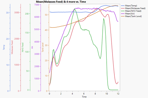
Figure 3.16 Multiple Y Axes
Axes for Temp, Molasses Feed, NH3 Feed, Air, and Tank Level is added to the graph, and the axes automatically rescale to display all values.
9. (Optional) Click Done.
