Populations
This section provides the estimate of the number of ancestral populations.
Scree Plot
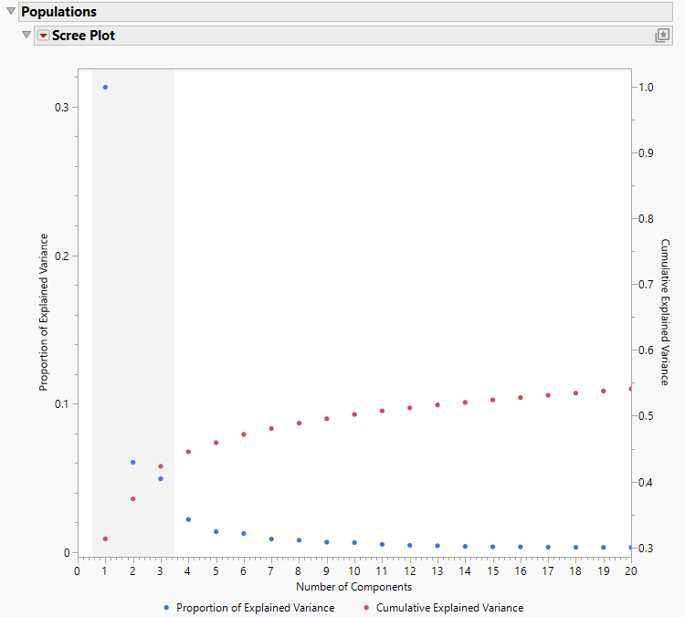
The scree plot contains two plots: the proportion of explained variance (blue dots) and the cumulative explained variance (red dots). The horizontal axis shows the number of components that contribute to the variance. The important thing to note in both plots is the region where there is the greatest change in the vertical dimension. It is this region, reminiscent of an “elbow”, where the individual components exert the greatest influence on variation, that gives you an indication of the number of ancestral populations.
Figure 6.8 The Scree Plot
Examination of the previous scree plot shows that the region encompassed by the first three components (shaded) exhibits the greatest change in both the proportion of explained variance (blue dots) and the cumulative explained variance (red dots). Components 4 and above have much less individual effect on the variance. This plot strongly indicates the existence of three ancestral populations.
