X and R Chart Phase Example
|
1.
|
|
2.
|
Select Analyze > Quality and Process > Control Chart Builder.
|
|
3.
|
|
4.
|
|
5.
|
|
6.
|
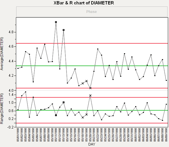
In the Average chart, right-click and select Warnings > Test Beyond Limits.
|
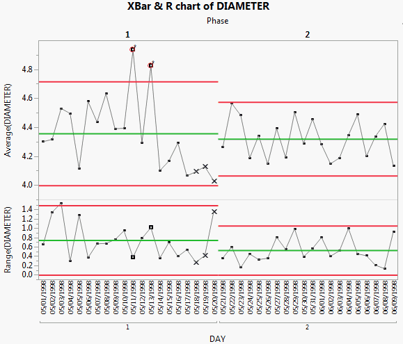
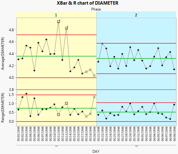
Including the Phase variable means that the control limits for phase 2 are based only on the data for phase 2. None of the phase 2 observations are outside the control limits. Therefore, you can conclude that the process is in control after the adjustments were made.
|
1.
|
Starting from Control Charts for each Phase, double-click in the X axis.
|
|
2.
|
Select Allow Ranges.
|
|
3.
|
Enter -0.5 for the Min Value (the scale minimum).
|
|
4.
|
Enter 19.5 for the Max Value (the dividing line).
|
|
6.
|
Click Add.
|
|
7.
|
Click Allow Ranges.
|
|
8.
|
Enter 19.5 for the Min Value (the dividing line).
|
|
9.
|
Enter 39.5 for the Max Value (the maximum of the axis).
|
|
11.
|
Click Add.
|
|
12.
|
Click OK.
|
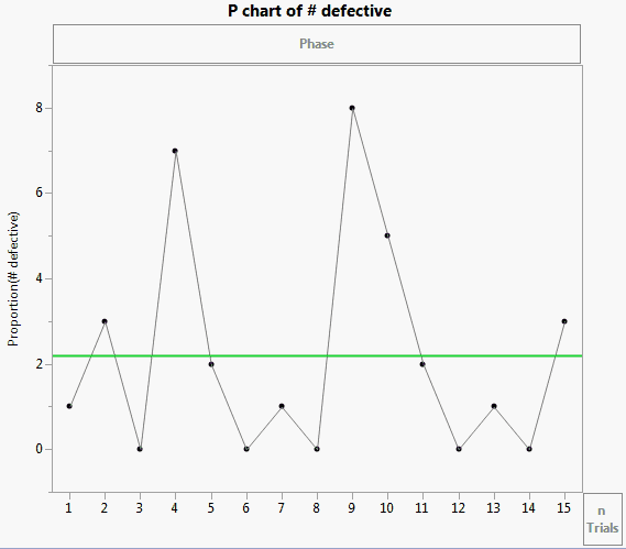
The Washers.jmp sample data contains defect data for two different lot sizes from the ASTM Manual on Presentation of Data and Control Chart Analysis, American Society for Testing and Materials. To view the differences between constant and variable sample sizes, you can compare charts for Lot Size and Lot Size 2.
|
1.
|
|
2.
|
Select Analyze > Quality and Process > Control Chart Builder.
|
|
3.
|
|
4.
|
Select Shewhart Attribute from the drop down to change the chart to an attribute chart.
|
|
5.
|
|
6.
|
|
7.
|
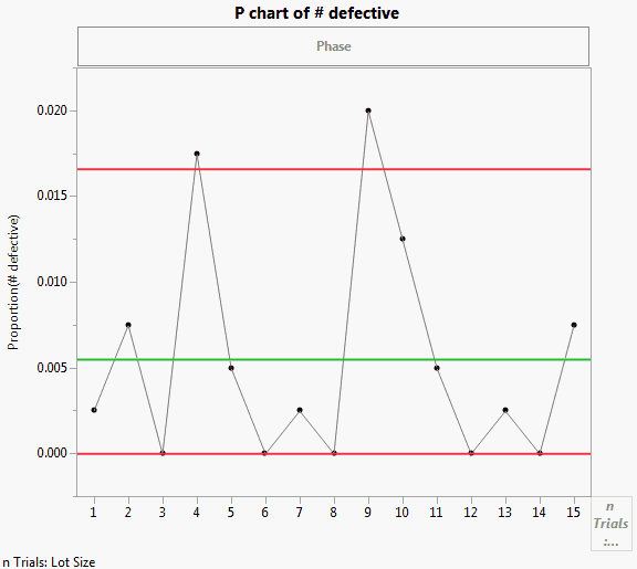
To view the differences between constant and variable sample sizes, you can compare charts for Lot Size and Lot Size 2 by simply dragging the variables to the nTrials zone.
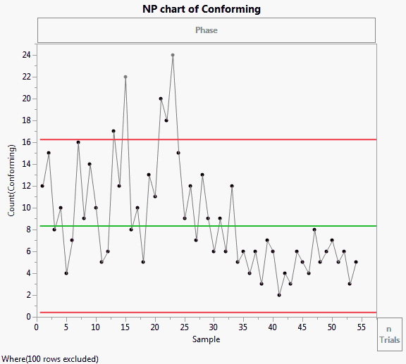
The Bottle Tops.jmp sample data contains simulated data from a bottle top manufacturing process. Sample is the sample ID number for each bottle. Conforming indicates whether the bottle top met the design standards. In the Phase column, the first phase represents the time before the process adjustment. The second phase represents the time after the process adjustment. Notes on changes in the process are also included.
|
1.
|
|
2.
|
Select Analyze > Quality and Process > Control Chart Builder.
|
|
3.
|
|
4.
|
|
5.
|
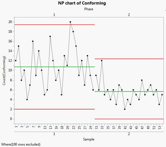
Including the Phase variable means that the control limits for phase 2 are based only on the data for phase 2. None of the phase 2 observations are outside the control limits. Therefore, you can conclude that the process is in control after the adjustment.
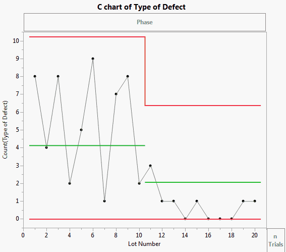
The Cabinet Defects.jmp sample data table contains data concerning the various defects discovered while manufacturing cabinets over two time periods.
|
1.
|
|
2.
|
Select Analyze > Quality and Process > Control Chart Builder.
|
|
3.
|
|
4.
|
A np-chart of Type of Defect appears.
|
5.
|
|
6.
|
Open the Type of Defect disclosure button. Note all of the defect types are listed. Currently, only Bruised veneer is selected and displayed in the chart. You can select additional defect types and the chart updates immediately.
|
|
7.
|
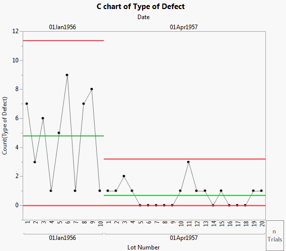
You can now view the results on the two different days. Both appear to be within limits. To examine other defect type behavior, select another defect type under the Event Chooser and view the results as the limits are updated.
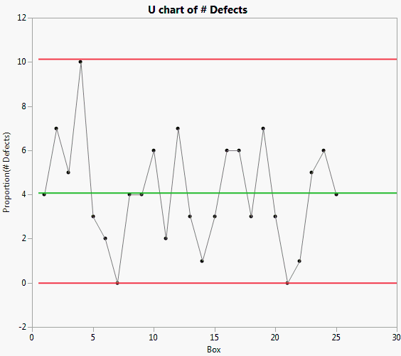
The Shirts.jmp sample data table contains data concerning the number of defects found in a number of boxes of shirts.
|
1.
|
|
2.
|
Select Analyze > Quality and Process > Control Chart Builder.
|
|
3.
|
|
4.
|
|
5.
|
To change the chart to an Attribute chart, select Shewhart Attribute from the drop down list.
|
A c-chart of # Defects appears.
|
6.
|
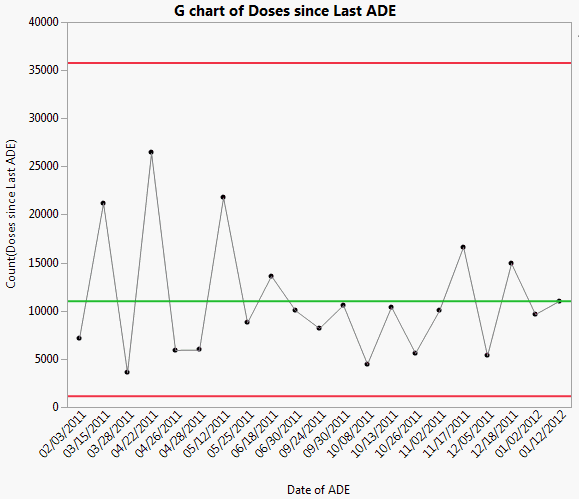
Rare event charts are helpful when you know your data will not follow a normal distribution (for example, when measuring counts or wait times). The g-chart is an effective way to understand whether rare events are occurring more frequently than expected and warrant an intervention. A g-chart counts the number of possible opportunities since the last event. If you plot this type of data using a standard Shewhart control chart, you might see many more false signals, as the limits might be too narrow. The Adverse Reactions.jmp sample data table contains simulated data about adverse drug events (ADEs) reported by a group of hospital patients. An ADE is any type of injury or reaction the patient suffered after taking the drug. The date of the reaction and the number of days since the last reaction were recorded.
|
1.
|
|
2.
|
Select Analyze > Quality and Process > Control Chart Builder.
|
|
3.
|
|
4.
|
|
5.
|
To change the chart to a Rare Event chart, select Rare Event from the drop down list.
|
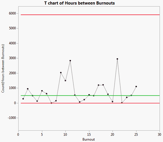
Rare event charts are helpful when you know your data will not follow a normal distribution (for example, when measuring counts or wait times). t-charts are used to measure the time that has elapsed since the last event. If you plot this type of data using a standard Shewhart control chart, you might see many more false signals, as the limits might be too narrow. The Fan Burnout.jmp sample data table contains simulated data for a fan manufacturing process. The first column identifies each fan that burned out. The second column identifies the number of hours between each burnout.
|
1.
|
|
2.
|
Select Analyze > Quality and Process > Control Chart Builder.
|
|
3.
|
|
4.
|
|
5.
|
To change the chart to a Rare Event chart, select Rare Event from the drop down list.
|
|
6.
|