Run charts display a column of data as a connected series of points. The following example is a Run chart for the Weight variable from Coating.jmp in the Quality Control sample data folder (taken from the ASTM Manual on Presentation of Data and Control Chart Analysis).
|
1.
|
|
2.
|
Select Analyze > Quality and Process > Control Chart > Run Chart.
|
|
3.
|
|
4.
|
|
5.
|
Click OK.
|

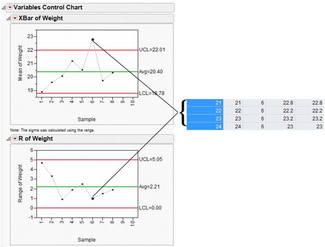
X- and R-charts Example
The following example uses the Coating.jmp data table. The quality characteristic of interest is the Weight column. A subgroup sample of four is chosen. An X-chart and an R-chart for the process are shown in Variables Charts for Coating Data.
|
1.
|
|
2.
|
Select Analyze > Quality and Process > Control Chart > XBar.
|
|
3.
|
|
4.
|
|
5.
|
Click OK.
|
Note: If an S chart is chosen with the X-chart, then the limits for the X-chart are based on the standard deviation. Otherwise, the limits for the X-chart are based on the range.
Variables Charts for Coating Data
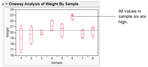
You can use Fit Y by X for an alternative visualization of the data. First, change the modeling type of Sample to Nominal. Specify the interval variable Weight as Y, Response and the nominal variable Sample as X, Factor. Select the Quantiles option from the Oneway Analysis drop-down menu. The box plots in Quantiles Option in Fit Y By X Platform show that the sixth sample has a small range of high values.
X- and S-charts with Varying Subgroup Sizes Example
The following example uses the Coating.jmp data table. This quality characteristic of interest is the Weight 2 column. An X-chart and an S chart for the process are shown in X and S Charts for Varying Subgroup Sizes.
|
1.
|
|
2.
|
Select Analyze > Quality and Process > Control Chart > XBar.
|
|
3.
|
|
4.
|
|
5.
|
|
6.
|
Click OK.
|
X and S Charts for Varying Subgroup Sizes

Weight 2 has several missing values in the data, so you might notice the chart has uneven limits. Although, each sample has the same number of observations, samples 1, 3, 5, and 7 each have a missing value.
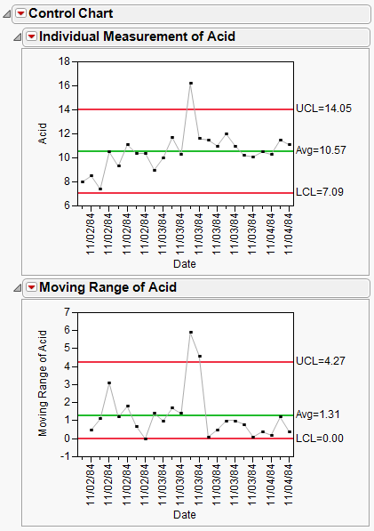
The Pickles.jmp data in the Quality Control sample data folder contains the acid content for vats of pickles. Because the pickles are sensitive to acidity and produced in large vats, high acidity ruins an entire pickle vat. The acidity in four vats is measured each day at 1, 2, and 3 PM. The data table records day, time, and acidity measurements. You can create Individual Measurement and Moving Range charts with date labels on the horizontal axis.
|
1.
|
|
2.
|
Select Analyze > Quality and Process > Control Chart > IR.
|
|
3.
|
|
4.
|
|
5.
|
|
6.
|
Click OK.
|
The individual measurement and moving range charts shown in Individual Measurement and Moving Range Charts for Pickles Data monitor the acidity in each vat produced.
The Washers.jmp data in the Quality Control sample data folder contains defect counts of 15 lots of 400 galvanized washers. The washers were inspected for finish defects such as rough galvanization and exposed steel. If a washer contained a finish defect, it was deemed nonconforming or defective. Thus, the defect count represents how many washers were defective for each lot of size 400. Using the Washers.jmp data table, specify a sample size variable, which would allow for varying sample sizes. This data contains all constant sample sizes.
|
1.
|
|
2.
|
Select Analyze > Quality and Process > Control Chart > P.
|
|
3.
|
|
4.
|
|
5.
|
|
6.
|
Click OK.
|
p-chart displays a p-chart for the proportion of defects.
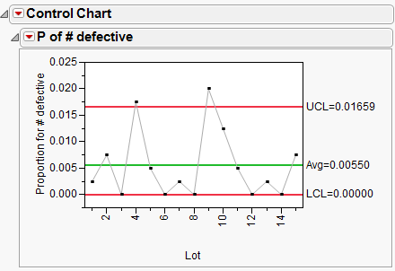
Note that although the points on the chart look the same as the np-chart in np-chart, the y axis, Avg and limits are all different since they are now based on proportions.
The following example uses the Washers.jmp data table.
|
•
|
|
•
|
Select Analyze > Quality and Process > Control Chart > NP.
|
|
•
|
|
•
|
Change the Constant Size to 400.
|
|
•
|
Click OK.
|
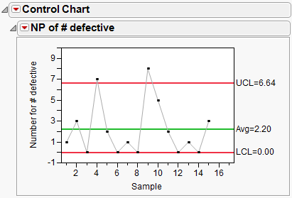
np-chart displays an np-chart for the number of defects. Points 4 and 9 are above the upper control limit.
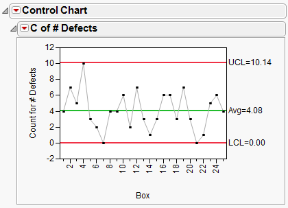
c-charts are similar to U-charts in that they monitor the number of nonconformities in an entire subgroup, made up of one or more units. c-charts can also be used to monitor the average number of defects per inspection unit.
Note: When you generate a c-chart, and select Capability, JMP launches the Poisson Fit in Distribution and gives a Poisson-specific capability analysis.
|
1.
|
|
2.
|
Select Analyze > Quality and Process > Control Chart > C.
|
|
3.
|
|
4.
|
|
5.
|
|
6.
|
Click OK.
|
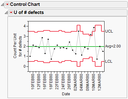
The Braces.jmp data in the Quality Control sample data folder records the defect count in boxes of automobile support braces. A box of braces is one inspection unit. The number of boxes inspected (per day) is the subgroup sample size, which can vary. The u-chart in u-chart is monitoring the number of brace defects per subgroup sample size. The upper and lower bounds vary according to the number of units inspected.
Note: When you generate a u-chart, and select Capability, JMP launches the Poisson Fit in Distribution and gives a Poisson-specific capability analysis. To use the Capability feature, the unit sizes must be equal.
|
1.
|
|
2.
|
Select Analyze > Quality and Process > Control Chart > U.
|
|
3.
|
|
4.
|
|
5.
|
|
6.
|
Click OK.
|
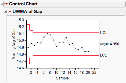
In sample data table, Clips1.jmp, the measure of interest is the gap between the ends of manufactured metal clips. To monitor the process for a change in average gap, subgroup samples of five clips are selected daily. A UWMA chart with a moving average span of three is examined.
|
1.
|
|
1.
|
Select Analyze > Quality and Process > Control Chart > UWMA.
|
|
2.
|
|
3.
|
|
4.
|
Change the Moving Average Span to 3.
|
|
5.
|
Click OK.
|
The result is the chart in UWMA Charts for the Clips1 data. The point for the first day is the mean of the five subgroup sample values for that day. The plotted point for the second day is the average of subgroup sample means for the first and second days. The points for the remaining days are the average of subsample means for each day and the two previous days.
UWMA Charts for the Clips1 data
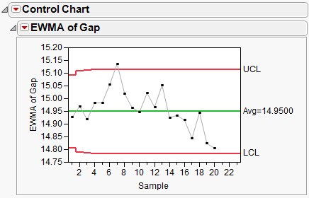
The following example uses the Clips1.jmp data table.
|
1.
|
|
2.
|
Select Analyze > Quality and Process > Control Chart > EWMA.
|
|
3.
|
|
4.
|
|
5.
|
Change the Weight to 0.5.
|
|
6.
|
Leave the Sample Size Constant as 5.
|
|
7.
|
Click OK.
|
EWMA Chart displays the EWMA chart for the same data seen in UWMA Charts for the Clips1 data. This EWMA chart was generated for weight = 0.5.
The following example uses the Coating.jmp data table.
|
1.
|
|
2.
|
Select Analyze > Quality and Process > Control Chart > Presummarize.
|
|
3.
|
|
4.
|
|
5.
|
Select both Individual on Group Means and Moving Range on Group Means. The Sample Grouped by Sample Label button is automatically selected when you choose a Sample Label variable.
|
When using Presummarize charts, you can select either On Group Means options or On Group Std Devs options or both. Each option creates two charts (an Individual Measurement, also known as an X chart, and a Moving Range chart) if both IR chart types are selected.
The On Group Means options compute each sample mean and then plot the means and create an Individual Measurement and a Moving Range chart on the means.
The On Group Std Devs options compute each sample standard deviation and plot the standard deviations as individual points. Individual Measurement and Moving Range charts for the standard deviations then appear.
|
6.
|
Click OK.
|
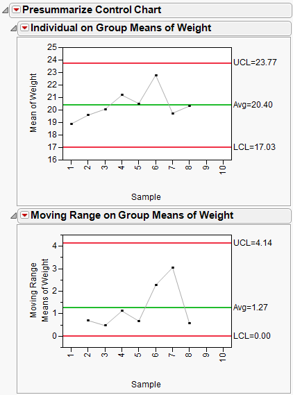
Although the points for X- and S-charts are the same as the Individual on Group Means and Individual on Group Std Devs charts, the limits are different because they are computed as Individual charts.
Another way to generate the presummarized charts, with the Coating.jmp data table:
|
1.
|
Choose Tables > Summary.
|
|
2.
|
|
3.
|
Click OK.
|
|
4.
|
Select Analyze > Quality and Process > Control Chart > IR.
|
|
5.
|
|
6.
|
Click OK.
|
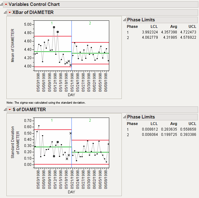
Open Diameter.jmp, found in the Quality Control sample data folder. This data set contains the diameters taken for each day, both with the first prototype (phase 1) and the second prototype (phase 2).
|
•
|
|
•
|
Select Analyze > Quality and Process > Control Chart > XBar.
|
|
•
|
|
•
|
|
•
|
|
•
|
|
•
|
Click OK.
|