To produce the 3D scatterplot shown in Example of Information Displayed on the Scatterplot 3D Report, follow the instructions in Example of a 3D Scatterplot.
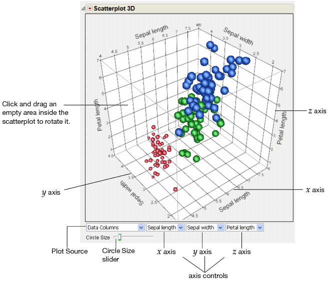
The Scatterplot 3D report shows a three-dimensional spinnable view of your data. See Example of Information Displayed on the Scatterplot 3D Report. In the launch window, you select the variables and then create the report. The variables are displayed on the 3D scatterplots’ x, y, and z axes. Up to three variables can be displayed at a time.
|
Circle Size slider
|
Click and drag the Circle Size slider to resize the balls while maintaining their relative sizes.
|
|
Select which variable appears on each axis. Choose the Other option to add a new variable.
|
|
After you create a 3D scatterplot, you can add features such as displaying ellipses around specific data points, showing separate principal components, rotating components, connecting points, and more. See Scatterplot 3D Platform Options for details.
You can also assign colors and symbols (or markers) to data points either on the 3D scatterplot itself or in the associated data table. See Assign Colors and Markers to Data Points and Assign Colors and Markers in the Data Table.
The variables on each axis are determined by the order in which you select the variables in the launch window. For example, the first variable that you select is displayed on the x axis. The second variable is displayed on the y axis, and the third variable is displayed on the z axis.
|
2.
|
To add a different variable, click an axis control drop-down menu, select Other, select the variable, and then click OK.
|
|
3.
|
To sequence through combinations of all variables, click the Next Axis Set button until the variables that you want to plot are displayed.
|
For more details about updating axes, see Using JMP.
|
1.
|
To assign a color to the selected point, select Rows > Colors and then select the color.
|
|
2.
|
To assign a marker to the selected point, select Rows > Markers and then select the marker.
|
You can assign colors and markers to rows in the data table. The colors and markers appear next to the row number in the data table and on the 3D scatterplot. This option distinguishes points for each variable, and you can save the settings in the data table. Assigning colors and markers to specific data points (as described in Assign Colors and Markers to Data Points) only highlights them for the current open graphs.
See the Using JMP book for details about assigning colors and markers in the data table. For details about changing the size, quality, or transparency of markers, see Scatterplot 3D Settings.