Range
What is range?
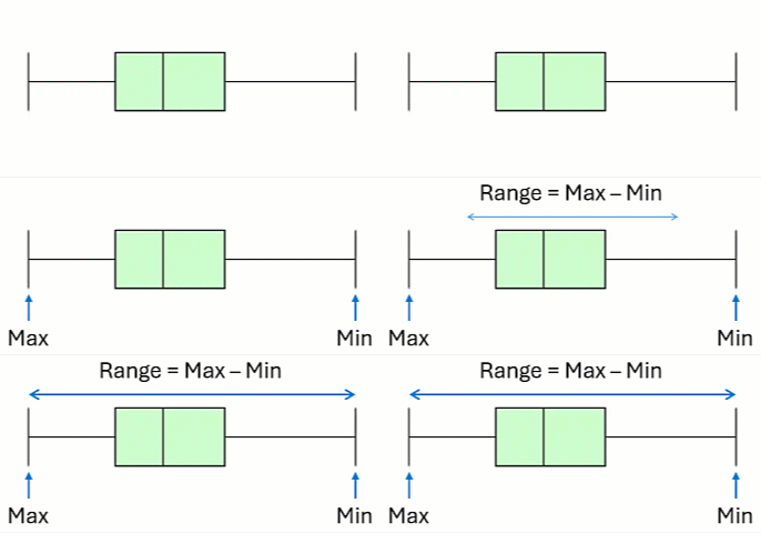
The range is a statistic used to describe the variability or spread in a continuous variable. The range of the data is the distance between the extreme values of the data. It is the maximum value of the data minus the minimum value.
When should you use the range?
Since the range depends only on the two extreme values in the data, it is not widely used as a measure of variability. Even if the underlying distribution of data stays the same, as sample size increases, the range will increase. It is also highly influenced by extreme values in the data. The standard deviation and interquartile range are more stable measures of variability that are more robust to outliers or contamination in the distribution.
The range can be used as a very quick measure of variability or to visually compare the spread of different groups of data.
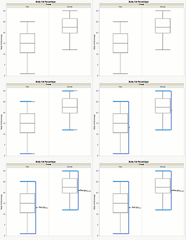
You can visually compare variability by comparing the width (or height, depending on orientation!) of box plots for different groups. In the figure below, two box plots for body fat percentage for men and women are displayed. Notice that the range for men is greater than the range for women.
When should you use the range instead of standard deviation?
The range is commonly used in statistical process control charts. The purpose of a control chart is to monitor a process and detect unexpected changes in the process distribution. In control charts, data are collected over time, summarized, and displayed on a time plot with the addition of control limits based on historical variation. Each time data are collected is called a subgroup. To summarize data in a subgroup, the first control charts used the subgroup average to measure the location and the subgroup range to measure spread.
The reason the range is appropriate in this situation is that the distribution of the subgroup range and subgroup standard deviations are very similar for a subgroup size less than about 15. Control chart subgroups are usually much smaller than 15. Historically, the range was used because calculators or computers, used to calculate the standard deviation today, didn’t exist.
Why can’t we just use the standard deviation for control charts? Today, it is recommended that standard deviation control charts are used instead of range control charts when the calculations are done by machine. However, people still use the range chart because it is historically popular.
How do you calculate the range?
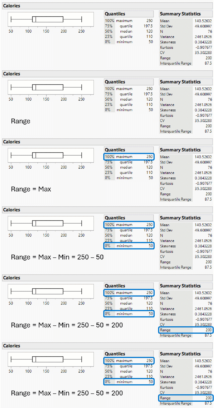
The range is the difference between the maximum and minimum values of the data. For example, in the figure below, we can see the box plot and some statistics for the cereal calories data. The maximum is 250, the minimum is 50, therefore the range is 250 – 50 = 200.
Examples of range
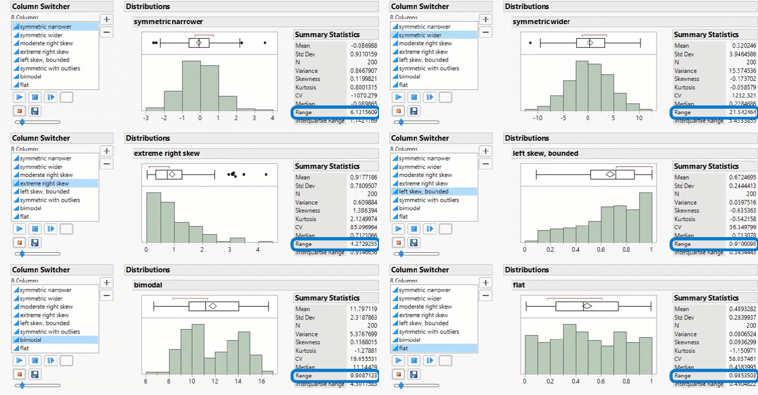
Examine the range the data in the Univariate Statistics Data. You can visualize the range using the box plot and histogram and see the value of the range in the Summary Statistics report.
Does the range seem like an adequate measure of variability for the data?