See what you've been missing.
- Plot your data to spot patterns and patterns that don't fit the trend.
- Uncover hidden relationships quickly with the interactive Graph Builder.
- Use the deep and wide toolbox for building production-ready graphs to better present your findings.
- Work with your data using graphs that represent an interactive interface to linked data.
Graphing
- Histogram
- Box plot
- Scatterplot
- Scatterplot matrix
- Bar chart
- Heat map
- Pie chart
- Tree map
- Mosaic plot
- Parallel plot
- Run chart
- Line chart
- Profiler
- Comparative box plots
- Variability chart
- Bubble plot
- Surface plot
- Contour plot
- Ternary plot
- Pareto plot
- Overlay
Data summary
- Mean
- Standard deviation
- Median
- Frequency
- Variance
- Quantiles
- Robust
Tabular summaries
- Pivot tables
- Contingency tables
- Crosstab
Geographic maps
- X-Y map
- Shape files
Filtering
- Subgrouping
Dashboards
- Applications
Explore text
- Word cloud
- Unstructured data
If you are spending more than five minutes per month using Excel for data visualization, you are wasting your time by not using JMP.
NVIDIA
Pete Cannon, Product Quality Engineering & Quality Management Systems Senior Director
Featured Resources
- The Top 7 Myths That Lead to Really Bad GraphsIn this brief, we review seven of the most common misconceptions when visualizing data. When these myths are dispelled, your charts will be more effective and easier to design.
- How data visualization facilitates the analytic workflowAdvancing scientific discovery and innovation with leaders from Calico, Lundbeck and SAS
- SeagateJMP and JMP Pro are an integral part of wide-ranging data analysis techniques, statistical process control, reliability analysis, experimental design and modeling.

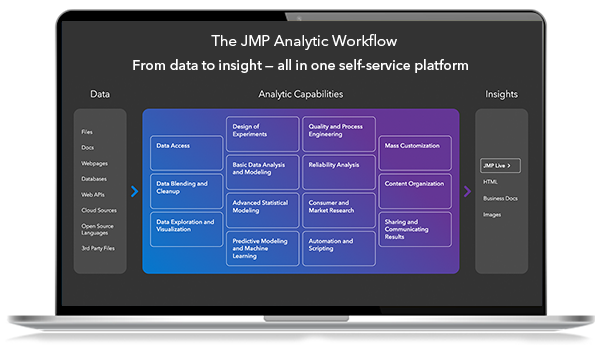
JMP® Analytic Capabilities
See everything that JMP® can do for you and your organization, from data access and cleaning, to exploration and visualization, all the way through sharing and communicating your results.
