Gene Expression Analysis of Estradial-Responsive Genes in a Cell Line
The data used in this chapter is from a study of the whole genome cartography of human estrogen receptor binding sites by Lin, et al., 20071. The data set was downloaded from the Gene Expression Omnibus and imported as described in Importing Series Matrix Files.
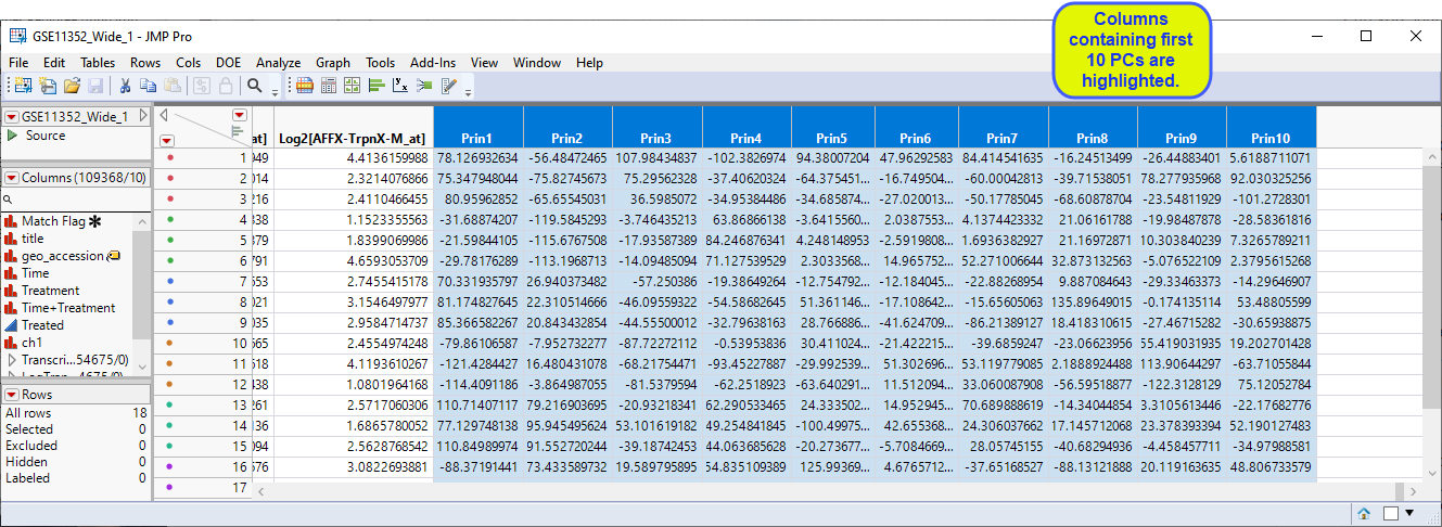
The starting point for this analysis is the GSE11352_Wide_1 JMP table, shown below. This table has 18 rows and 54684 columns (columns include data for 54675 probesets collected into a group called Transcripts).
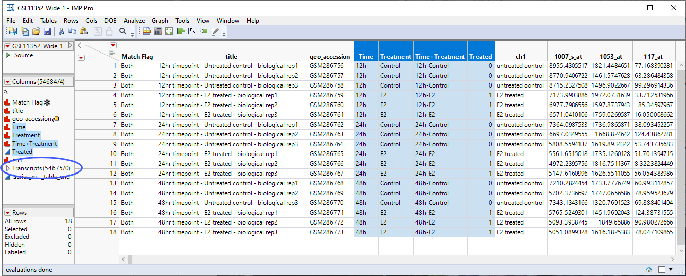
As a first step, it is worth considering the design of this experiment. Human breast cancer cells are cultured with or without estradiol and harvested after 12, 24, and 48 hours of treatment. 3 biological replicates are taken for each treatment and time point giving a total of 18 samples. It is worth noting that the samples can be grouped for analysis in several ways: treated vs control at each time point for a total of six groups, treated at each time point for a total of three groups (disregarding the control), and treated vs control regardless of the time for a total of two groups. The choice of how to proceed does not need to be made now. However, going forward we should keep this point in mind.
Quality Control and Normalization
Cursory examination of the data reveals a large range of expression values among the various probes. To adjust the scale of any plots of this data to a more consistent and manageable level, reduce skewness, and to effectively smooth out the observations, scientists often log transform the data. To log2-transform the data, carry out the following steps:
| 8 | Select the 54675 transcript data columns. |
| 8 | Right-click on the selected columns and select New Formula Column > Log > Log2. |
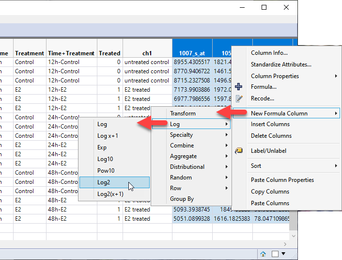
This operation results in the creation of 54675 new columns each containing the log2 transformed values of its corresponding Transcript column.
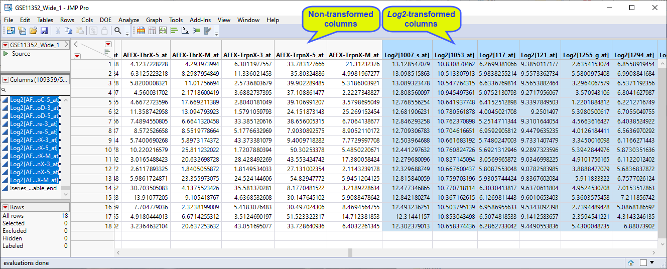
| 8 | Group the log2-transformed data columns and save the data set. |
Note: The effect of this transform
The log2-transformed data is used in the following analysis.
Clustering
One of the first things that are traditionally done in an expression analysis is to run a two-way hierarchical clustering of the expression data by the treatment to see whether any patterns in expression are evident
| 8 | Open the GSE11352_Wide_1 JMP table. |
| 8 | Click Analyze > Clustering > Hierarchical Cluster. |
| 8 | Select the log2-transformed data columns as the Y, Columns. |
| 8 | Label the plot using Time+Treatment. |
| 8 | Select Hybrid Ward as the clustering method and specify Two Way Clustering. |
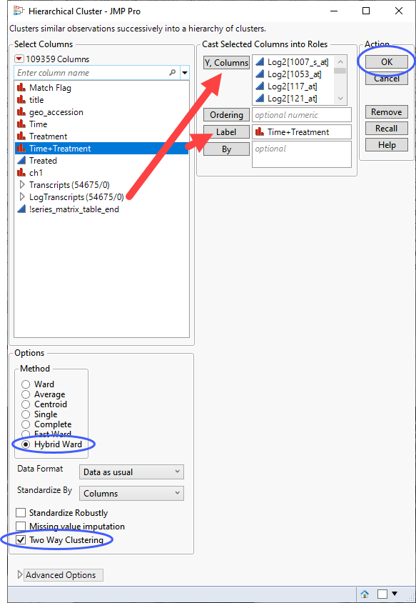
| 8 | Click . |
The clustering might take a few seconds or up to several minutes depending on the size of your data table.
The dendrogram is shown below.
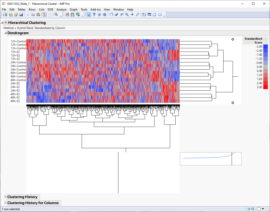
The first thing that can be discerned from the heat map is that the six time and treatment groups cluster tightly together, indicating that this grouping variable is likely the main source of variability.
Second, even though the plot is noisy, it appears that there are localized pattern differences in the plot suggesting that different clusters of genes are either up-regulated or down-regulated by estradiol. For example, examine the lower right and lower left corners of the heat map and compare the 24h-E2 and 48h-E2 rows with their respective controls. Genes illustrated in red show higher expression whereas genes illustrated in blue are down regulated.
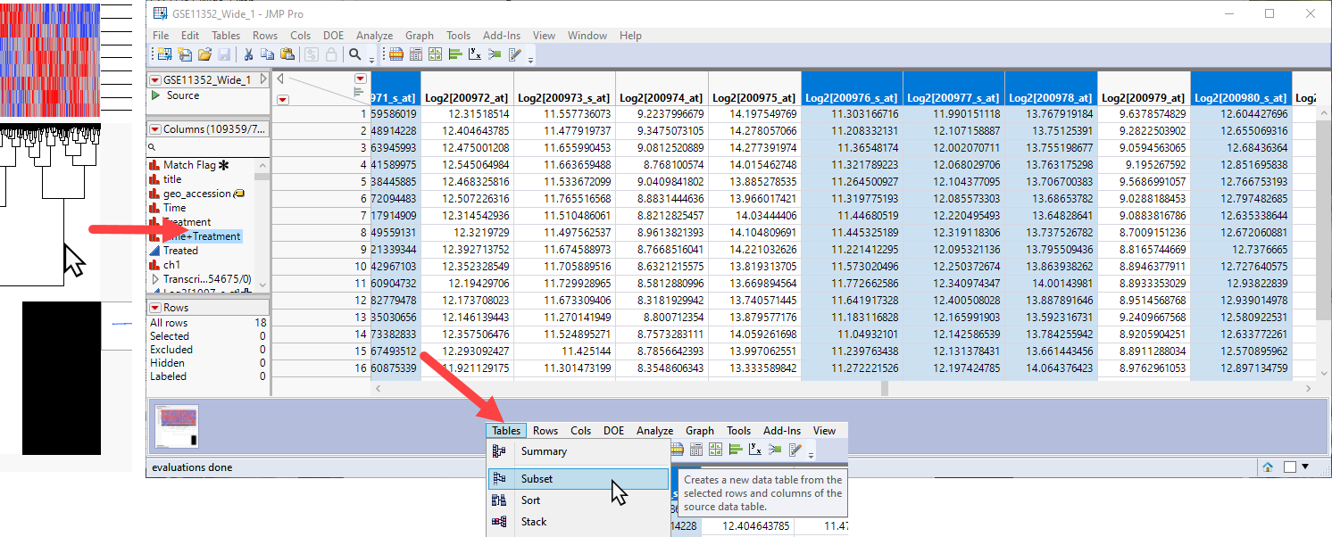
To further examine differentially expressed genes, you can click on and highlight a cluster on the heat map. This also highlights specific columns or rows in the data table, which can then be subsetted (using the Tables > Subset command) to a new table for further analysis.
Alternatively, we can proceed to further examine what is driving the patterns that we see in the data, identify more precisely the causes of variation, and narrow the list of interesting genes.
Principal Components
Another classic technique used to examine the structure of expression data is principal component analysis (PCA). The purpose of principal component analysis is to derive a small number of independent linear combinations (principal components) of a set of measured variables that capture as much of the variability in the original variables as possible. Principal component analysis is a dimension-reduction technique, as well as an exploratory data analysis tool.
For genomic data, which typically have a very large number of variables, the Principal Components platform provides an estimation method called the Wide method. The Wide method enables you to calculate principal components in short computing times.
| 8 | Open the GSE11352_Wide_1 JMP table. |
| 8 | Click Analyze > Multivariate Methods > Principal Components. |
| 8 | Select the log2-transformed data columns as the Y, Columns. |
| 8 | Specify Wide Data as the Method Family. |
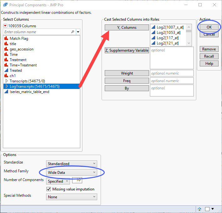
| 8 | Click |
The analysis might take a few seconds or up to several minutes depending on the size of your data table.
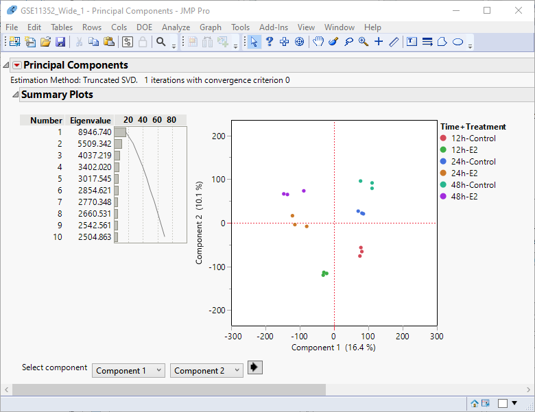
Examination of the summary plot (left) shows that close to 70% of the observed variability can be explained by the first ten principal components. Alone, the first two components account for 30% of the total variability. You can see from the principal components plot at right that the replicates for each treatment-time group cluster together.
We can extend this analysis using a method called principal variance components analysis (PVCA) whereby we combine PCA with analysis of variance.
Principal Variance Components
In this analysis, we treat the principal components as responses and model them as a function of the known experimental variables (in this case, time and treatment, and their interaction) to determine which set of conditions drives the greatest variability.
The first step in PVCA is to save the principal components from the PCA to the data table.
| 8 | Click  and select Save Columns > Save Principal Component Values. and select Save Columns > Save Principal Component Values. |
| 8 | Specify 10 as the number of components to save in the pop-up window. |
This adds 10 columns containing the first 10 PC values for each sample to the end of the data table.
In the next step, we will use JMPs Fit Model platform to model the principal components using a mixed model that allows us to specify variance components that function as a source of variability. Refer to JMP for Mixed Models2 for more information.
| 8 | Click Analyze > Fit Model. |
| 8 | Select the Prin1 - Prin10 columns as the Y variables. |
| 8 | Use the Personality drop down menu to specify Mixed Model. |
| 8 | Click the Random Effects tab and add Time, Treatment and Time+Treatment as random effects. |
| 8 | Uncheck the Unbounded Variance Components check box to keep the estimates nonnegative. |
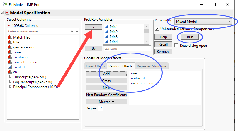
| 8 | Click . |
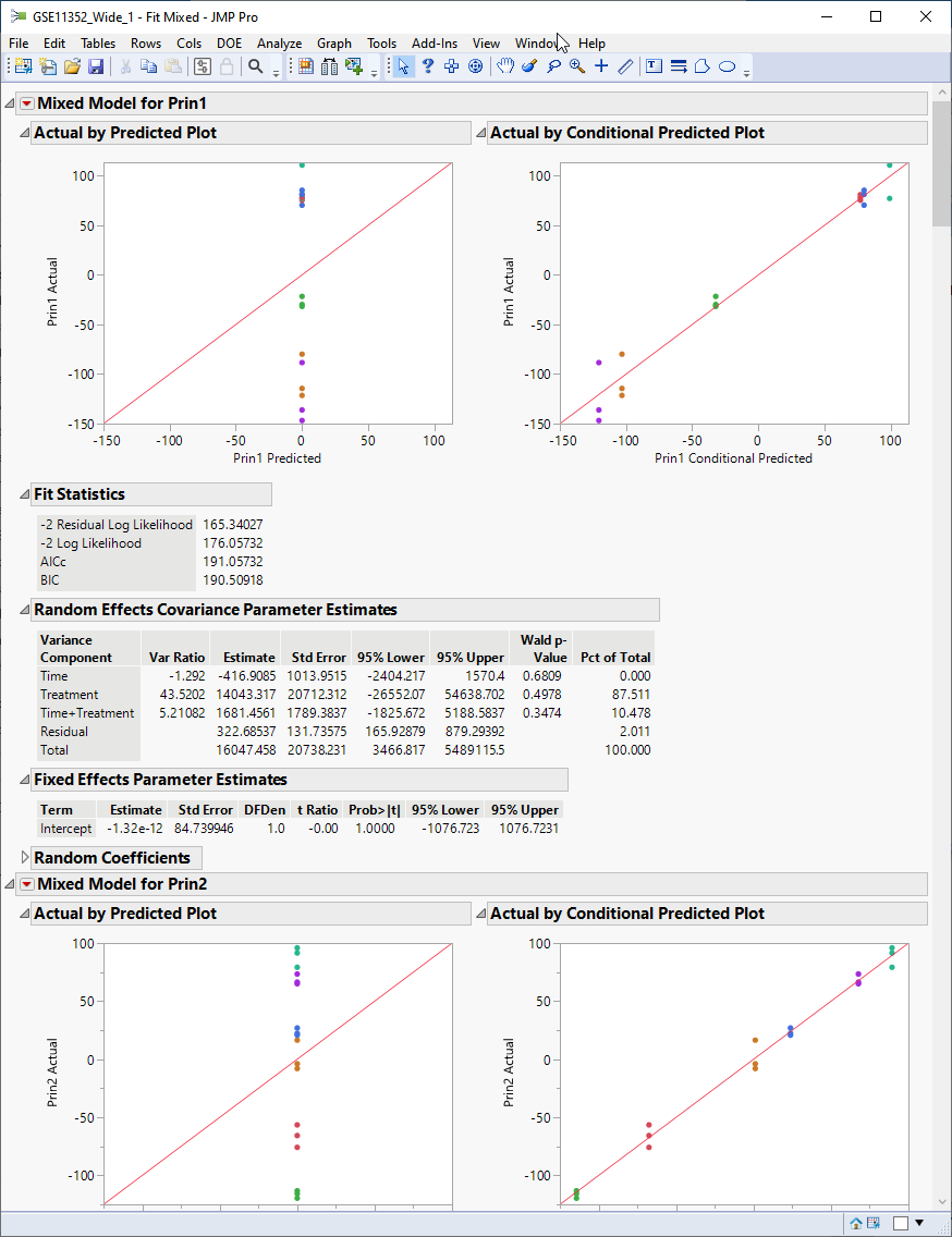
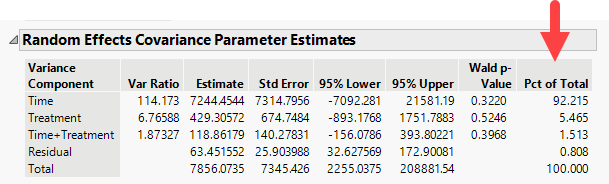
The report generated displays the result of modeling each of the first 10 principal components. Let us focus on the Random Effects Covariance Parameter Estimates table for Prin1, shown below.
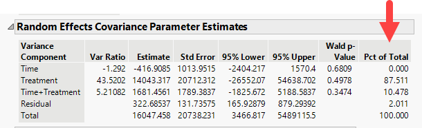
We find that over 87% of the total variance observed in Prin1 is driven by the experimental treatment (estradiol). Time has no effect on its own. The interaction of time and treatment has a small effect (~10%). The residual (everything not specified as a random effect) is responsible for a minute amount of the observed variation.
Let us compare that to the estimates for Prin2.
We find that over 92% of the variation observed for Prin2 is driven by time. Less that 8% was the result of all of the other effects.
Examination of the remaining components that interaction of time and treatment, along with the residuals, account for a small amount of the variance.
Response Screening
Analysis of the data structure has established that treatment is the principal component driving the observed variation in gene expression. In light of this, we should sharpen our focus from using a two-way design for looking at all combinations of effects (Treatment, time and the interaction of time and treatment) to a one-way design where we are just treatment versus control at each of the time points. We will use the Response Screening platform, a high-performance method best used for large experiments with simple designs, to run a one-way anova.
| 8 | Open the GSE11352_Wide_1 JMP table. |
| 8 | Click Analyze > Screening . Response Screening. |
| 8 | Select the log2-transformed data columns as the Y, Columns. |
| 8 | Specify Time+Treatmentt column for X. |
| 8 | Check the Common Y Scale box. |
| 8 | Use the Means Comparisons drop-down menu to specify that the model include All Combinations. |
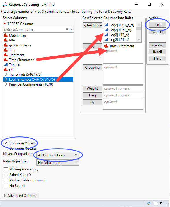
| 8 | Click . |
The screening runs very quickly and the report showing the results of almost 55,000 one-way anovas (one for each transcript) is shown below:
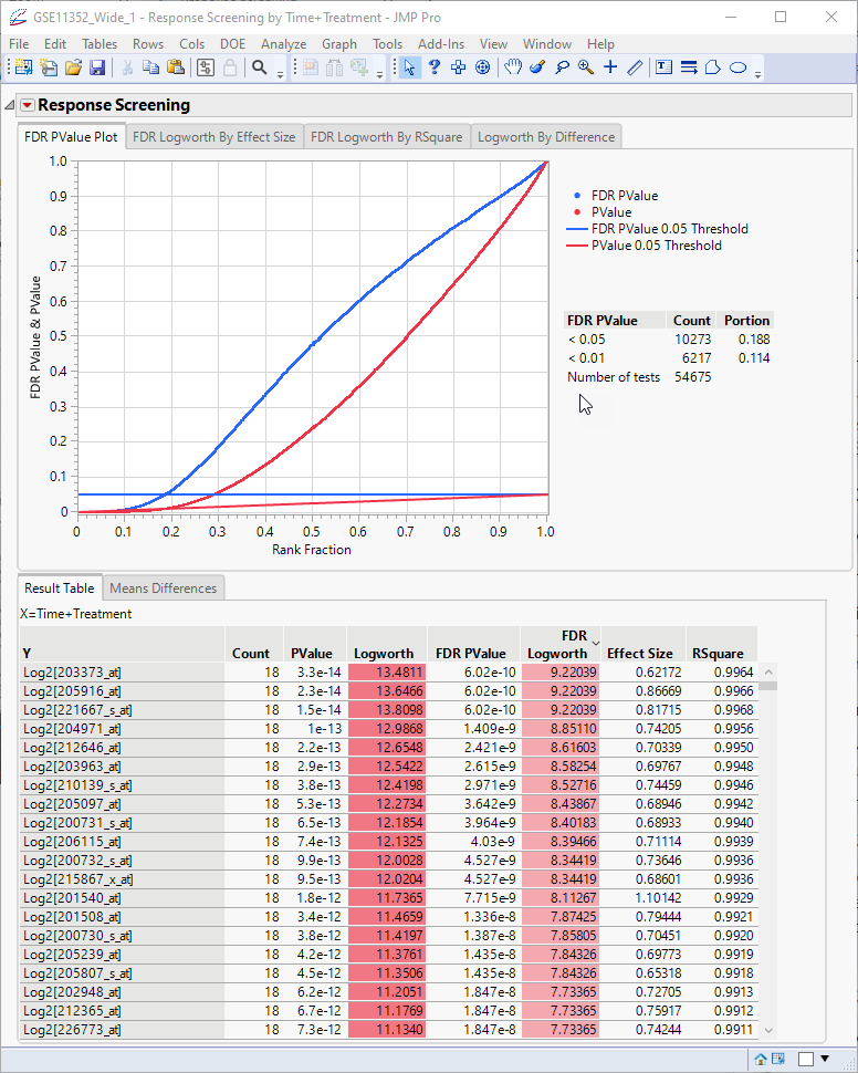
The plot at top presents a holistic view of all of the models, showing the p-values and false discovery rate (FDR) p-values. The FDR statistic is useful for controlling the error testing rate among the genes that we might consider significant. The p-values and FDR p-values for each transcript are shown in the table.
The Logworth values represent the -log10 of the p-values and FDR p-values. The smaller (and more significant) the p-values and FDR p-values, the larger the Logworth values, and. the more significant the observation.
Looking at the table, we can see that we have some very significant differences. However, these values represent all possible comparisons, some of which might not be biologically meaningful. This becomes more obvious if we examine the means differences.
| 8 | Click the Means Differences tab on the report table> |
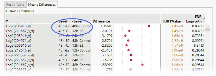
The means comparison for transcript 205916_at after 48 h (top row) was the most significant difference observed. The fact that this difference was observed at the same time point means that it is likely to be biologically relevant. However, the comparison showing the next most significant difference occurred at different time points, casting doubt on its relevance. Instead of examining all possible comparisons, we should instead focus only on those made at the same time points.
To isolate only those comparisons made at the same time points, we need to do the following:
| 8 | Click and select Save Tables > Save Means Differences. |
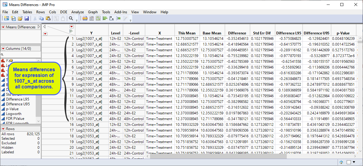
The means differences table contains differences in expression between each pair of experimental conditions for each transcript. There are, thus 15 rows for each transcript for a total of 820125 rows. However, because we are interested only in the differences between treated and control cells at each time point, we really want only 3: 12h-Treated:12h-Control, 24h-Treated:24h-Control, and 48h-Treated:48h-Control. Let us subset this table to include only those comparisons.
| 8 | Highlight the two columns listing the experimental conditions (in this example, Level and -Level). |
| 8 | Right-click within the column heading and select New Formula Column > Character > Concatenate with Underscore. |
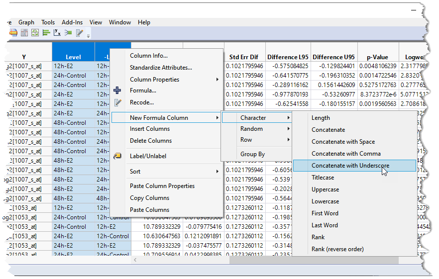
This creates a new column of values concatenated from the highlighted columns (highlighted below).
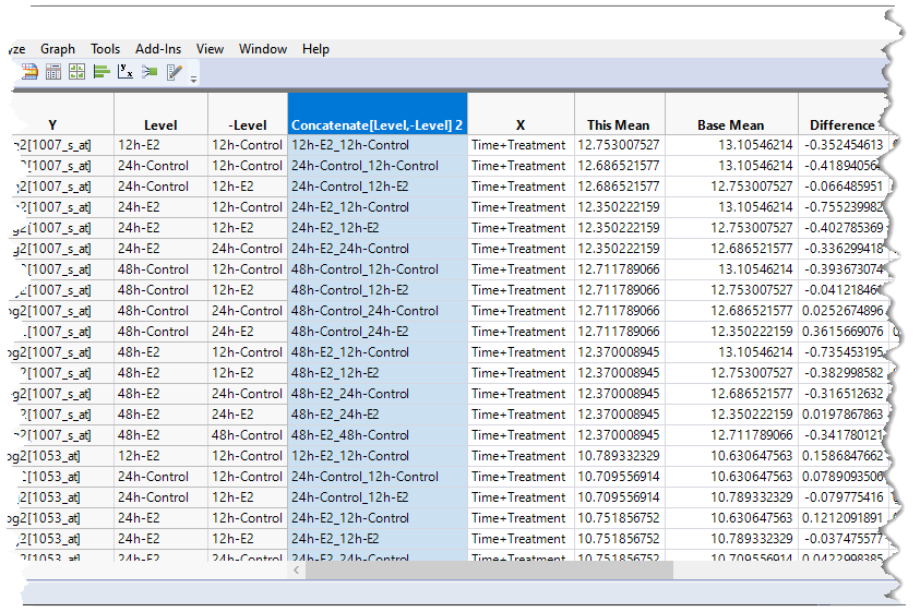
This gives us one single column that we can filter on for subsetting the table.
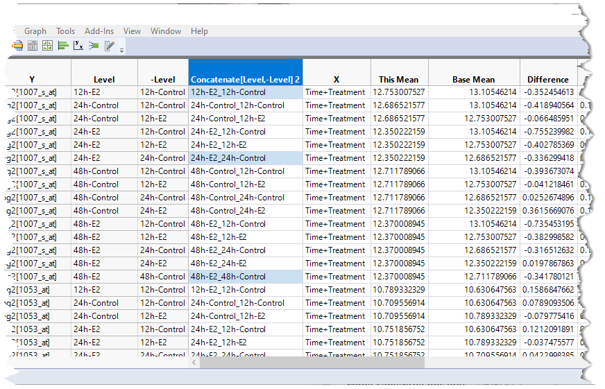
The next step is to select all of the rows that we want to explore further (12h-Treated:12h-Control, 24h-Treated:24h-Control, and 48h-Treated:48h-Control).
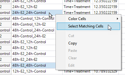
| 8 | Hold down the CTRL key and click the cells in the Concatenate[Level,-Level]2 column in rows 1, 6 and 15. These correspond to the 12h-Treated:12h-Control, 24h-Treated:24h-Control, and 48h-Treated:48h-Control rows for probe set 1007_s_at. |
| 8 | Right-click on one of the matching cells and select Select Matching Cells to select the corresponding cells for all of the probe sets. |
| 8 | Select Table > Subset to open the Subset window. Make sure the Selected Rows and All Columns specifications are selected and click . |
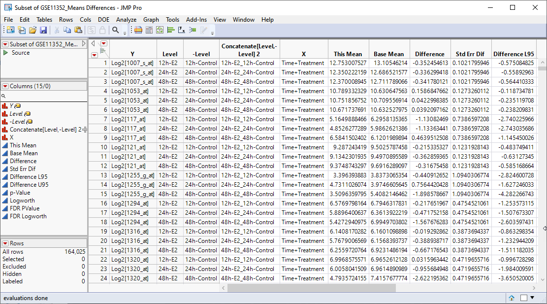
The resulting table (shown below) contains the only selected rows corresponding to the experimental data that we are interested in examining further.
We can now use JMPs Graph Builder to examine the data in more detail.
| 8 | Select Graph > Graph Builder to open the Graph Builder platform. We will use this platform to plot the difference in expression between the treated cells and control cells by the Logworth (or significance) values for each transcript and from that plot identify those transcripts most affected by estradiol-treatment. |
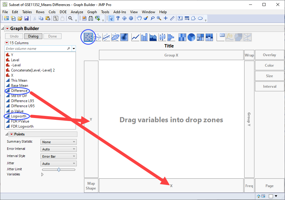
| 8 | Select Logworth from the column list at left and drag it to the Y-axis. |
| 8 | Select Difference from the column list and drag it to the X-axis. |
| 8 | Click  to show the individual points in the plot. to show the individual points in the plot. |
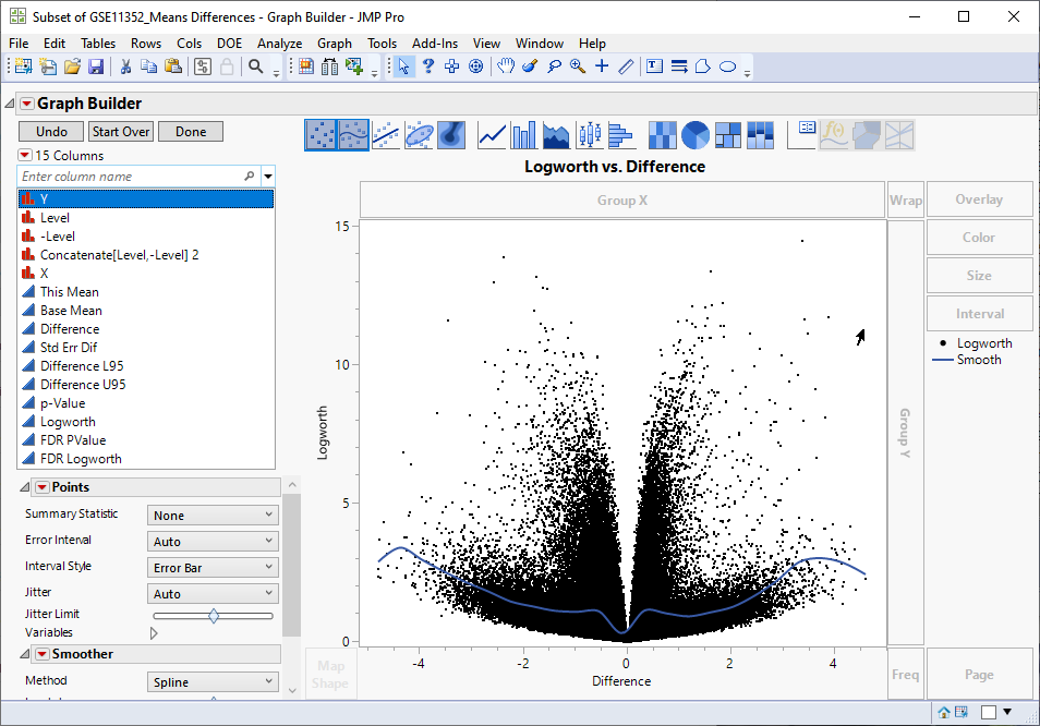
Examine the volcano plot shown above. The higher the points are on the Y axis, the more significant the observation (remember, Logworth is a negative log function of the p-value). The farther to the right or to the left from 0 on the X axis, the greater the difference in expression (positive or negative, respectively) from the treated cells are from the control cells.
JMPs interactivity makes it easy to select the transcripts that you want to examine further. You can select points individually or in a rectangular or irregular area. Selecting one or more points on the plot also selects the corresponding row in the data table. For example, selecting transcripts showing greater than a four-fold increased expression (remember, expression values are log2-transformed), regardless of significance automatically selects the corresponding row in the data table.
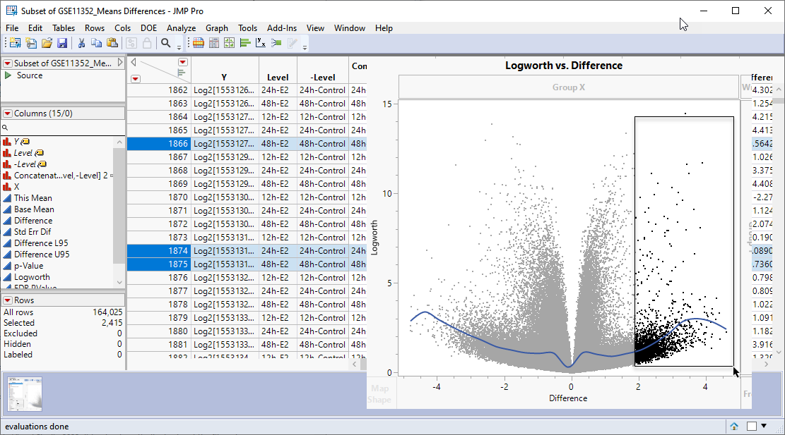
You can then subset the table, adding only the selected rows to the new table, as discussed above. Once you have your subsetted table of your genes of interest, you can combine it with gene names and other annotation information to identify and further investigate your experimental results.
Let us summarize what we have accomplished in this case study. We have imported data from cell lines treated or not treated with estradiol and analyzed more than 54000 transcripts for differential expression across 18 samples. We have fit almost 55000 one-way anova models and isolated data for a set of three experimental combinations. We then generated an interactive volcano plot displaying the response and statistical significance of each transcript to those experimental combinations such that we can select and isolate the transcripts that meet the criteria of interest for further study.