Genetic Analysis of 6 Loblolly Pine Traits
The data used in this chapter is from a study of the accuracy of different genomic selection methods in Loblolly pine by Resende, et al. 20121 and was downloaded from the authors' public site as a CSV text file, opened in JMP, and saved as the loblolly.jmp table shown below.
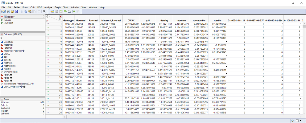
This table is a wide![]() A data table in which variables are columns and samples are rows. table with 926 samples in rows and 4889 columns listing parental, trait and genotype data. The 4853 genotype columns are collected into a group named SNPs, for convenience. The 926 individual pine trees used in this study were from 70 full-sib families generated from crosses of 32 parents. Traits assessed here include crown width (CWAC), susceptibility to fusiform rust (gall and rust_bin)), wood specific gravity (density), and the development (Rootnum_bin) and number (Rootnum) of seedling roots. The SNP genotypes are numerically encoded with 2 designating individuals homozygous for the most common allele, 0 representing individuals homozygous for the less common allele, and 1 representing the heterozygotes.
A data table in which variables are columns and samples are rows. table with 926 samples in rows and 4889 columns listing parental, trait and genotype data. The 4853 genotype columns are collected into a group named SNPs, for convenience. The 926 individual pine trees used in this study were from 70 full-sib families generated from crosses of 32 parents. Traits assessed here include crown width (CWAC), susceptibility to fusiform rust (gall and rust_bin)), wood specific gravity (density), and the development (Rootnum_bin) and number (Rootnum) of seedling roots. The SNP genotypes are numerically encoded with 2 designating individuals homozygous for the most common allele, 0 representing individuals homozygous for the less common allele, and 1 representing the heterozygotes.
In this case study, we model a typical genetic analysis work-flow in JMP PRO.
Data Import
The downloaded text file was opened in JMP PRO (File > Open) and saved as a .jmp table.
Data Structure
It is useful, as a first step in a genetic analysis, to explore the nature and structure of the collected data. JMP PRO has numerous platforms that facilitate rapid exploration of genotype data and associated traits.
Trait Correlation
Is the expression of certain phenotypic traits correlated? We can use JMP PRO's Multivariate platform to assess the correlated expression of associated trait combinations.
| 8 | Open the loblolly.JMP table. |
| 8 | Click Analyze > Multivariate Methods > Multivariate. |
| 8 | Select the six trait columns as the Y, Columns. |
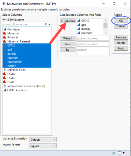
| 8 | Click . |
The following report is generated:
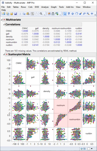
From this plot, we can see that most of the traits occur independent of each other with the exception of root development (rootnumbin) and root numbers (rootnum) (highlighted in red), which appear to be highly correlated.
Marker Statistics
The Marker Statistics platform provides a convenient method for exploring several properties of all the biallelic markers in a data set. This process calculates various single marker measures, such as polymorphism information content, allele diversity, heterozygosity, minor allele frequency, allele and genotype frequencies, tests for Hardy-Weinberg equilibrium (HWE). It also calculates various measurements of linkage disequilibrium, as well as an overall test for linkage disequilibrium, between pairs of markers.
| 8 | Click Analyze > Genetics > Marker Statistics. |
| 8 | Select the SNPs group as the Marker columns. |
| 8 | Loblolly pine is diploid, so make sure that 2 is specified for the ploidy. |
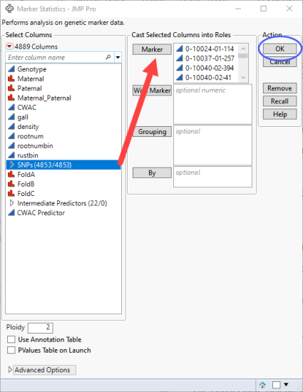
| 8 | Click . |
The following report is generated:
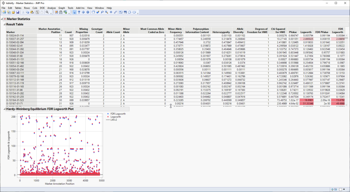
The Results table provides statistics for each of the markers analyzed.
The Hardy-Weinberg Equilibrium plot shows how close each of the markers are to equilibrium. The column number of each marker in the JMP table is plotted on the x-axis. The FDR-adjusted -log10(p-value) and -log10(p-value) for HWE for each marker is plotted on the y-axis. Markers at or below the reference line are at equilibrium, markers above the line are not. The farther from the reference a marker is, the further the marker is from equilibrium. Markers not equilibrium might be under selective pressure.
Pattern Discovery
Hierarchical Clustering
One of the first things that are traditionally done in a genetic analysis is to run a two-way hierarchical clustering of the genotype data to see whether any patterns are evident.
| 8 | Click Analyze > Clustering > Hierarchical Cluster. |
| 8 | Select the SNPsgrouping of the genotype columns as the Y, Columns. |
| 8 | Select FastWard as the clustering method and specify Two Way Clustering. |
| 8 | Check Missing value imputation to account for any missing data. |
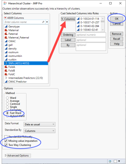
| 8 | Click . |
The clustering might take a few seconds or up to several minutes depending on the size of your data table.
The dendrogram is shown below.
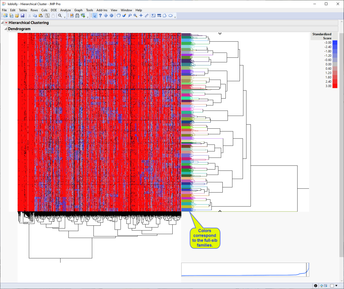
The first thing that can be discerned from the heat map is that the individual samples cluster into approximately 70 groups (indicated by the multicolored column on the right side of the heat map) that correspond to the 70 full-sib families generated from the initial crosses.
Second, the majority red portion of the heat map represents the major alleles, whereas the bluer regions represent the minor alleles. You can see from the blue regions where the minor alleles are clustering as well as the key places in the genome that distinguish the unique crosses that make up the study population.
Principal Component Analysis
Another way to approach exploration of the data is through dimension reduction using principal component analysis (PCA).
| 8 | Click Analyze > Multivariate Methods > Principal Components. |
| 8 | Select the SNPsgrouping of the genotype columns as the Y, Columns. |
| 8 | Specify Wide Data as the Method Family. |
| 8 | Specify Fast Approximate as the Special Method. |
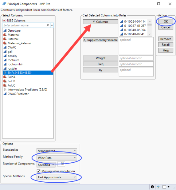
| 8 | Click . |
The Summary plot for the first two principal components is shown below:
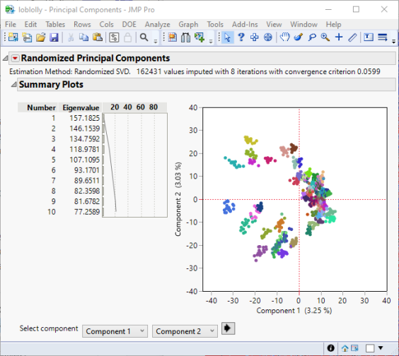
As seen in the hierarchical clustering shown above, the full-sib families cluster together for the first two principal components. The families are color coded in the same way.
Multivariate Embedding
A third method way to approach exploration of the data is mapping high dimensional data to a low dimensional space using the t-Distributed Stochastic Neighbor Embedding (t-SNE) method available in the Multivariate Embedding platform.
| 8 | Click Analyze > Multivariate Methods > Multivariate Embedding. |
| 8 | Select the SNPsgrouping of the genotype columns as the Y, Columns. |
| 8 | Check Missing value imputation to account for any missing data. |
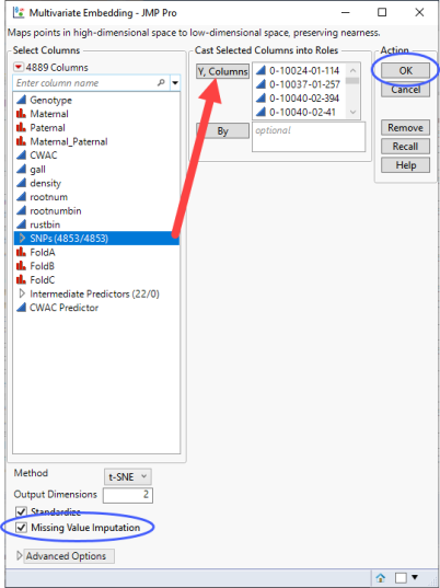
| 8 | Click . |
As with PCA, the t-SNE plot shows clusters corresponding to the half-sib families. However, these clusters are tighter than those seen with PCA. This is because t-SNE tries to reduce the dimensions by searching for localized areas of structure to form tight local clusters whereas PCA searches for dimensions of largest variability across all of the markers.
Genome-Wide Association (GWAS)
Large-scale genetic mapping studies seek to associate genetic markers, such as SNPs, of known location, with various quantitative and qualitative phenotypic traits. The go-to option for GWAS in JMP PRO is the Response Screening platform
Response Screening
| 8 | Click Analyze > Screening > Response Screening. |
| 8 | Select the six traits as the Y, Response |
| 8 | Select the SNPsgrouping of the genotype columns as the X variables. |
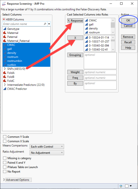
| 8 | Click . |
The process runs very fast. In this case it carried out 29,118 regressions (6 traits x 4853 markers) and reported the results in the report below:
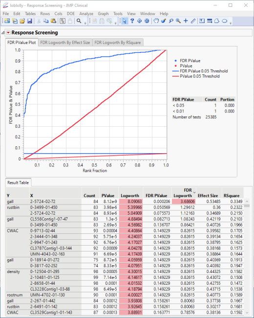
The plot shows all of the associated p-values and FDR p-values plotted together.
The table is sorted by significance. The data indicates that, overall, the trait influenced the most by specific genotypes is CWAC. To investigate further, save the results in a new table.
| 8 | Click  and select Save Tables > Save PValues. and select Save Tables > Save PValues. |
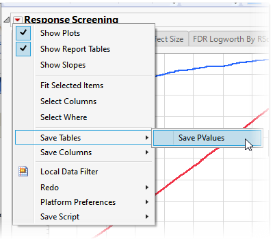
The following table of p-values and other statistics is generated.
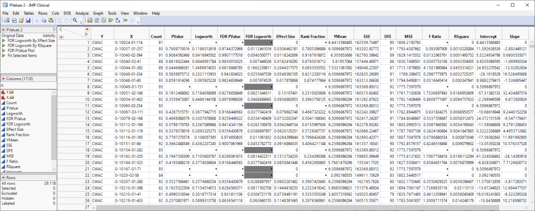
We can now use JMPs Graph Builder to examine the data in more detail.
| 8 | Select Graph > Graph Builder to open the Graph Builder platform. We will use this platform to plot the difference in expression between the treated cells and control cells by the Logworth (or significance) values for each transcript and from that plot identify those transcripts most affected by estradiol-treatment. |
| 8 | Select Logworth from the column list at left and drag it to the Y-axis. |
| 8 | Select Slope from the column list and drag it to the X-axis. |
| 8 | Select Y from the column list and drag it to the Wrap box to create a separate volcano plot for each trait. |
| 8 | Click  to show the individual points in the plot. to show the individual points in the plot. |
The plots are displayed:
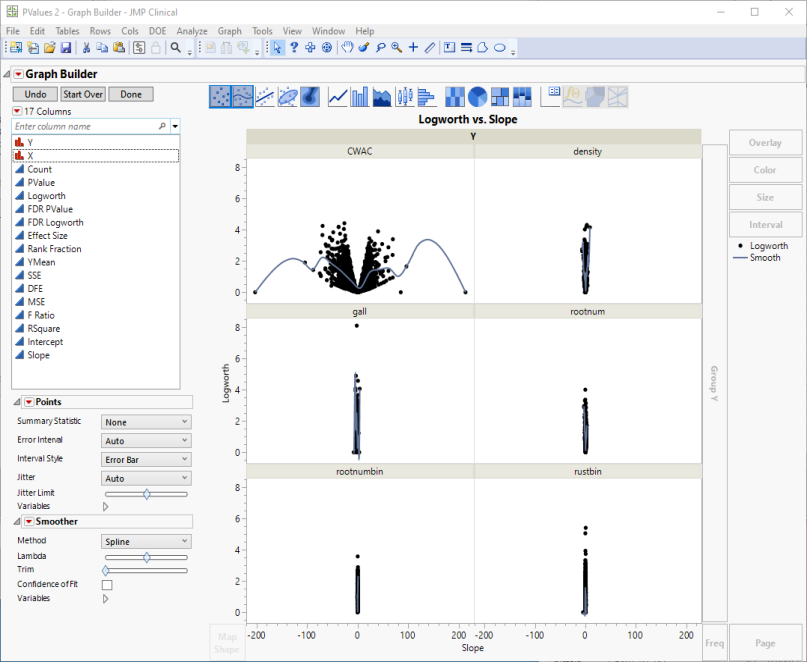
Volcano plots excel at revealing differences from the mean effect. A quick examination. reveals that CWAC shows the greatest variability. The points on the other 5 plots all cluster close to the zero, indicating much less of a genetic effect on these traits.
Examine the CWAC volcano plot shown above. The higher the points are on the Y axis, the more significant the observation (remember, Logworth is a negative log function of the p-value). The farther to the right or to the left from 0 on the X axis, the greater the genetic effect (positive or negative, respectively) the locus has on the trait. You can use JMP Pro's lasso tool to select and subset markers that you want to investigate further.
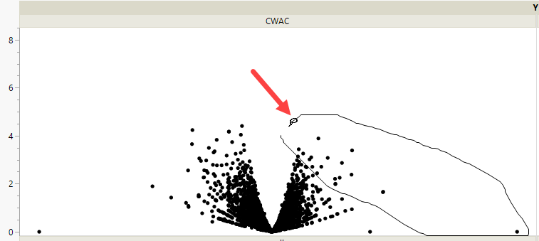
Once you have identified genes/loci of interest, you can combine your data with gene identifiers, physical position, pathway information and other annotation information, to develop a deeper understanding of the role these genes play in growth and development that can lead to further investigations.
Marker Simulation
An additional line of investigation made possible in JMP PRO is to use genotype and trait data in simulated crosses to predict the best individuals to use as parents in a selective breeding program. This method is especially useful for species, such as loblolly pine, that are long-lived and can take years or even decades between generations.
Marker Simulation simulates the progeny from a specified set of crosses using biallelic markers and predictor formulas saved in your data table. This process enables you to test various crosses to estimate which crosses generate progeny with the desired combinations of traits.
Predictor formulas were generated for this example using the Generalized Regression personality in the Fit Model platform. Formulas were generated for the CWAC trait only and saved to the data table. Refer to Generating Predictor Formulas for Marker Simulation for information about generating predictor formulas.
| 8 | Open the loblolly JMP table. |
| 8 | Select the SNPs group as the Marker columns. |
Running Marker Simulation for a data set as large as the loblolly.jmp table requires considerable time and computer resources. In the interest of brevity, this example was run using the first 30 rows of the table only.
| 8 | Loblolly pine is diploid, so make sure that 2 is specified for the ploidy. |
| 8 | Enter 2 for the Number of Individuals per Cross. |
| 8 | Enter 2 for the Number of Generations. |
| 8 | Check the Use Only markers Found in the Predictor Formula check box. |
| 8 | Under Advanced Options, enter 123 for the Random Seed. |
| 8 | Check the Unthreaded check box. |
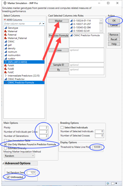
| 8 | Click to generate the report and several tables. |
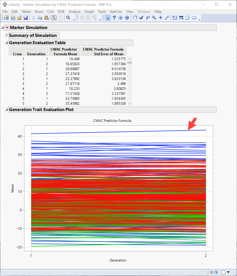
Note: You might have to click and select Show Evaluation Plot and Show Diversity Plot to view the plot shown above.
From this plot, you can select crosses that you want to investigate further. For example, the top line in the plot represents the cross with the largest mean effect on the CWAC trait. This effect increases from the first to the second generation. Selecting this line highlights the corresponding rows in the associated tables, enabling you to identify the cross (in this case, cross 19) and the row numbers of the initial parents (1 and 20) in the original data table.
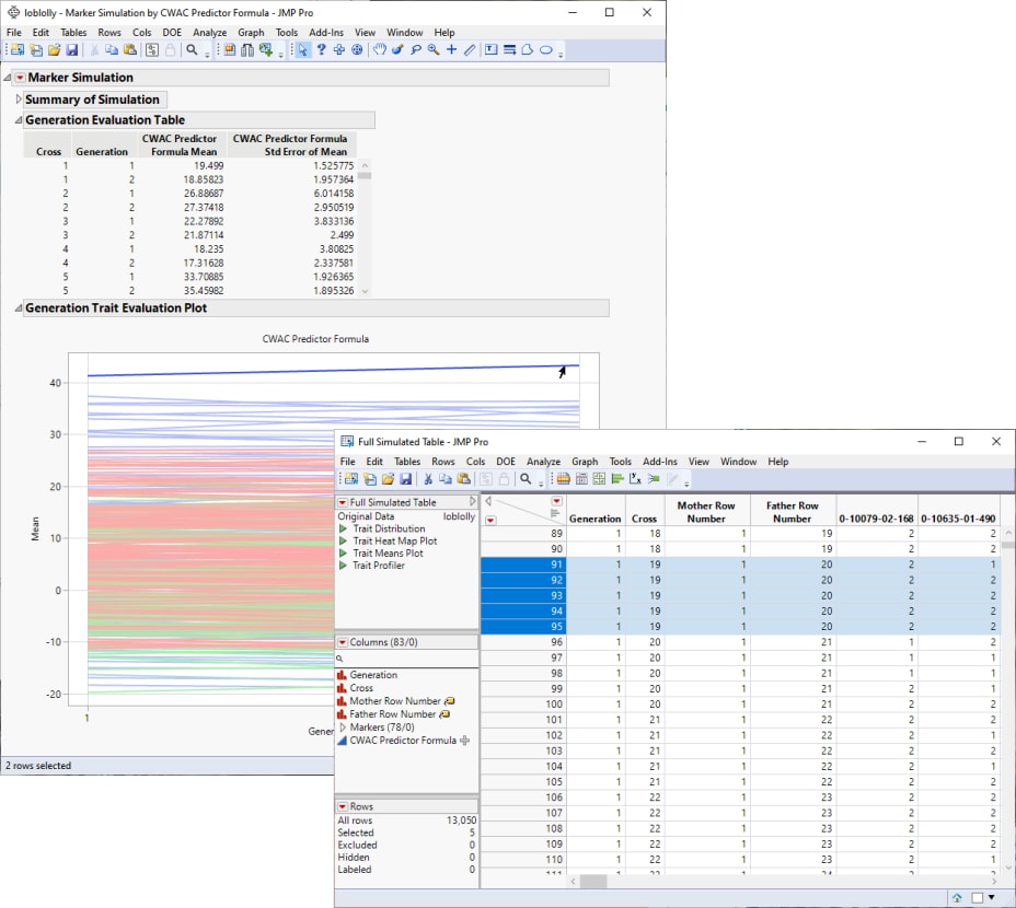
If increasing CWAC in loblolly pine is a goal of the research program, including the selected individuals in your breeding program might be a place to start.